A real estate website has two jobs. It has to make people fall a little in love with a home, and it has to get them searching, enquiring, or booking a valuation before they leave. The best real estate website designs do both on the first screen. This post showcases 20 of the best real estate website designs from the US, UK, Australia, and Dubai, with screenshots, what each one does well, and practical tips you can use on your own site.
Whether you are a broker planning a redesign, an agent building your first site, or a designer looking for inspiration, these examples show what good looks like in 2027. And if you want a real estate website that looks this good and keeps listings in sync with your CRM, talk to Dev Mizan.
Table of Contents
What Makes a Great Real Estate Website Design?
Before the examples, here is what the strongest sites in this list have in common:
- Search on the first screen. Buy, rent, and sell tabs with a single location box, right in the hero.
- One clear seller call to action. “Get a valuation” or “What’s my home worth?” for vendors and landlords.
- Photography that sells a lifestyle, not just a building.
- A recognisable brand through colour, type, and tone of voice.
- Local proof, such as offices, areas, stats, or reviews.
- Accurate, current listings, ideally synced from the agency’s CRM.
1. Compass
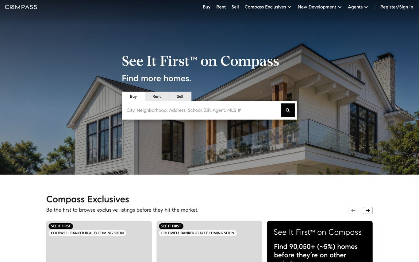
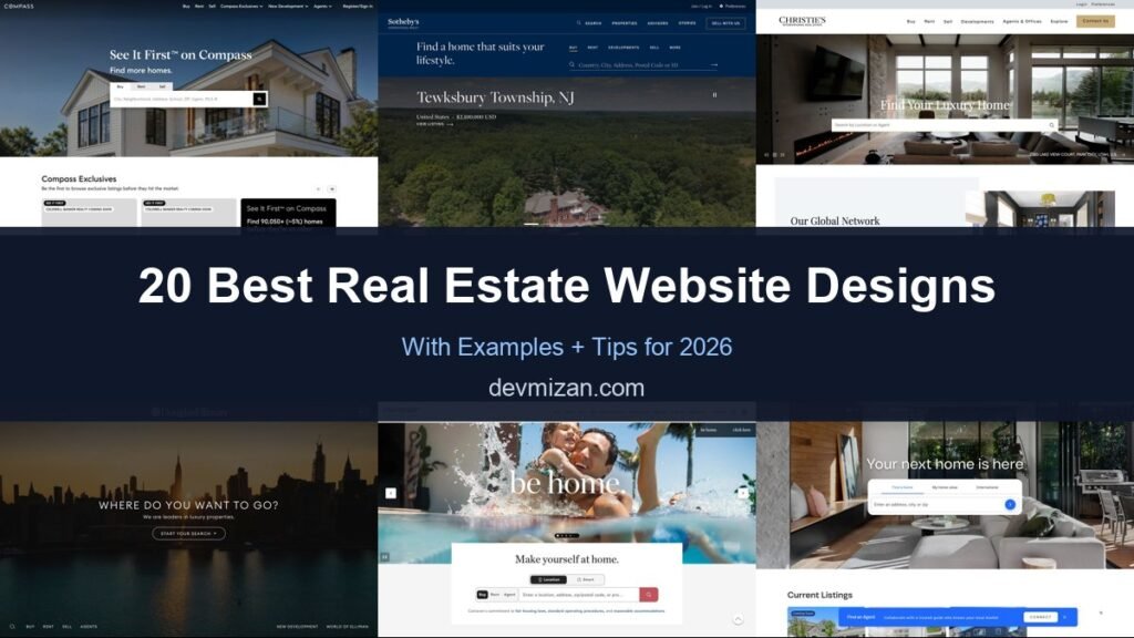
Compass opens with a bright, full-width photo of a classic family home and a single message: “See It First on Compass.” The search box sits right in the hero with Buy, Rent, and Sell tabs and accepts almost anything, from a neighbourhood or school to an agent name or MLS number. Directly below, a “Compass Exclusives” carousel shows listings you can only find on Compass, which gives buyers a concrete reason to search here instead of on a portal.
What to borrow: A unique-inventory hook (exclusive listings) placed right under the search.
2. Sotheby’s International Realty
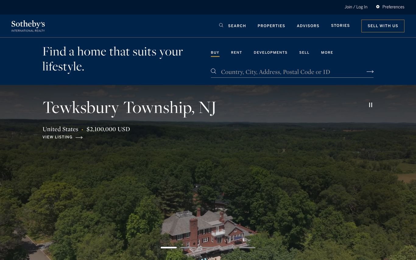
Sotheby’s pairs a deep navy header with an elegant serif headline: “Find a home that suits your lifestyle.” Search sits next to it with tabs for Buy, Rent, Developments, and Sell. Below, a full-width featured listing fills the screen with its location, price, and a “View listing” link, so the homepage works like a luxury magazine cover that changes as listings rotate.
What to borrow: Full-screen featured properties that change as you browse.
3. Christie’s International Real Estate
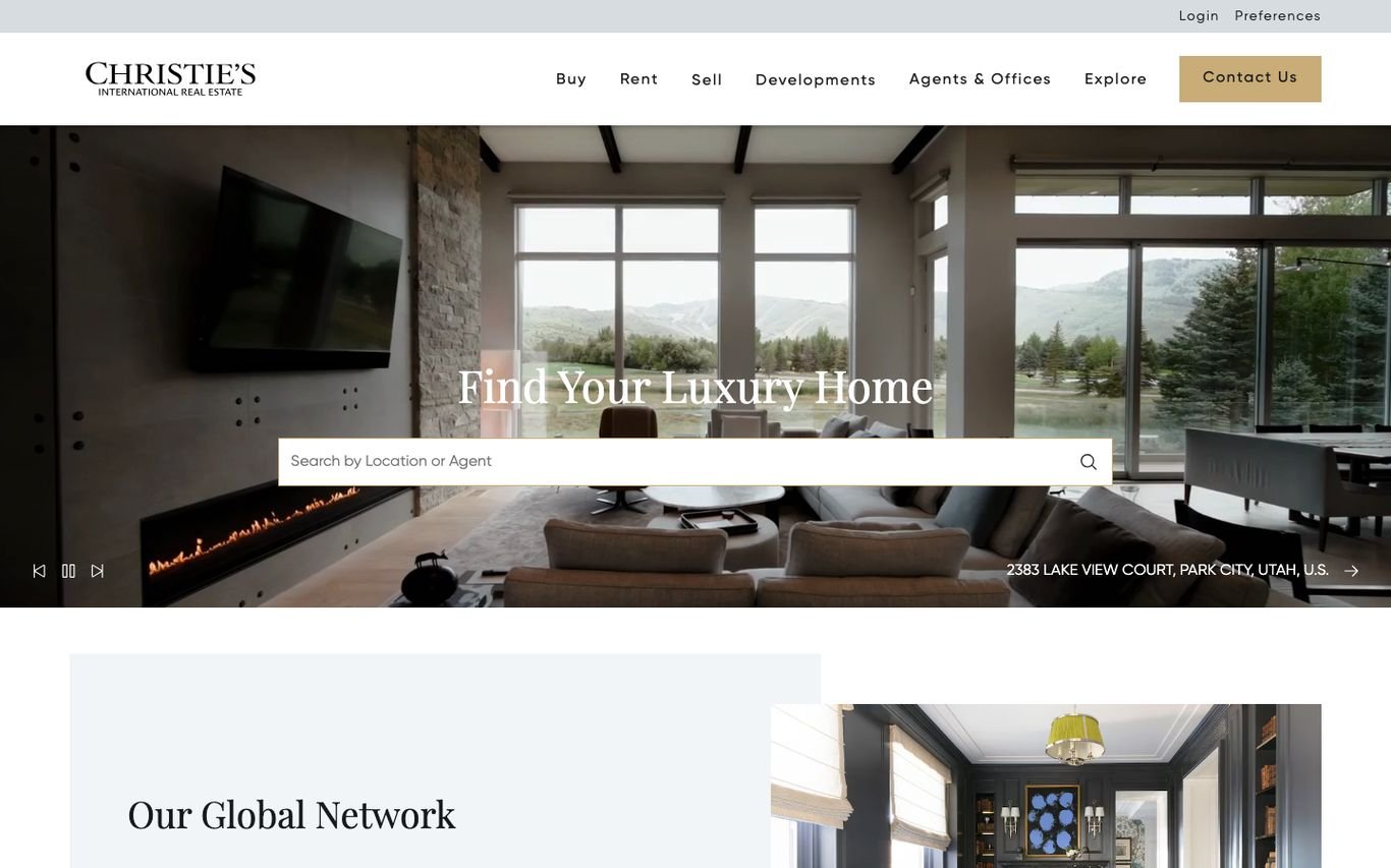
Christie’s keeps the navigation classic and calm: Buy, Rent, Sell, Developments, Agents & Offices, Explore, and a gold “Contact Us” button. The hero plays full-width property video with “Find Your Luxury Home” and a single search bar for location or agent. A small caption names the featured property, a subtle detail that makes the imagery feel real rather than stock.
What to borrow: Video hero that captions the featured home.
4. Douglas Elliman
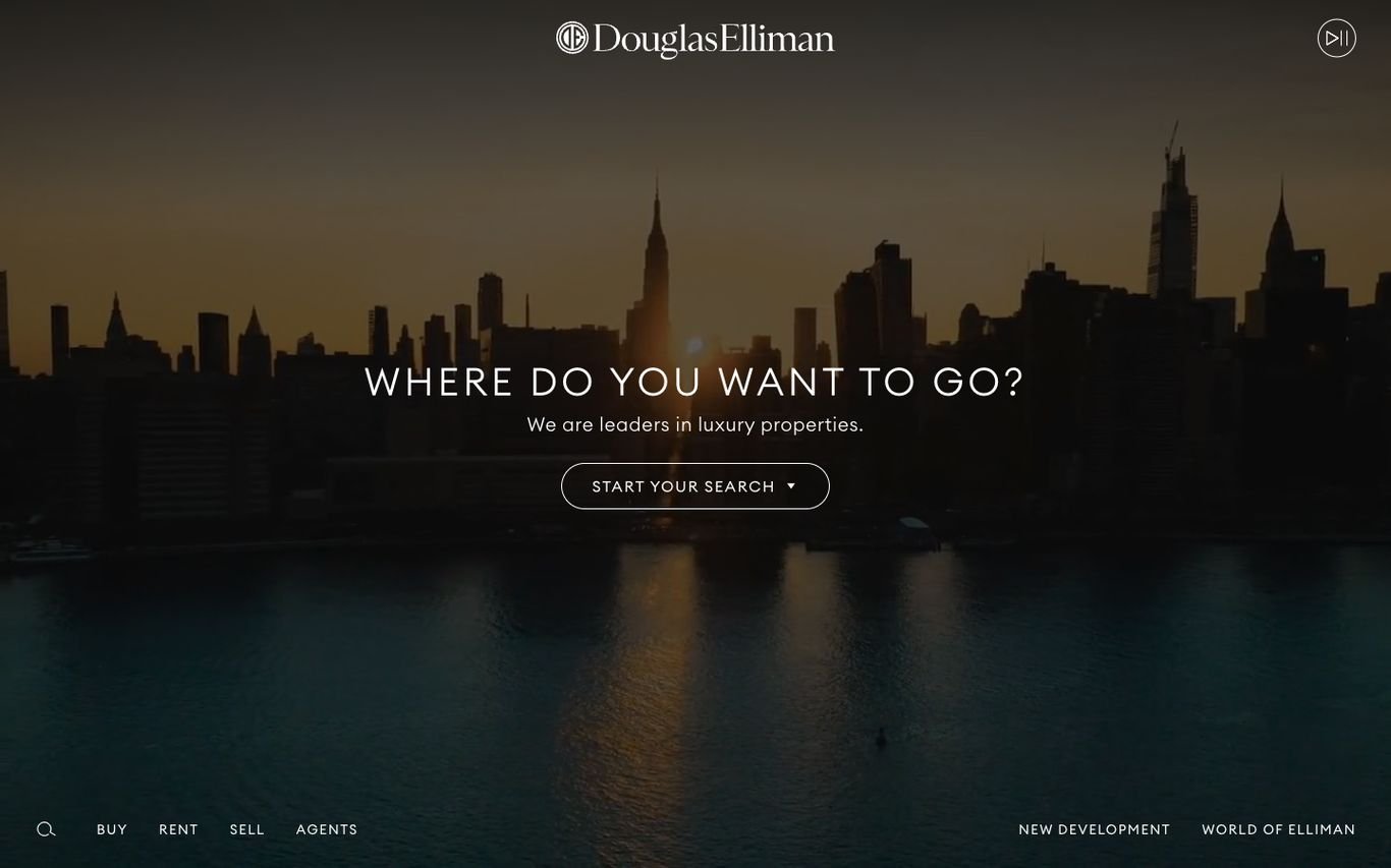
Douglas Elliman strips the homepage back to a dark, full-screen skyline, a centred logo, and one question: “Where do you want to go?” A single “Start your search” button replaces the usual form, and a slim bottom bar holds Buy, Rent, Sell, Agents, New Development, and World of Elliman. It is a confident, luxury-first approach that trusts the imagery to do the work.
What to borrow: Restraint: one question, one button, one image.
5. Corcoran
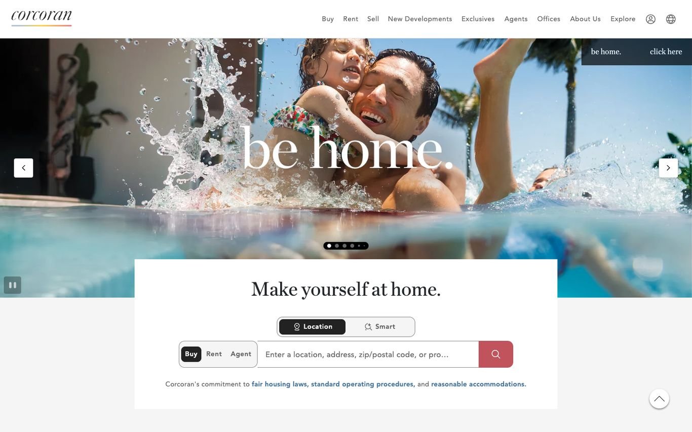
Corcoran leads with emotion rather than architecture. A joyful family photo and a large “be home.” headline fill the slider, while a white search card overlaps it with “Make yourself at home.” The card lets visitors switch between location and smart search and between Buy, Rent, and Agent, so the brand moment and the search tool share the same screen.
What to borrow: Brand storytelling and search combined in one hero.
6. Coldwell Banker
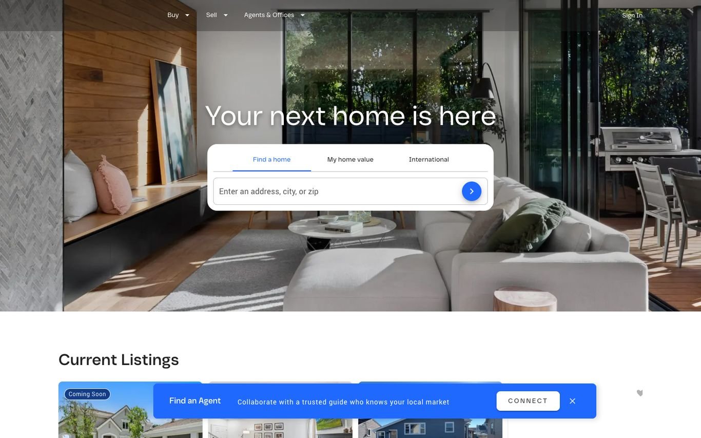
Coldwell Banker uses a warm, sunlit interior and a simple promise: “Your next home is here.” The search card has three tabs, Find a home, My home value, and International, which covers buyers, sellers, and overseas clients from one box. Real listings with prices follow straight away under “Current Listings”.
What to borrow: A home-value tab inside the main search for seller leads.
7. SERHANT.
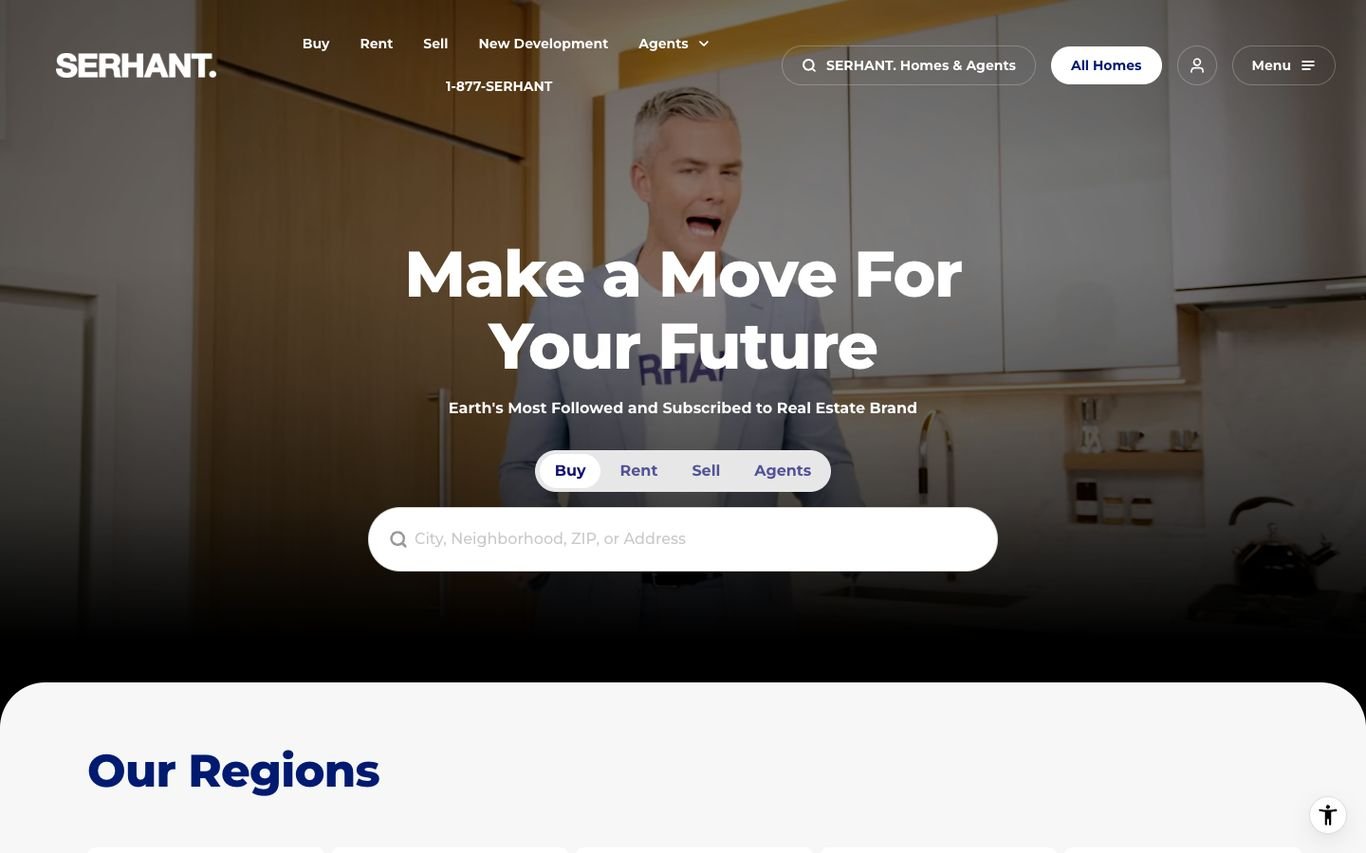
SERHANT. looks more like a media company than a traditional brokerage, which matches how it describes itself. A bold “Make a Move For Your Future” headline sits over a strong blue, magazine-style hero with Buy, Rent, Sell, and Agents search. An “Our Regions” section then lists the states it serves, a clear way to route visitors to the right local team.
What to borrow: Personal-brand energy with a clear regional structure.
8. Hilton & Hyland
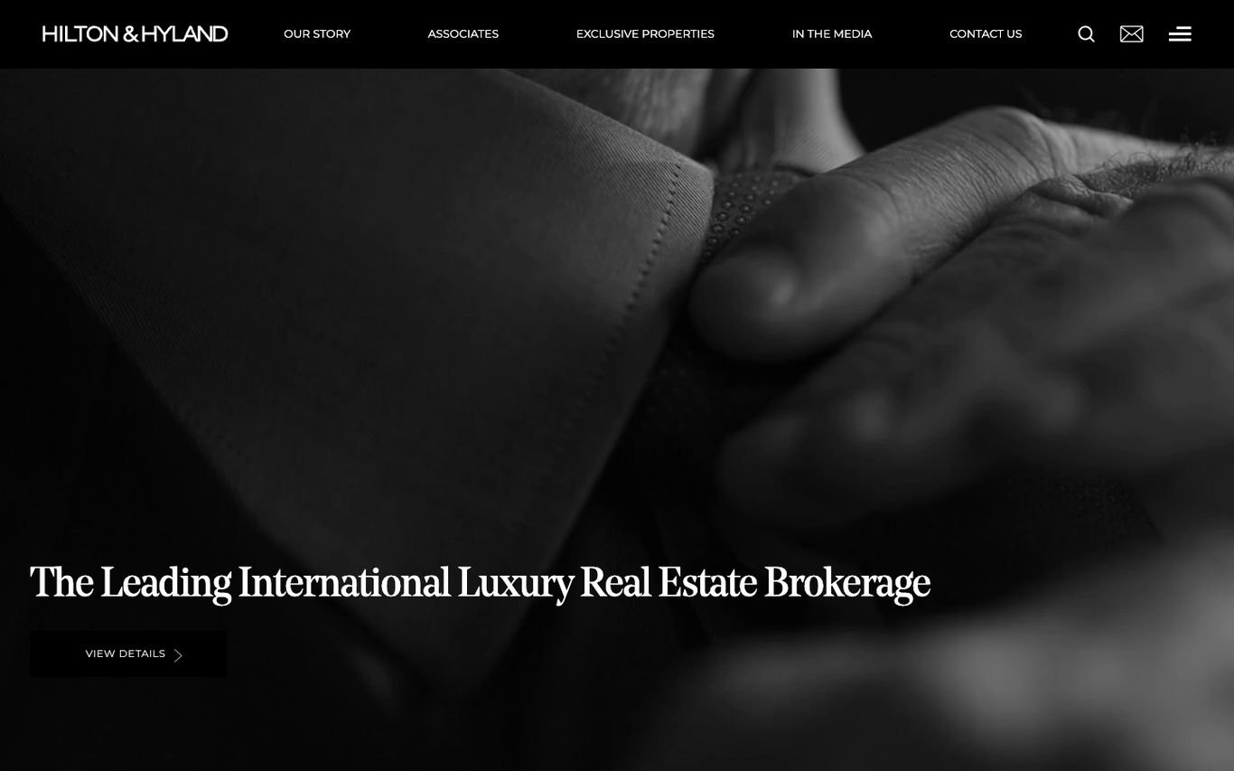
Hilton & Hyland goes fully monochrome. Dramatic black-and-white imagery and a single line, “The Leading International Luxury Real Estate Brokerage”, set the tone, followed by sections for Our Story, Featured Listings, and a showcase of sold properties. Showing sold homes is a smart trust signal for sellers choosing an agent.
What to borrow: A sold-properties showcase that speaks to sellers.
9. Knight Frank
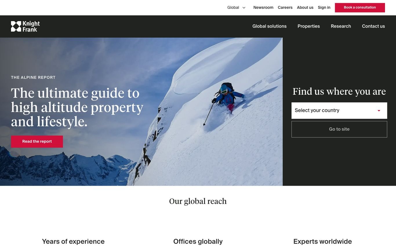
Knight Frank leads with content rather than listings. The hero promotes its research, for example a guide to high-altitude property, beside a “Find us where you are” country selector. Below, big numbers summarise its reach: years of experience, offices worldwide, and experts. For an advisory brand, research is the strongest proof of expertise.
What to borrow: Market research used as the main hook.
10. Savills
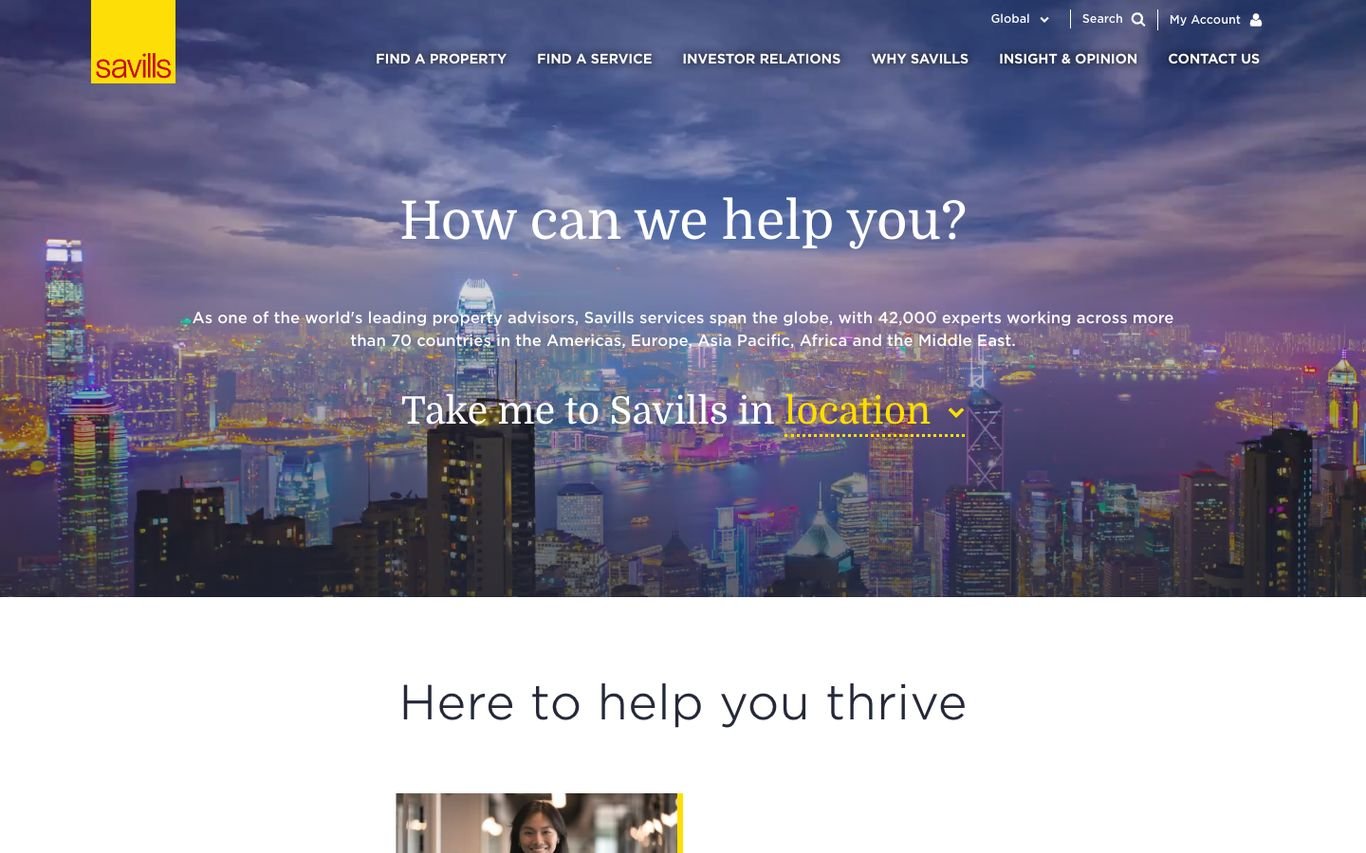
Savills sets a twilight cityscape behind a friendly question: “How can we help you?” A short paragraph explains its global scale, and then comes a clever touch, a sentence that doubles as a dropdown: “Take me to Savills in [location].” It turns a country selector into natural language and makes a huge organisation feel approachable.
What to borrow: A sentence-style dropdown instead of a plain country menu.
11. Engel & Völkers

Engel & Völkers keeps the page white and minimal with its signature red accents. The first instruction is simple: “Choose a country where you want to buy or sell,” with a country selector and a red “Visit website” button, next to a collage of its shopfronts. For a network operating across many countries, sending visitors to the right local site first is the right priority.
What to borrow: Shopfront imagery that shows a real, physical network.
12. Foxtons

Foxtons is unmistakable: green and yellow branding, an iconic London bus in the hero, and the line “London’s Estate Agent.” The search lets visitors switch between Buy and Rent and search by area or postcode, while a bright yellow “Get a free valuation” button targets sellers. Stat cards under “When you need experts” add proof straight away.
What to borrow: Seller valuation CTA built into the search panel.
13. Winkworth
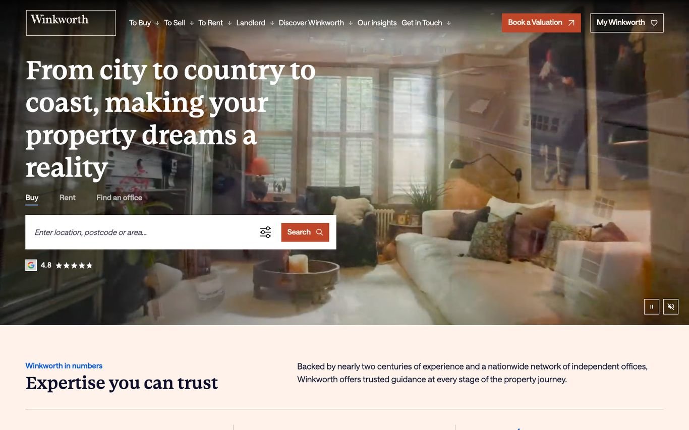
Winkworth’s serif headline, “From city to country to coast, making your property dreams a reality,” sits over a warm interior with search for buying, renting, or finding an office. A red “Book a valuation” button stays in the header, and the MyWinkworth account encourages buyers and sellers to register for updates, which is a quiet but effective lead capture.
What to borrow: A registered-user area (MyWinkworth) for ongoing leads.
14. Marsh & Parsons
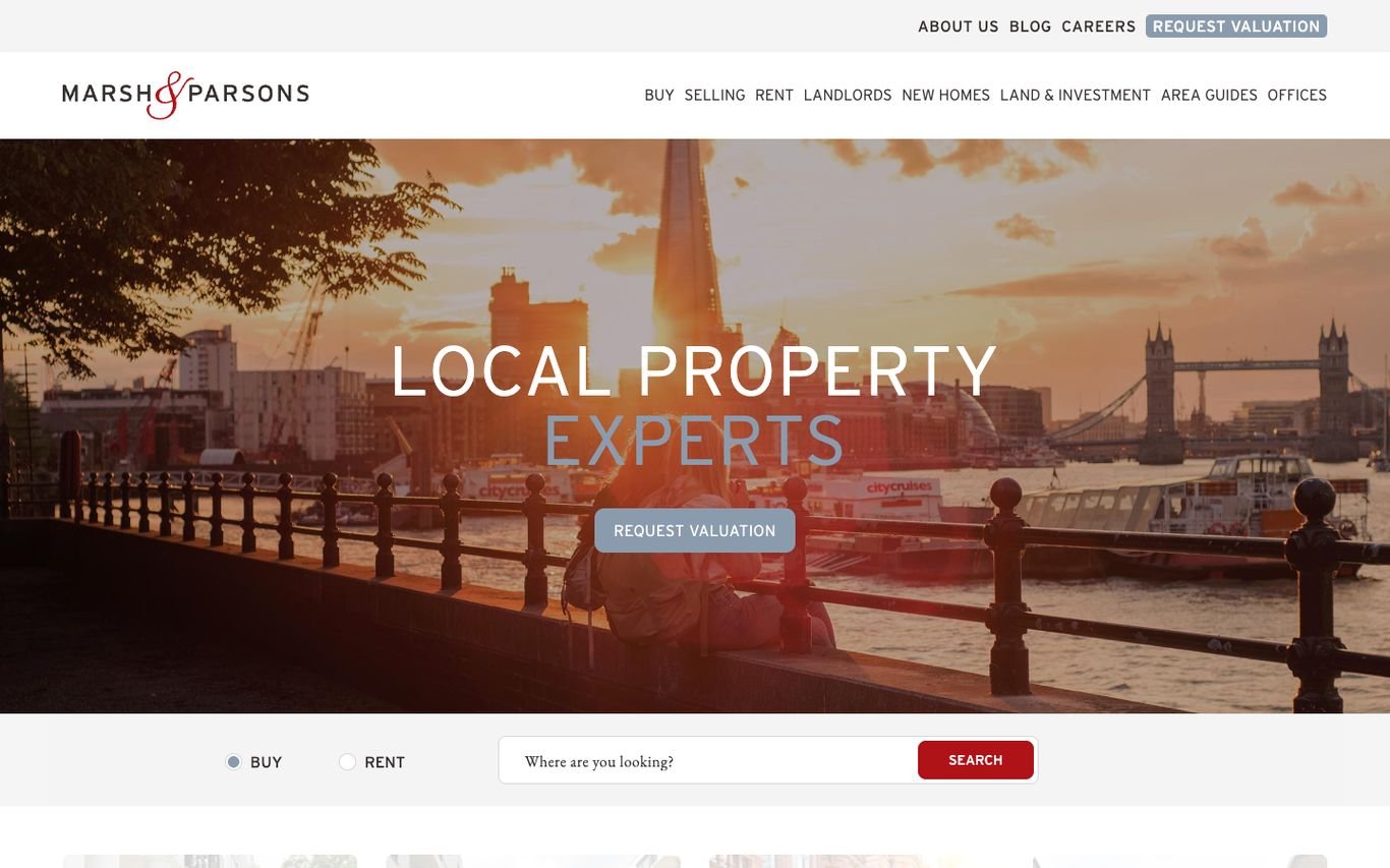
Marsh & Parsons overlays a sunset London skyline with a large “Local Property Experts” headline and a red “Request valuation” button. The search bar sits low in the hero with Buy and Rent options, while the navigation covers selling, lettings, new homes, land and investment, and area guides. Everything reinforces the local-specialist message.
What to borrow: Area guides that support both SEO and local trust.
15. Fine & Country

Fine & Country positions itself around lifestyle homes with the line “Exceptional homes, beautifully presented.” Refined serif type, gold buttons, and calm whitespace match its premium market. Further down, it highlights its TV and video content, showing sellers how their home would be marketed.
What to borrow: Video marketing shown as part of the seller pitch.
16. Ray White

Ray White’s yellow logo square stands out against a dark, atmospheric interior. The search panel offers Buy, Sold, Rent, and Agents tabs with search by suburb, postcode, or state, and a yellow search button that ties back to the brand. Including “Sold” as a search tab is a nice touch for buyers and sellers checking recent prices.
What to borrow: A “Sold” search tab for price research.
17. McGrath

McGrath opens with a modern home and pool and a serif headline: “Find a place you really love.” Its search includes a “Surrounding suburbs” toggle and an orange search button, and a “What’s Your Property Worth?” link sits in the hero for sellers. A “Guiding you home” section then splits content into buying, renting, and selling.
What to borrow: Search that can expand to surrounding suburbs.
18. Allsopp & Allsopp

Allsopp & Allsopp breaks away from dark luxury templates with a light, diagonal split hero and the line “Find your place.” The search covers Buy, Rent, Commercial, and Off Plan, with a community or building search and filters. A currency switcher, a market report banner, and a floating WhatsApp button are all tuned for Dubai buyers.
What to borrow: Off-plan built into the main search, plus WhatsApp.
19. fäm Properties
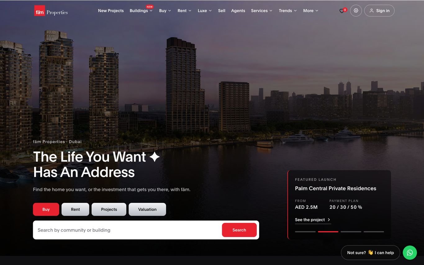
fäm Properties uses an aerial Dubai photo and the line “The Life You Want Has An Address.” Alongside Buy, Rent, Projects, and Valuation search, a featured launch card shows the project, starting price, and payment plan, which is exactly what off-plan investors want to see first. New Projects and Buildings sit in the main navigation.
What to borrow: Payment plans shown on the homepage for new launches.
20. haus & haus
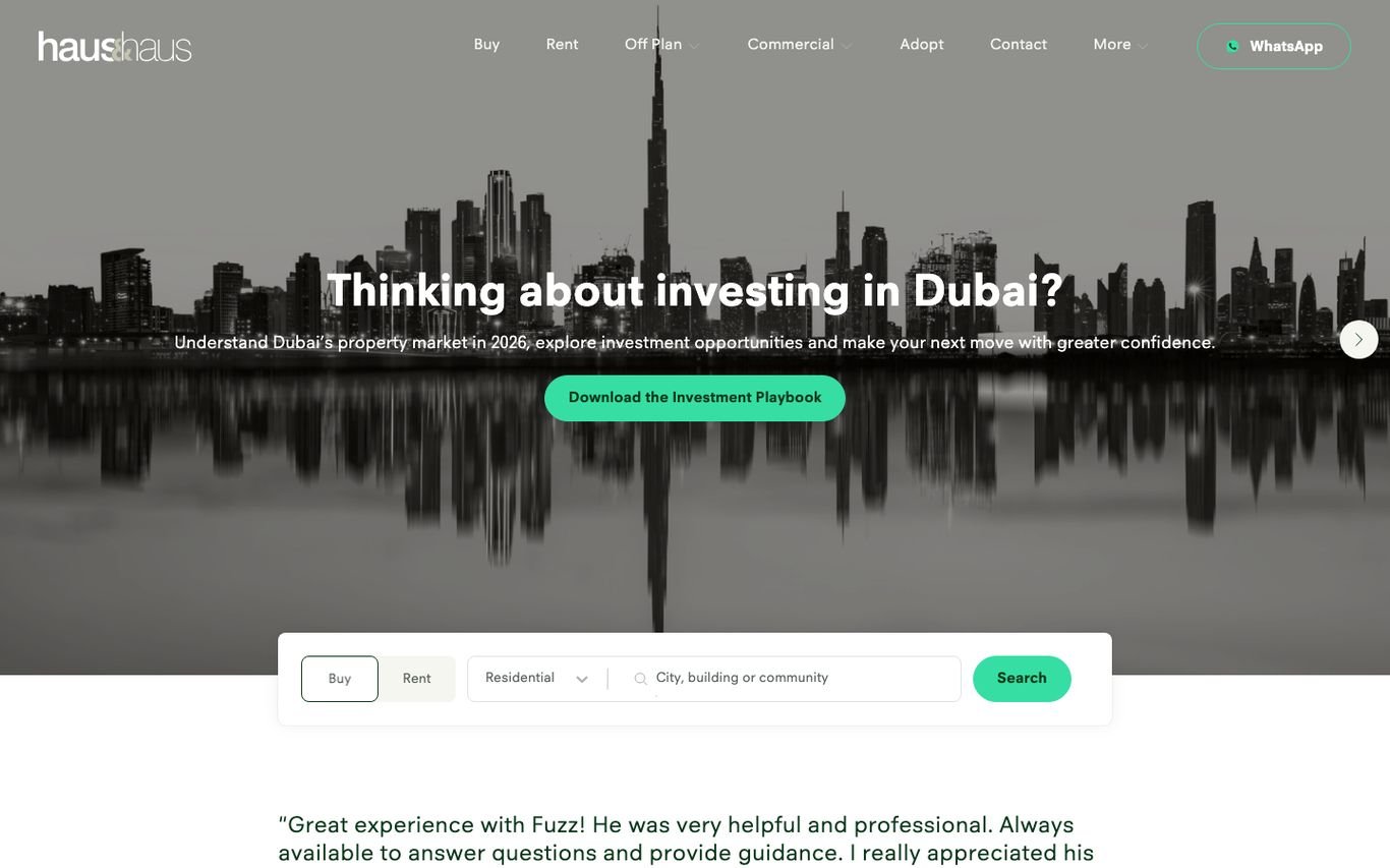
haus & haus uses a striking black-and-white reflection of the Dubai skyline and asks: “Thinking about investing in Dubai?” Instead of jumping straight to listings, it offers a downloadable Investment Playbook, a lead magnet for overseas investors, followed by search by city, building, or community and customer reviews.
What to borrow: A downloadable investment guide that captures leads.
Quick Comparison
| Website | Market | Standout Feature |
|---|---|---|
| Compass | US | Exclusive listings shown before other sites |
| Sotheby’s International Realty | Global | Search plus a rotating featured-listing showcase |
| Christie’s International Real Estate | Global | Cinematic video hero with location or agent search |
| Douglas Elliman | US | Minimal full-screen hero with one question |
| Corcoran | US | Lifestyle photography with a floating search card |
| Coldwell Banker | US | Search tabs for home value and international |
| SERHANT. | US | Media-style personal brand brokerage |
| Hilton & Hyland | US | Black-and-white editorial luxury |
| Knight Frank | Global | Research-led homepage with global stats |
| Savills | Global | Conversational location selector |
| Engel & Völkers | Global | Country-first navigation for an international network |
| Foxtons | UK | Bold brand colours and a valuation CTA |
| Winkworth | UK | Warm serif headline and member accounts |
| Marsh & Parsons | UK | Local expertise front and centre |
| Fine & Country | UK | Lifestyle property positioning |
| Ray White | Australia | Strong brand colour on a moody hero |
| McGrath | Australia | Aspirational photography and seller tools |
| Allsopp & Allsopp | Dubai | Playful split hero with off-plan search |
| fäm Properties | Dubai | Featured off-plan launches in the hero |
| haus & haus | Dubai | Investor lead magnet above the fold |
Design Tips for Your Own Real Estate Website
1. Put Search in the Hero
Almost every site above leads with a search box. Keep it simple: buy or rent, one location field, and a search button. Advanced filters can live on the results page.
2. Give Sellers Their Own Call to Action
Foxtons, Winkworth, Marsh & Parsons, and McGrath all make the valuation request impossible to miss. Vendors and landlords are your most valuable leads, so do not hide that button in the footer.
3. Use a Lead Magnet
haus & haus offers an investment playbook and Knight Frank leads with research. A useful download turns browsers into contactable leads, especially for investors and overseas buyers.
4. Show Local and Market Context
Area selectors, regional pages, and market reports help buyers trust you and help your site rank for local searches.
5. Make WhatsApp and Phone Easy in Dubai and Beyond
Dubai agencies such as Allsopp & Allsopp, fäm Properties, and haus & haus keep WhatsApp one tap away. If your buyers prefer messaging, follow their lead.
6. Keep Listings Accurate Automatically
A beautiful site with sold properties still showing is worse than a plain one with accurate stock. Connect your website to your CRM so listings update on their own. Our guide on how to import properties from any CRM into WordPress explains how.
7. Send Enquiries Straight to Your CRM
Forms should create leads in your CRM, linked to the right property and agent, not just send an email. See our guide to real estate lead capture.
Frequently Asked Questions
What should a real estate website homepage include?
A property search, a valuation call to action, featured or new listings, proof such as reviews or stats, and clear contact options. Most of the best examples above fit all of this on the first screen or two.
Can I build a site like these on WordPress?
Yes. Real estate themes such as Houzez provide listings, search, and agent profiles, and a custom design can give you the look of the sites above. If you are budgeting, see how much a real estate website costs in 2027.
How do these sites keep thousands of listings up to date?
Large agencies feed their websites directly from their CRM or listing database. Smaller agencies can do the same with a property importer that syncs on a schedule.
What makes a luxury real estate website different?
Luxury sites such as Sotheby’s, Christie’s, Douglas Elliman, and Hilton & Hyland use more whitespace, serif or refined typography, full-screen photography or video, and fewer elements per screen.
Conclusion
The best real estate website designs combine beautiful presentation with clear next steps: search, value my home, download, or call. Use these 20 examples as a reference for your own site, borrow the patterns that fit your brand, and make sure the listings behind the design are always accurate.
Dev Mizan designs and builds real estate websites on WordPress and Houzez, with automatic property import from more than 50 CRMs and CRM-connected lead forms. Get in touch to plan your new website.