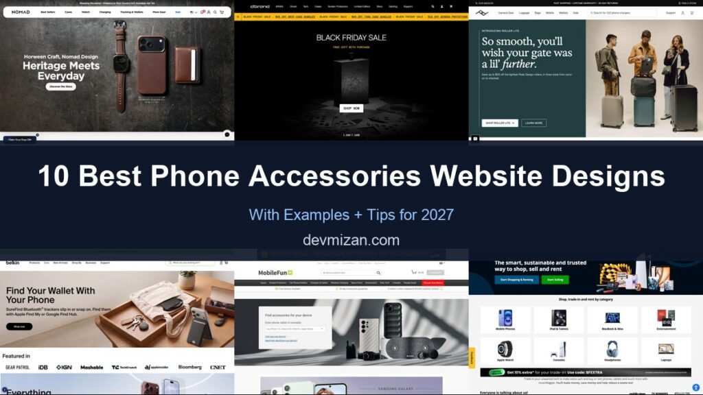
Phone and accessories shops sell to customers who want the right fit for their exact device, quickly. The best sites make device selection, product discovery and checkout fast and fun. This post showcases 10 of the best phone accessories website design examples for 2027, with screenshots, what each site does well, and practical tips you can use on your own website.
From case brands to refurbished phone marketplaces, these examples show how to sell tech accessories online.
Table of Contents
What Makes a Great Phone Accessories Website?
- Shop by device. Pick a phone model first, then see compatible products.
- Bold product photography. Clean shots and lifestyle imagery.
- Customisation. Personalised cases and bundles.
- Trust signals. Warranties, reviews and returns.
- Fast checkout. Express payments on mobile.
- Brand personality. Tech brands thrive on a distinctive voice.
1. Nomad
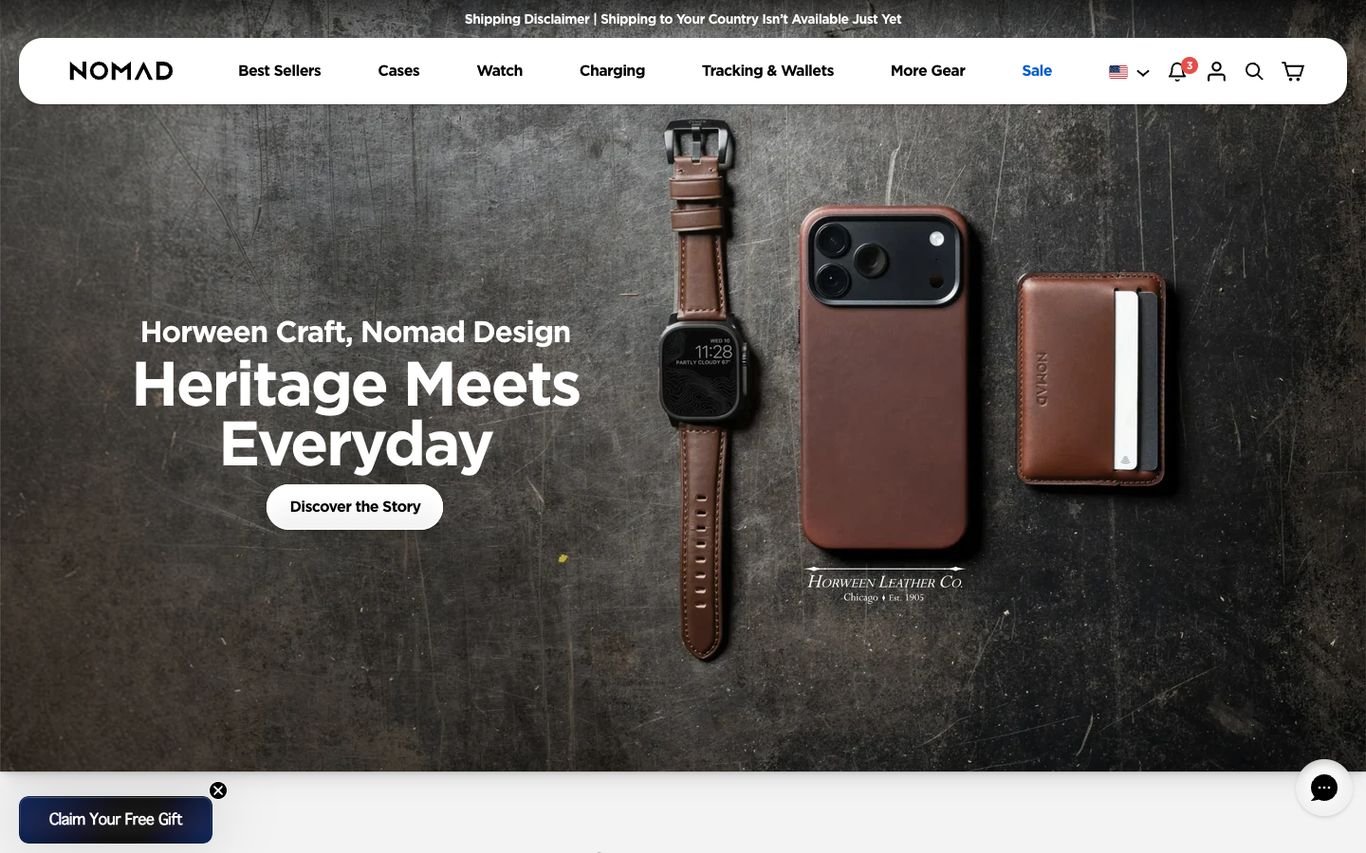
Nomad photographs its leather case and watch band like luxury goods, with “Heritage Meets Everyday” and a Discover the Story button about its partnership with a heritage leather tannery. A free gift offer sits in the corner.
What to borrow: Tell the materials story to justify a premium price.
2. dbrand
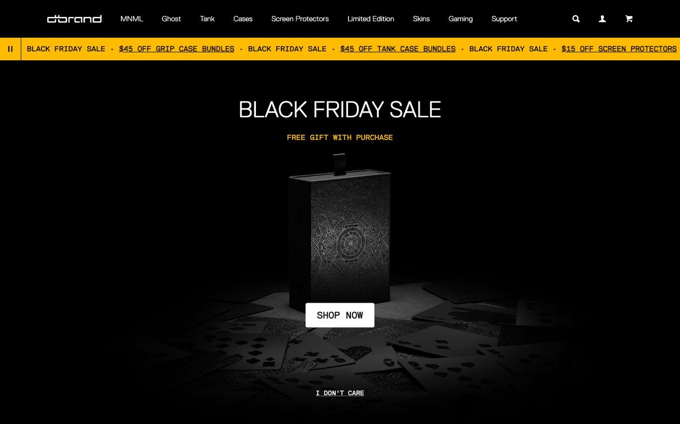
dbrand keeps its famous tongue-in-cheek tone: a moody black hero with a mystery-box sale, a scrolling ticker of offers, and a cheeky “I don’t care” link under the Shop Now button. The navigation is organised by product lines and devices.
What to borrow: A distinctive voice that makes a commodity product memorable.
3. Peak Design
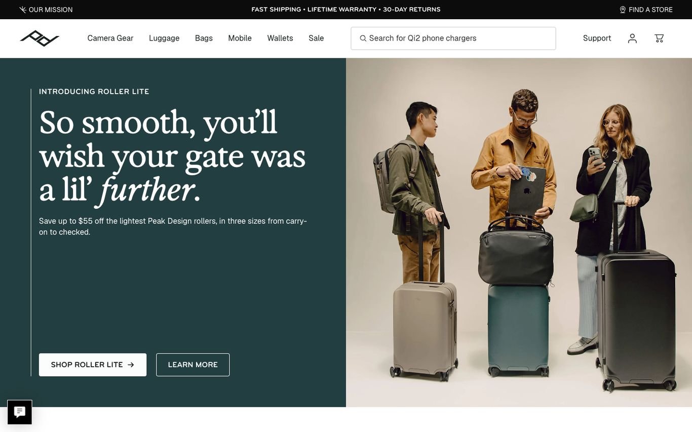
Peak Design splits its hero between a deep green panel with witty serif copy about its new carry-on and a lifestyle photo of travellers. A utility bar promises free shipping, a lifetime warranty, and 30-day returns.
What to borrow: Warranty and returns promises in the top bar.
4. Belkin
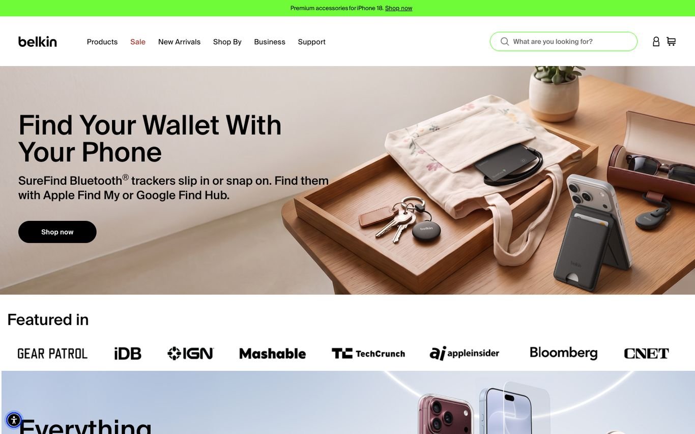
Belkin shows its tracker accessories in a styled lifestyle scene with “Find Your Wallet With Your Phone,” followed by a “Featured in” row of well-known tech publication logos. A search and clear product navigation sit in the header.
What to borrow: Press logos for instant credibility.
5. MobileFun
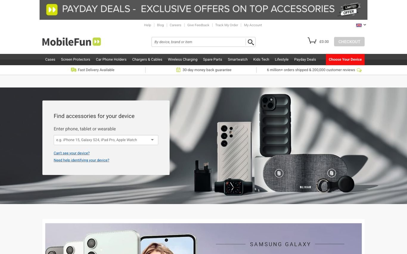
MobileFun puts a “Find accessories for your device” field right in the hero, where shoppers type their phone, tablet, or wearable model. A trust bar highlights fast delivery, a money-back guarantee, and order and review counts.
What to borrow: Start with the customer’s device to avoid wrong purchases.
6. musicMagpie

musicMagpie positions itself as the smart, sustainable way to shop, sell, and rent tech, with Start Shopping and Start Selling buttons. Category tiles for phones, tablets, laptops, and more follow, plus a trade-in bonus banner.
What to borrow: Two clear paths for buyers and sellers.
7. OtterBox
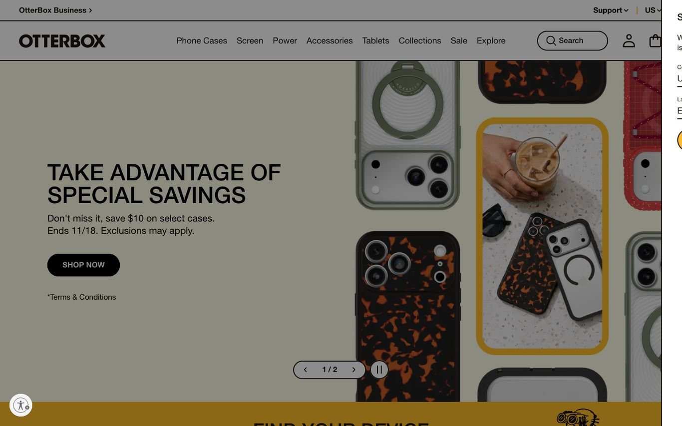
OtterBox uses a bold, patterned product photo for its promotion and a “Find your device” bar below, so shoppers can jump straight to compatible cases.
What to borrow: A device finder placed directly under the promotion.
8. ZAGG
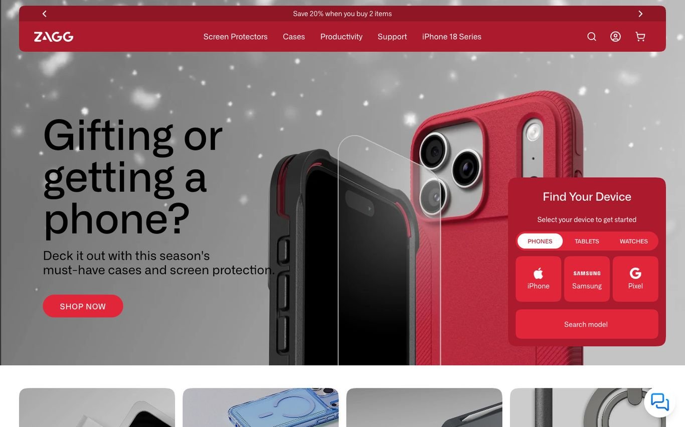
ZAGG promotes gifting with a bold red case and “Gifting or getting a phone?”, and adds a floating “Find Your Device” card with tabs for phones, tablets, and watches, brand buttons, and a model search.
What to borrow: A device finder card right in the hero.
9. BURGA

BURGA’s illustrated holiday campaign, “Knock Knock, Ready to Unwrap?”, is full of personality. A device selector in the header, a promo ticker, and category navigation for cases, charging, bundles, and accessories make shopping fast.
What to borrow: A persistent device selector in the header.
10. RHINOSHIELD
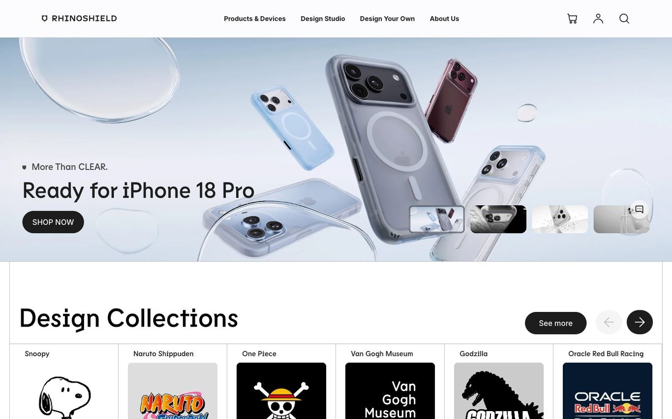
RHINOSHIELD launches cases for a new phone with a clean product composition, then showcases licensed design collections from well-known franchises and museums, plus a design-your-own option.
What to borrow: Licensed collaborations and custom designs to stand out.
Quick Comparison
| Website | Market | Standout Feature | Our Rating |
|---|---|---|---|
| Nomad | US | Craft-led product photography | |
| dbrand | Canada / Global | Irreverent brand voice | |
| Peak Design | US | Split hero with playful copy | |
| Belkin | US / Global | Lifestyle hero plus press logos | |
| MobileFun | UK | Device finder in the hero | |
| musicMagpie | UK | Shop, sell and rent in one place | |
| OtterBox | US | Colourful product pattern and device finder | |
| ZAGG | US | Floating “Find Your Device” card | |
| BURGA | Europe / Global | Playful illustrated campaigns and device selector | |
| RHINOSHIELD | Global | Licensed design collections |
Design Tips for Your Phone Accessories Website
1. Start With Device Selection
A device picker prevents wrong purchases and simplifies browsing.
2. Use Bundles
Case, screen protector and charger bundles increase order value.
3. Show Protection Proof
Drop tests, ratings and warranties reassure buyers.
4. Offer Personalisation
Custom designs and engraving make products feel unique.
5. Optimise for Mobile
Your customers are literally shopping on the devices you sell for.
Frequently Asked Questions
What should a phone accessories store include?
A device picker, compatible product listings, bundles, reviews, warranties and fast mobile checkout.
Can WooCommerce filter products by phone model?
Yes, using attributes and filter plugins.
How do accessory shops increase order value?
Bundles, cross-sells and free shipping thresholds.
Conclusion
The best phone accessories website design combines trust, clarity and an obvious next step. Make it easy to find accessories that fit and to check out in seconds. Use these 10 examples as inspiration and adapt the patterns that fit your business.
For more inspiration, see our best real estate website designs and best solar company website designs.
Dev Mizan designs and builds fast, conversion-focused WordPress websites for growing businesses, with lead forms connected to your CRM. Get in touch to plan your new website, or message us on WhatsApp.