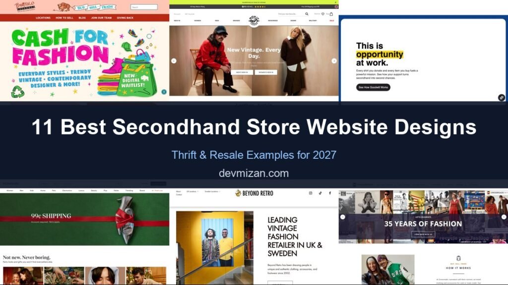
Secondhand, thrift and resale shopping has gone mainstream, and the best resale websites make one-of-a-kind items easy to discover while building trust in condition and authenticity. This post showcases 11 of the best secondhand store website design examples for 2027, with screenshots, what each site does well, and practical tips you can use on your own website.
These examples cover charity shops, vintage retailers and luxury resale platforms.
Table of Contents
What Makes a Great Secondhand Store Website?
- Strong search and filters. Size, brand, condition and price.
- Condition and authenticity. Clear grading and authentication.
- Sell or donate paths. Make it easy to send items in.
- Sustainability story. The environmental impact of buying used.
- Fresh arrivals. New stock highlighted daily.
- Trust and returns. Clear policies for unique items.
1. Buffalo Exchange

Buffalo Exchange looks like a hand-drawn poster: “Cash for Fashion” in bold colours, a buy, sell, trade banner logo, and a badge promoting its new digital waitlist for selling. Navigation covers locations, how to sell, its blog, and giving back.
What to borrow: Make selling to you feel fun and rewarding.
2. Rokit

Rokit uses editorial fashion photography with “New Vintage. Every Day.” and buttons for men’s and women’s new arrivals. A trust bar shows its returns policy, review rating, and free shipping threshold, and the navigation includes reworked and military collections.
What to borrow: Editorial photography that makes secondhand feel premium.
3. Goodwill

Goodwill leads with a bold statement, “This is opportunity at work,” explaining how every donation and purchase funds its mission, with a See How Goodwill Works button.
What to borrow: Lead with impact when your mission is the differentiator.
4. Poshmark
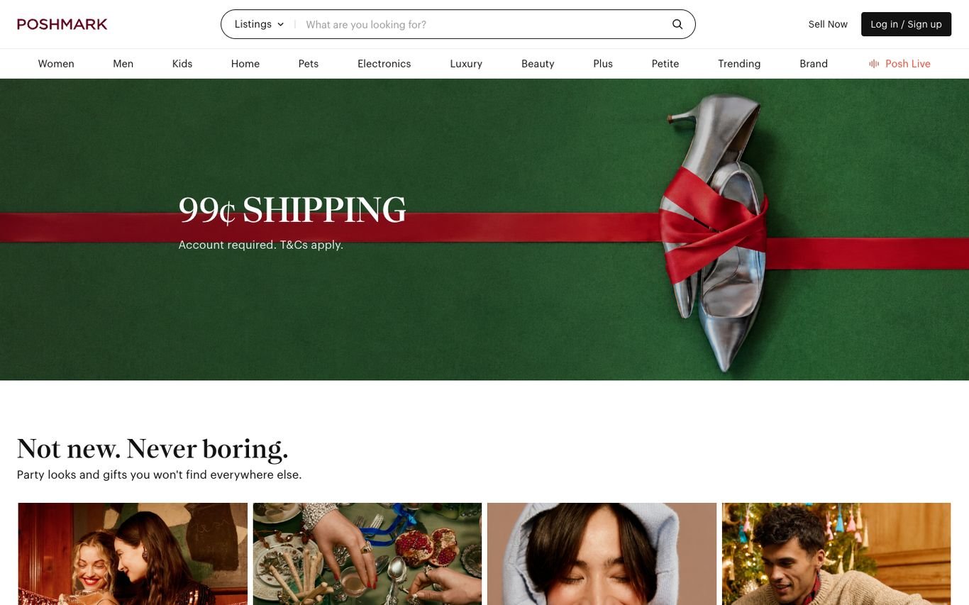
Poshmark promotes a shipping offer with a festive hero and its tagline, “Not new. Never boring.”, followed by curated looks. A listings search and Sell Now button sit in the header.
What to borrow: A short tagline that reframes secondhand positively.
5. Beyond Retro
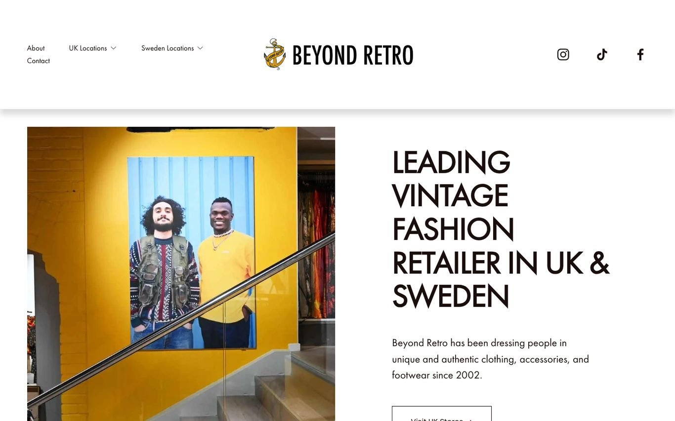
Beyond Retro pairs a colourful store photo with a clean statement about being a leading vintage fashion retailer in the UK and Sweden since 2002, plus menus for its store locations in each country.
What to borrow: Store location menus for a retailer with physical shops.
6. Crossroads Trading

Crossroads celebrates its anniversary with a photo collage strip, then explains how buying, selling, and trading works for cash or store credit. Navigation covers selling by mail, a selling guide, and locations.
What to borrow: Explain the sell-for-cash process in a few lines.
7. Oxfam Shop

Oxfam’s online shop promotes a fashion discount with a bold green panel and shop buttons, with navigation for books, clothes, entertainment, home and collectables, and Oxfam’s own products. A search covers new and secondhand items.
What to borrow: Clear categories for a very varied secondhand range.
8. Vinted

Vinted’s hero invites visitors to sell, not just buy: “Ready to declutter your wardrobe?” with Sell Now and Learn How It Works buttons over a lifestyle photo. A catalogue search and category navigation sit above.
What to borrow: Recruit sellers from the homepage to keep stock fresh.
9. HEWI
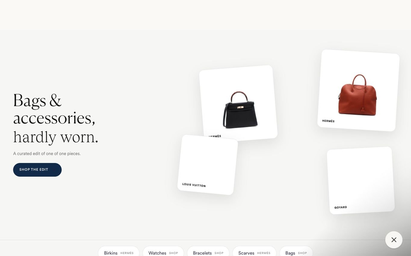
HEWI presents “Bags & accessories, hardly worn.” in elegant serif type beside floating cards of designer pieces, with a Shop the Edit button and chips for popular categories and brands.
What to borrow: Curated edits that make resale feel like luxury retail.
10. British Heart Foundation Shop
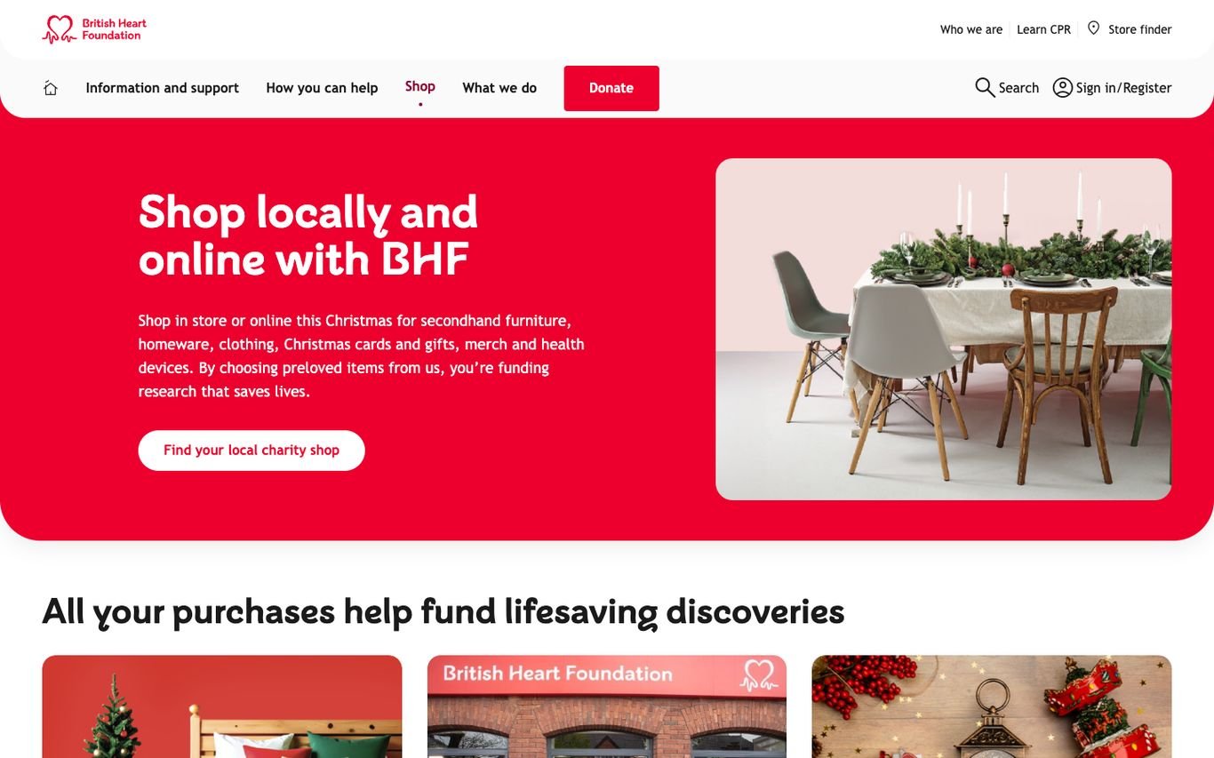
The British Heart Foundation shop uses a bold red panel, “Shop locally and online with BHF,” explaining that purchases fund lifesaving research, with a Find Your Local Charity Shop button and a Donate button in the header.
What to borrow: Connect every purchase to the cause it funds.
11. Mercari
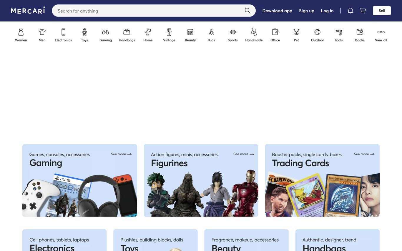
Mercari uses a row of category icons and large image tiles for gaming, figurines, trading cards, electronics, beauty, and handbags, helping shoppers explore a huge marketplace quickly. A Sell button sits in the header.
What to borrow: Visual category tiles for a massive, varied catalogue.
Quick Comparison
| Website | Market | Standout Feature | Our Rating |
|---|---|---|---|
| Buffalo Exchange | US | Poster-style illustration | |
| Rokit | UK | Editorial vintage fashion | |
| Goodwill | US | Mission-first statement | |
| Poshmark | US | Marketplace with personality | |
| Beyond Retro | UK / Sweden | Clean editorial split | |
| Crossroads Trading | US | Anniversary collage and how it works | |
| Oxfam Shop | UK | Charity retail with clear categories | |
| Vinted | UK / Europe | Sell-first hero | |
| HEWI | UK | Curated luxury edit | |
| British Heart Foundation Shop | UK | Charity impact message | |
| Mercari | US | Image-led category tiles |
Design Tips for Your Secondhand Store Website
1. Make Discovery Fun
New-in feeds, curated edits and saved searches keep shoppers returning.
2. Be Transparent About Condition
Clear grading, detailed photos and measurements reduce returns.
3. Build In Selling or Donating
A simple sell or donate flow brings in supply.
4. Tell the Impact Story
Show how much waste and carbon buying secondhand saves.
5. Earn Trust
Authentication for luxury items and clear returns build confidence.
Frequently Asked Questions
What should a secondhand store website include?
Search and filters, condition grading, authentication where relevant, sell or donate options and clear returns.
Can WooCommerce sell one-off items?
Yes. Single-stock products and fast listing workflows suit resale and vintage.
How do resale sites build trust?
Detailed photos, condition grading, authentication and reviews.
Conclusion
The best secondhand store website design combines trust, clarity and an obvious next step. Make unique finds easy to discover and buying secondhand feel as safe as buying new. Use these 11 examples as inspiration and adapt the patterns that fit your business.
For more inspiration, see our best real estate website designs and best solar company website designs.
Dev Mizan designs and builds fast, conversion-focused WordPress websites for growing businesses, with lead forms connected to your CRM. Get in touch to plan your new website, or message us on WhatsApp.
Want more inspiration? Browse all website design examples by industry →