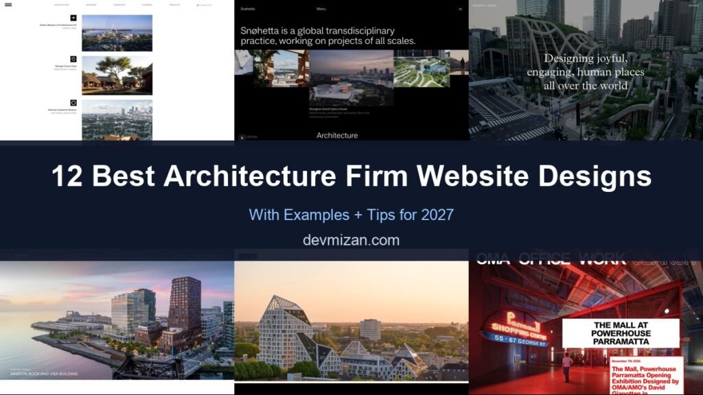
Architecture firm websites are portfolios with a point of view. They need to show buildings at their best, communicate a design philosophy, and serve clients, press, and future employees. The best architecture websites are often experimental, but they still make projects easy to explore. This post showcases 12 of the best architecture firm website designs for 2027, with screenshots, what each does well, and tips for your own practice.
Table of Contents
What Makes a Great Architecture Website?
- Projects front and centre. Large imagery and an easy way to browse work.
- A distinctive identity. Typography and layout that reflect the practice.
- Filterable portfolio. By sector, location, status, or scale.
- Ideas and research. Writing, research, and news that show thinking.
- People and careers. Studios attract talent through their websites.
- Fast loading despite heavy imagery. Optimised images and video.
1. BIG (Bjarke Ingels Group)
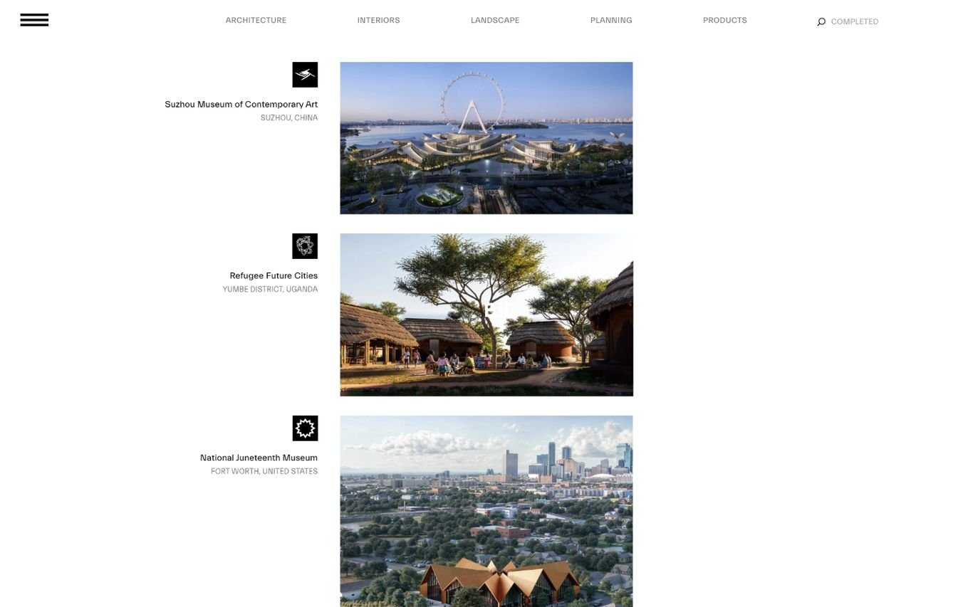
BIG turns its homepage into a scrolling index of projects, each with a small icon, name, location, and thumbnail, with filters across the top for architecture, interiors, landscape, planning, and products. Visitors start exploring work from the first second.
What to borrow: A filterable project index instead of a hero image.
2. Snøhetta

Snøhetta states exactly who it is, “a global transdisciplinary practice, working on projects of all scales,” on a black background, followed by a horizontal strip of project images with captions. It is calm, confident, and easy to scan.
What to borrow: One sentence that defines the practice, then straight to the work.
3. Heatherwick Studio

Heatherwick Studio sets a centred serif line, “Designing joyful, engaging, human places all over the world,” over an aerial photograph of one of its green, terraced buildings. The mission and the image reinforce each other.
What to borrow: A mission statement that the hero image visibly proves.
4. Henning Larsen
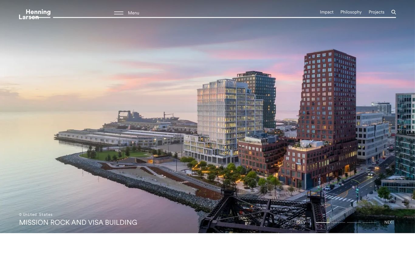
Henning Larsen shows a waterfront development at dusk with the project name in a small caption, and keeps the navigation to impact, philosophy, and projects. The photography does the selling.
What to borrow: Caption every hero image so visitors know what they are seeing.
5. MVRDV
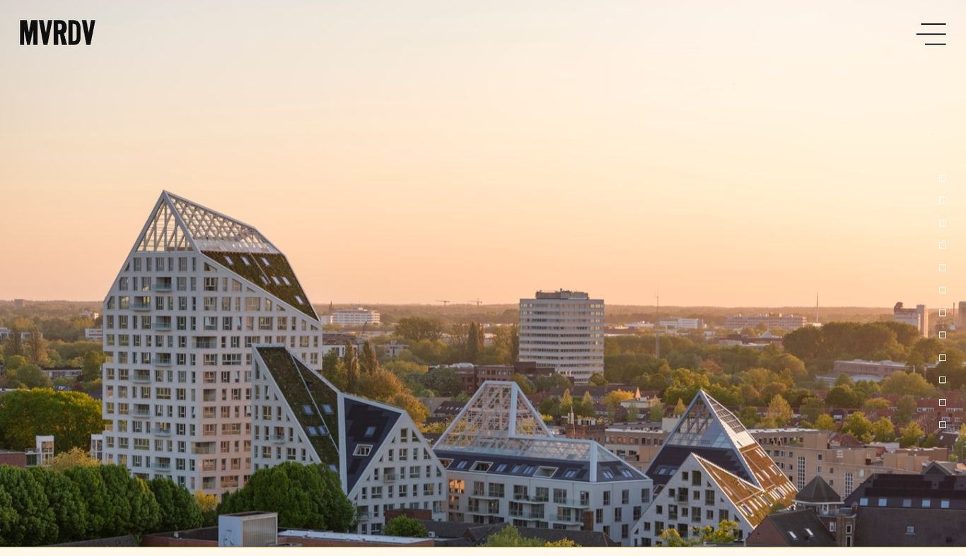
MVRDV shows one of its distinctive, pixel-like buildings glowing at sunset, with just the logo and a menu icon on screen. The building itself is the brand statement.
What to borrow: A single iconic project can represent the whole practice.
6. OMA

OMA uses oversized bold words, Office, Work, and Search, as its navigation across the top of the screen, over a vivid photo of a recent project. A news card with large red type announces openings and exhibitions.
What to borrow: Make the navigation part of the visual identity.
7. 3XN

3XN opens with a clear belief, “We are 3XN. We believe that architecture shapes behaviour,” on a warm cream background, beside a tall, slim project image slider. It explains the practice’s philosophy before showing the work.
What to borrow: Lead with what you believe, not just what you build.
8. Diller Scofidio + Renfro

Diller Scofidio + Renfro fills the screen with an aerial photograph of a planted urban walkway it designed, with the studio’s name running vertically down the left edge. Index, search, and news are tucked into the corners.
What to borrow: Vertical type and edge-placed navigation keep the image uninterrupted.
9. Gensler
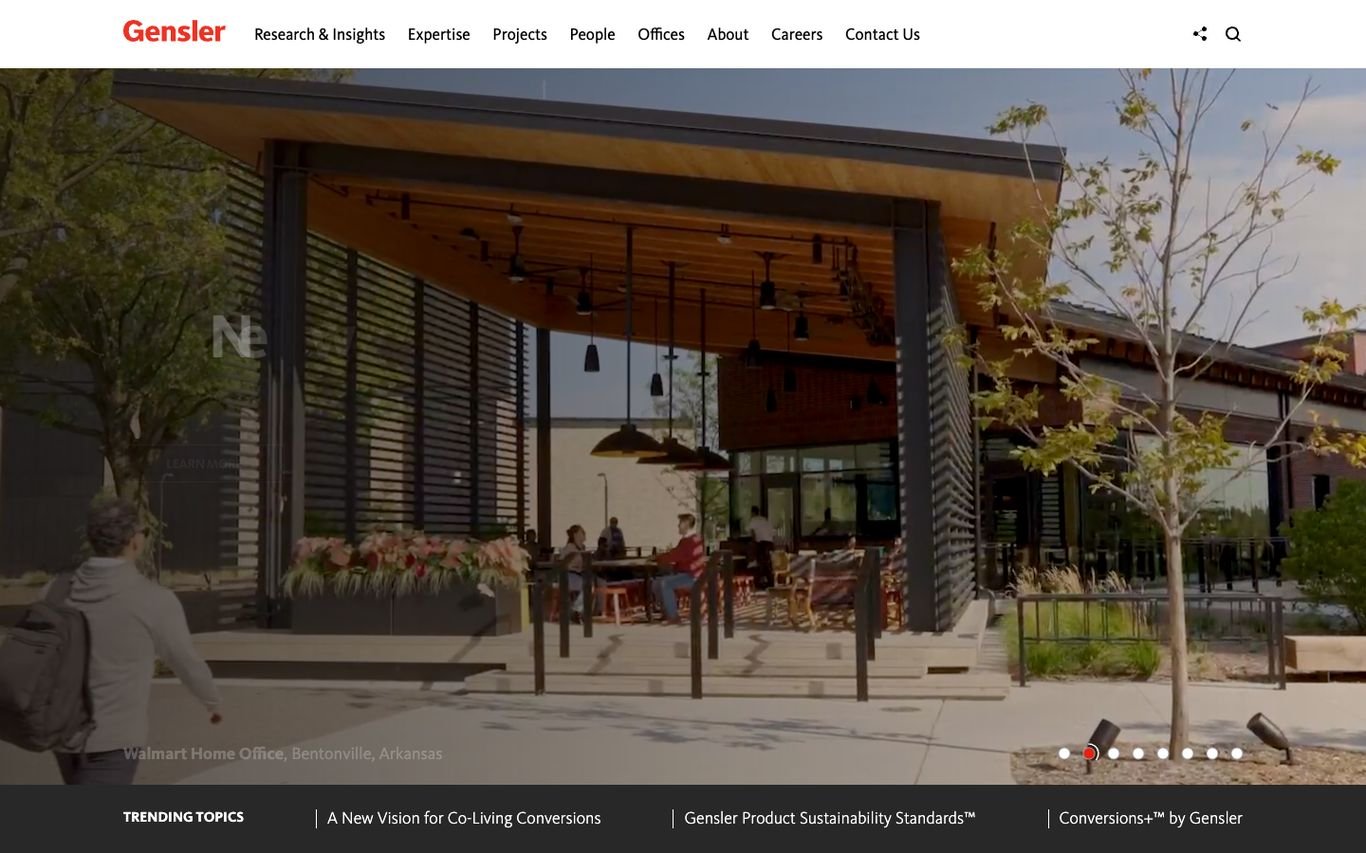
Gensler pairs a project photo slider with a “Trending topics” bar linking to its latest research. The navigation leads with research and insights, then expertise, projects, people, offices, and careers.
What to borrow: Research links on the homepage show thought leadership.
10. SOM
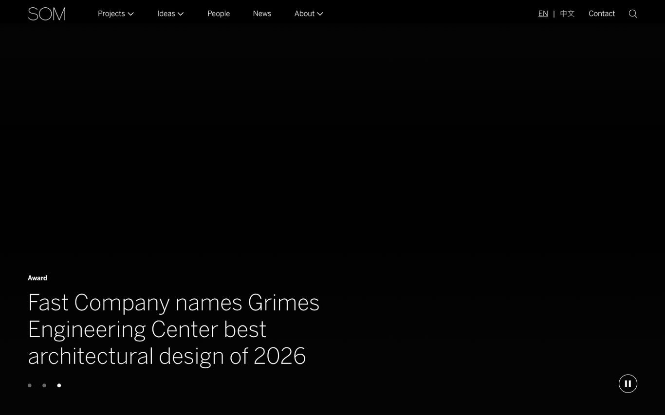
SOM uses a dark, full-screen slider to highlight news such as industry awards for its projects. The navigation is understated, with projects, ideas, people, news, about, and a language switch.
What to borrow: Use the hero slider for recognition and news.
11. Studio Gang
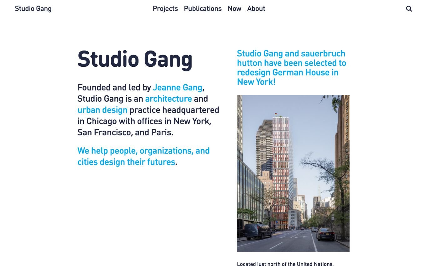
Studio Gang takes an editorial approach: a large name, a short paragraph about the founder, its disciplines, and offices, with key words linked in blue, and the line “We help people, organizations, and cities design their futures.” A news item with a photo sits alongside.
What to borrow: An introductory paragraph where key words link deeper into the site.
12. WilkinsonEyre

WilkinsonEyre shows dramatic aerial photography of its projects, such as a landmark London regeneration, with a large logo across the top and slider arrows to browse more work.
What to borrow: Aerial views that show how buildings fit their surroundings.
Quick Comparison
| Website | Market | Standout Feature | Our Rating |
|---|---|---|---|
| BIG (Bjarke Ingels Group) | Denmark / Global | Homepage as a project index | |
| Snøhetta | Norway / Global | Clear one-line positioning with a project strip | |
| Heatherwick Studio | UK | Human-centred mission over aerial photography | |
| Henning Larsen | Denmark / Global | Dusk photography with project captions | |
| MVRDV | Netherlands | Iconic building at sunset, minimal interface | |
| OMA | Netherlands / Global | Giant typographic navigation | |
| 3XN | Denmark | Belief statement and slim project slider | |
| Diller Scofidio + Renfro | US | Full-bleed aerial photo and vertical name | |
| Gensler | US / Global | Projects plus a research bar | |
| SOM | US / Global | Dark slider with award news | |
| Studio Gang | US | Editorial text with linked keywords | |
| WilkinsonEyre | UK | Aerial project slider with a large logo |
Design Tips for Your Architecture Website
1. Let Projects Lead
Use large photography and let visitors browse projects quickly. Filters by sector and location help clients find relevant work.
2. Express Your Philosophy
A short statement and consistent design language tell clients how you think.
3. Balance Experiment and Usability
Creative navigation is fine as long as visitors can still find projects, people, and contact details.
4. Optimise Images
Architecture sites are image-heavy. Modern formats and lazy loading keep them fast.
5. Use the Site for Recruitment
A clear careers page with culture and open roles helps attract talent.
Frequently Asked Questions
What should an architecture firm website include?
A project portfolio, practice philosophy, people, news or research, careers, and contact details for each studio.
How should architects present projects online?
With strong photography, drawings where relevant, a short description of the brief and approach, and key facts such as location, size, and status.
Is WordPress good for architecture websites?
Yes. WordPress can power image-rich portfolios with custom layouts and filters, and stays easy for the studio to update.
Conclusion
The best architecture websites show the work boldly and reflect the practice’s thinking. Use these 12 examples as inspiration, and make sure your projects are as easy to explore as they are beautiful to look at.
For more inspiration, see our best real estate website designs and best solar company website designs.
Dev Mizan designs and builds fast, conversion-focused WordPress websites for growing businesses, with lead forms connected to your CRM. Get in touch to plan your new website, or message us on WhatsApp.
Want more inspiration? Browse all website design examples by industry →