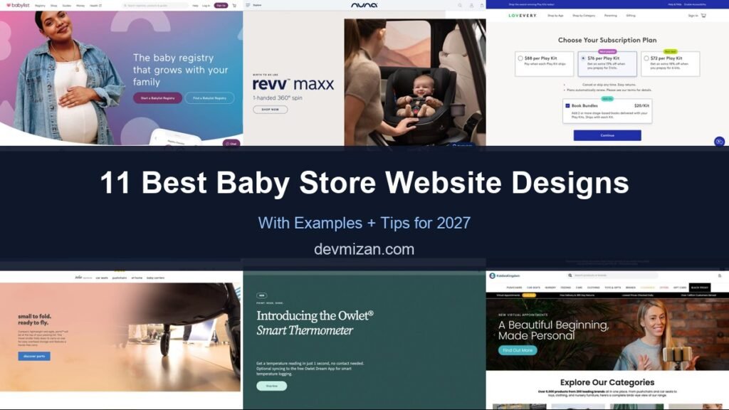
Parents-to-be research everything, from prams to cots, so baby product websites need to combine reassurance, expert guidance and easy shopping. This post showcases 11 of the best baby store website design examples for 2027, with screenshots, what each site does well, and practical tips you can use on your own website.
The best baby stores make safety information clear, help parents compare products and offer registries and expert advice.
Table of Contents
What Makes a Great Baby Store Website?
- Shop by stage and category. Pregnancy, newborn, toddler and more.
- Safety and specs. Clear safety standards and product details.
- Comparison tools. Compare prams, car seats and cots side by side.
- Registries and lists. Gift lists for baby showers.
- Expert advice. Guides, checklists and in-store appointments.
- Reassuring design. Soft, friendly and trustworthy.
1. Babylist
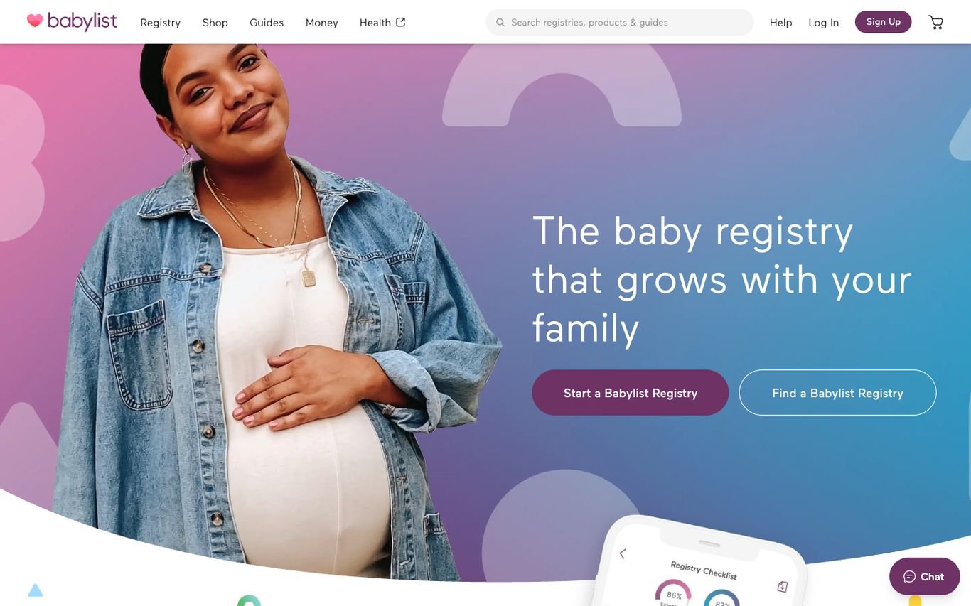
Babylist leads with its core product: “The baby registry that grows with your family,” beside a happy expectant mother, with Start a Babylist Registry and Find a Babylist Registry buttons. Guides, money, and health content sit in the navigation.
What to borrow: Lead with the registry for both parents and gift-givers.
2. Nuna

Nuna introduces a car seat with a clear, single benefit, “1-handed 360° spin,” beside a photo of a mother and baby using it, plus the age range and a Shop Now button. A contact chat sits in the corner.
What to borrow: Lead with one standout feature parents will remember.
3. Lovevery
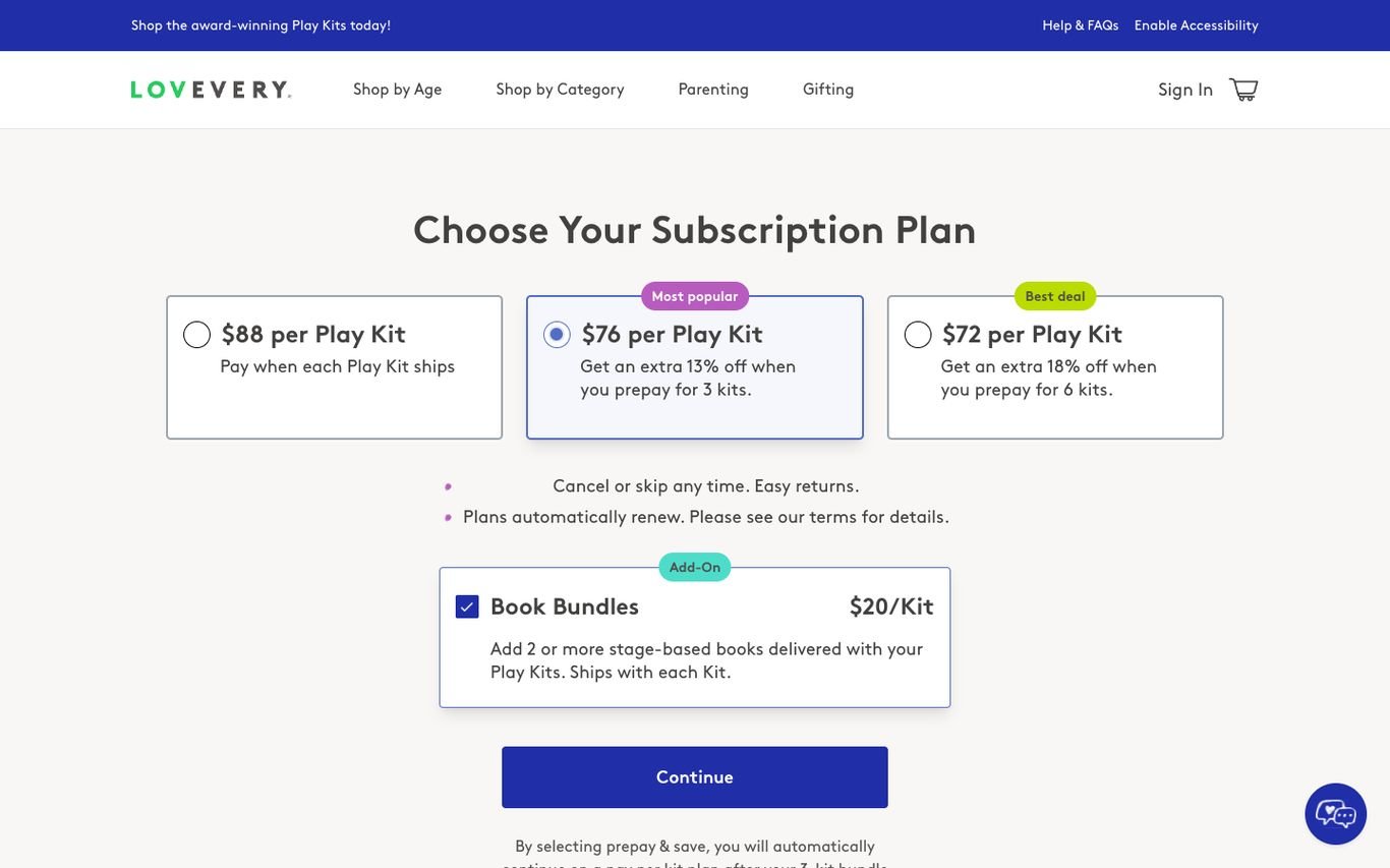
Lovevery shows exactly how its play kit subscription works: three plan options with prices and savings, the most popular plan highlighted, and an optional book bundle add-on. Cancel-anytime and returns messages reduce risk.
What to borrow: A clear plan chooser with the most popular option highlighted.
4. Joie
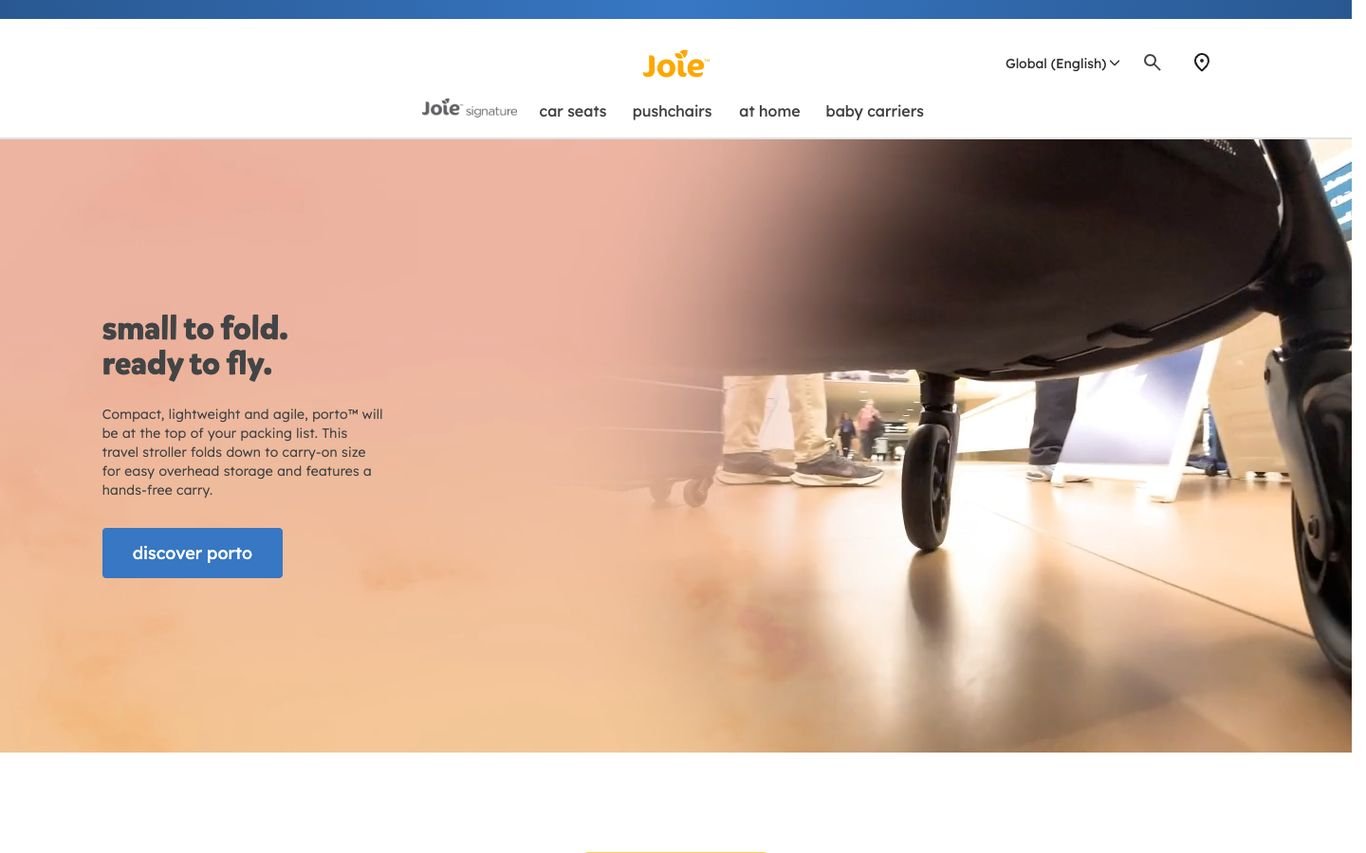
Joie promotes a compact travel stroller with “small to fold. ready to fly.” in soft peach tones and a Discover button, with a global region selector and store locator in the header.
What to borrow: Short, rhythmic headlines that communicate the key benefit.
5. Owlet
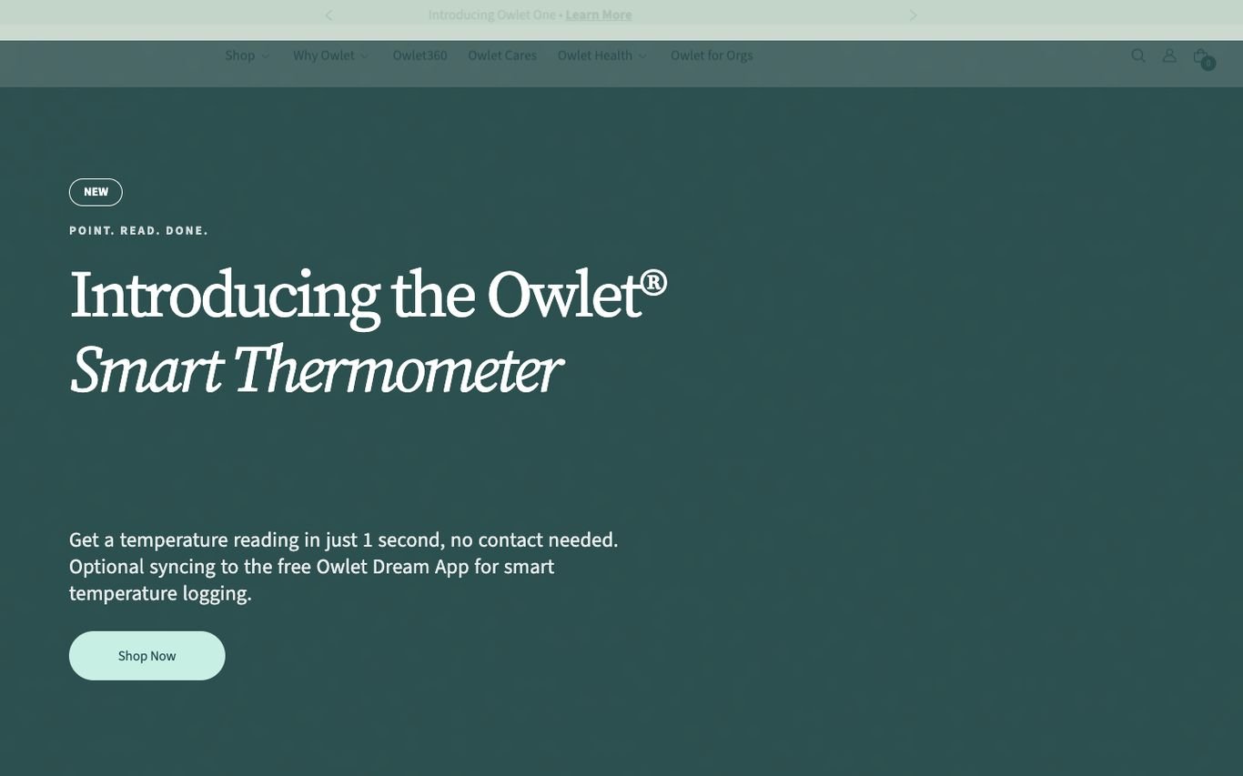
Owlet introduces its smart thermometer with an elegant serif headline on a calm teal background and a one-sentence explanation of how fast and easy it is, plus a Shop Now button.
What to borrow: A calm, reassuring tone for anxious new parents.
6. Kiddies Kingdom

Kiddies Kingdom promotes virtual appointments, where parents get personal advice over video, with a Find Out More button. A strip highlights free delivery and 365-day returns, daily price checks, and over a million customers.
What to borrow: Video consultations to help with prams and car seats.
7. Pottery Barn Kids
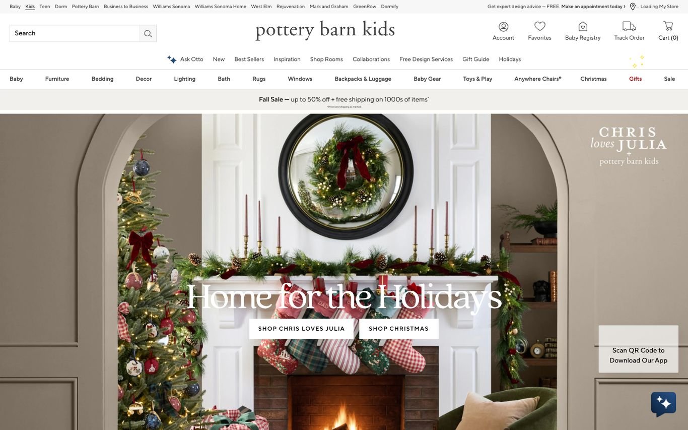
Pottery Barn Kids shows a beautifully styled holiday room from a designer collaboration, with buttons to shop the collection. Baby registry, design services, and an app download sit in the header.
What to borrow: Show complete nursery and kids’ rooms, not just products.
8. UPPAbaby

UPPAbaby shows a parent pushing a stroller in an elegant city setting with a seasonal offer, and the navigation covers strollers, car seats, travel systems, and accessories. Support and product registration links sit in the header.
What to borrow: Product registration links for owners.
9. Mumzworld
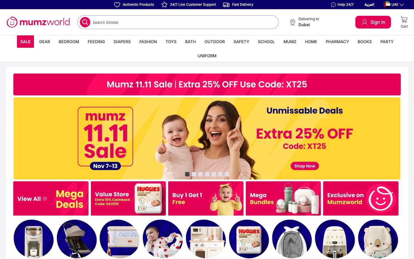
Mumzworld runs a bright sale banner with a discount code, a delivery location selector, and round category bubbles below. The navigation covers everything from gear and feeding to pharmacy and toys, with an Arabic option.
What to borrow: Round category bubbles for quick browsing on mobile.
10. buybuy BABY
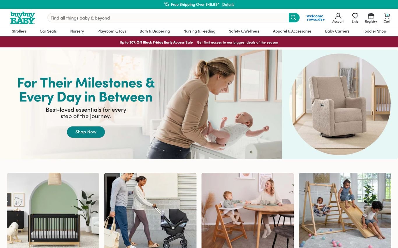
buybuy BABY uses “For Their Milestones & Every Day in Between” with a Shop Now button and a row of category photos, plus free shipping and rewards messaging.
What to borrow: Emotional milestone messaging for a practical store.
11. Mothercare

Mothercare’s global homepage tells its brand story and history, then asks visitors to choose their region, from Asia to Europe and the Middle East and Africa, to reach the right local store.
What to borrow: A brand story plus a clear route to local stores.
Quick Comparison
| Website | Market | Standout Feature | Our Rating |
|---|---|---|---|
| Babylist | US | Registry-first homepage | |
| Nuna | Netherlands / Global | Feature-led product hero | |
| Lovevery | US | Transparent subscription plan chooser | |
| Joie | UK / Global | Lifestyle travel photography | |
| Owlet | US | Calm product introduction | |
| Kiddies Kingdom | UK | Virtual appointments for big purchases | |
| Pottery Barn Kids | US | Styled seasonal rooms | |
| UPPAbaby | US | Lifestyle stroller photo and support links | |
| Mumzworld | UAE / GCC | Sale banner and category bubbles | |
| buybuy BABY | US | Milestone message and category photos | |
| Mothercare | Global | Brand story and region selector |
Design Tips for Your Baby Store Website
1. Guide Parents by Stage
New parents don’t know what they need yet, so organise products by stage with checklists.
2. Highlight Safety
Make safety standards and certifications easy to find on every relevant product.
3. Offer Registries
Baby registries bring in new customers through friends and family.
4. Add Expert Help
Video guides, chat and appointment booking help with big purchases like prams.
5. Show Real Families
Authentic photography builds trust and emotional connection.
Frequently Asked Questions
What should a baby store website include?
Shop by stage, detailed safety information, comparison tools, registries, expert advice and clear delivery and returns.
Can WooCommerce handle baby registries?
Yes, with registry and wishlist plugins.
How do baby brands build trust online?
Safety certifications, reviews, expert guides and transparent policies.
Conclusion
The best baby store website design combines trust, clarity and an obvious next step. Help anxious new parents choose the right products with confidence. Use these 11 examples as inspiration and adapt the patterns that fit your business.
For more inspiration, see our best real estate website designs and best solar company website designs.
Dev Mizan designs and builds fast, conversion-focused WordPress websites for growing businesses, with lead forms connected to your CRM. Get in touch to plan your new website, or message us on WhatsApp.
Want more inspiration? Browse all website design examples by industry →