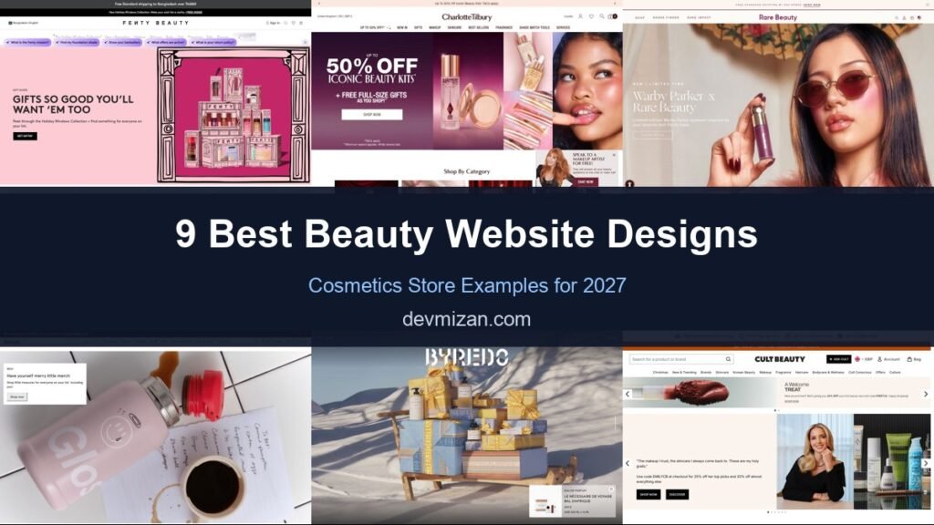
Premium cosmetics retailers and beauty brands compete on experience as much as product, so their websites have to feel luxurious while making discovery and checkout effortless. This post showcases 9 of the best beauty website design examples for 2027, with screenshots, what each site does well, and practical tips you can use on your own website.
The best beauty websites combine editorial imagery, smart product discovery and strong loyalty programmes.
Table of Contents
What Makes a Great Beauty Website?
- Editorial imagery. Campaign-style photography and video.
- Product discovery. Shop by concern, category, brand and bestsellers.
- Rich product pages. Shades, ingredients, reviews and how-to content.
- Loyalty and samples. Rewards, free samples and gifts.
- Personalisation. Quizzes, shade finders and recommendations.
- Fast mobile checkout. Most beauty shopping happens on phones.
1. Fenty Beauty
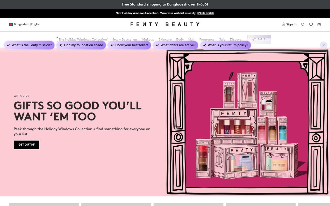
Fenty Beauty pairs an illustrated holiday gift guide with a row of question chips, such as finding a foundation shade, seeing bestsellers, or checking which offers are active, that work like a built-in shopping assistant.
What to borrow: Question chips that guide shoppers to answers instantly.
2. Charlotte Tilbury
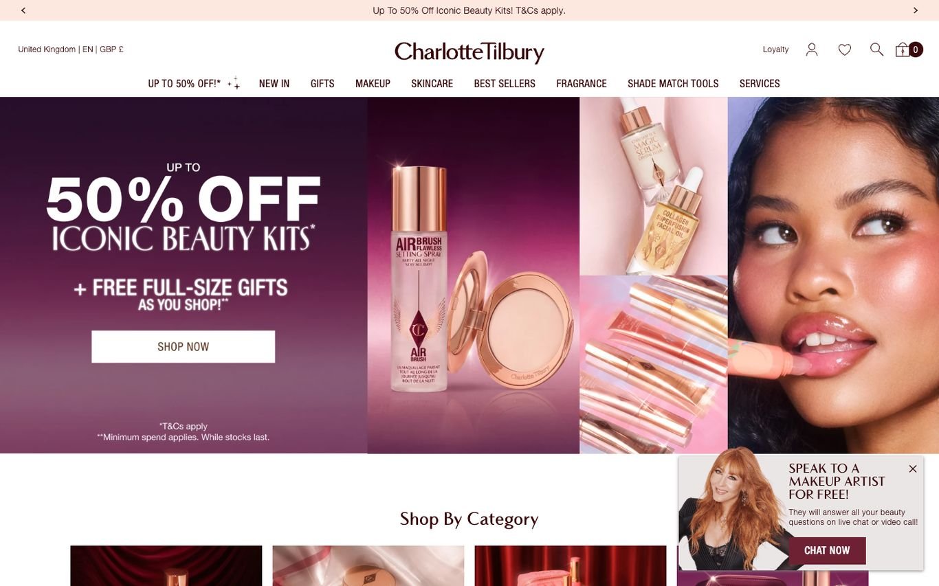
Charlotte Tilbury leads with a bold promotion, glamorous model photography, and a Shop Now button, with shade-match tools and services in the main navigation. A pop-up card invites shoppers to speak to a makeup artist for free by chat or video.
What to borrow: Free expert consultations that reduce shade anxiety.
3. Rare Beauty
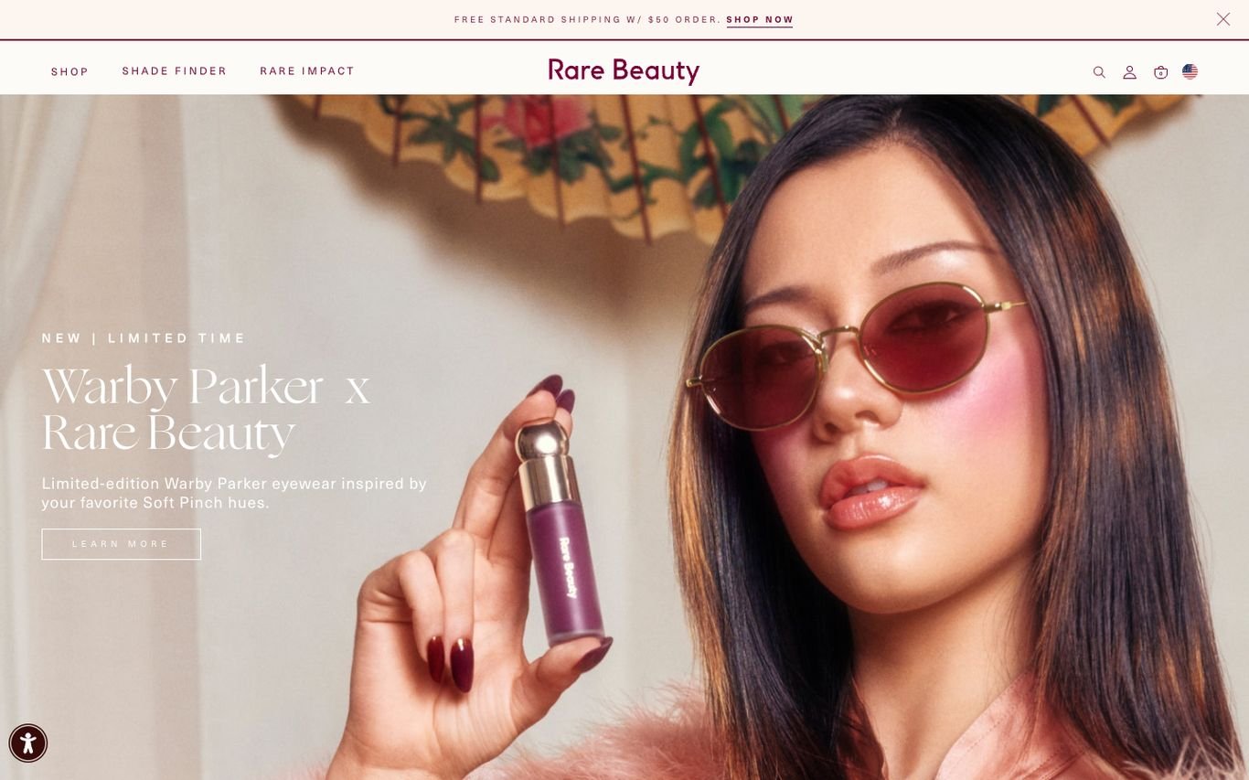
Rare Beauty uses an editorial portrait holding the product to promote a limited collaboration. The navigation includes a shade finder and Rare Impact, linking to the brand’s mental health mission.
What to borrow: Put your brand mission in the main navigation.
4. Glossier

Glossier’s homepage feels like a social post: a close-up of its signature pink product beside a coffee and handwritten notes, with a small card promoting holiday merchandise. Minimal navigation keeps the focus on brand mood.
What to borrow: Lifestyle styling that feels native to social media.
5. BYREDO
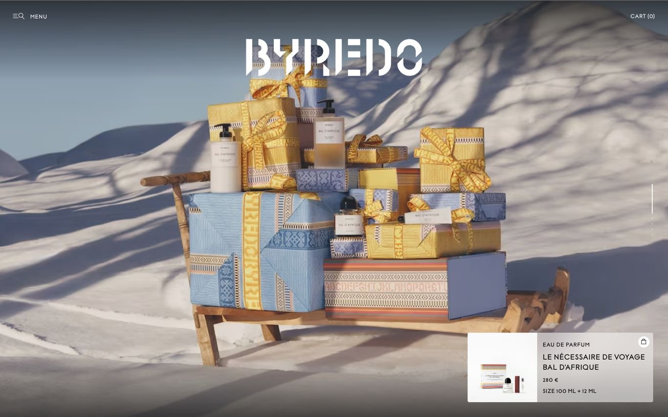
BYREDO shows a stack of gift boxes in the snow beneath its distinctive wordmark, with a small product card featuring a fragrance. The site feels like a luxury magazine spread.
What to borrow: Atmospheric seasonal art direction for luxury products.
6. Cult Beauty
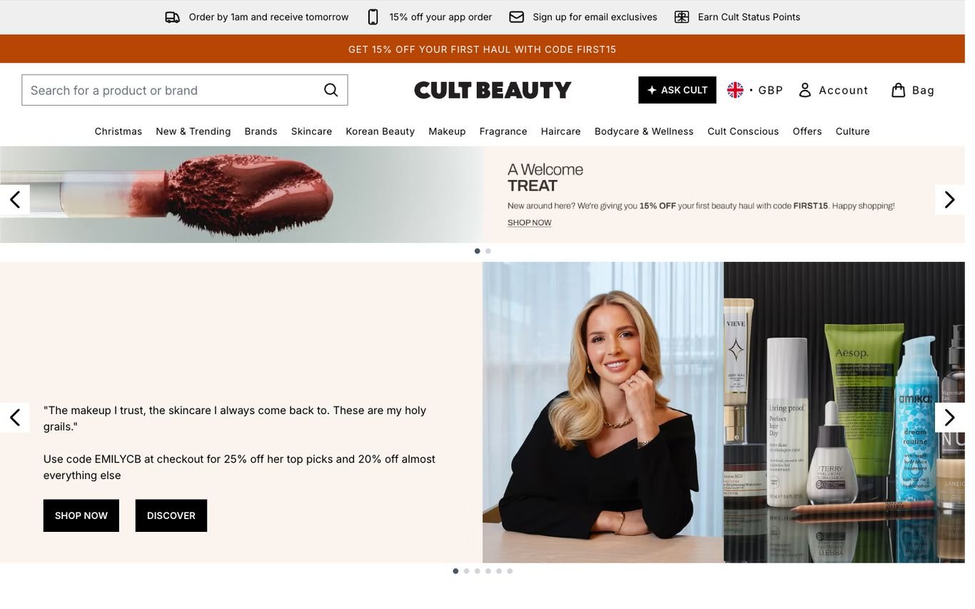
Cult Beauty puts an “Ask Cult” assistant button beside its search, with a utility bar covering next-day delivery cut-offs, an app discount, email sign-up, and loyalty status points. Below, a carousel features founders and the products they love.
What to borrow: Delivery cut-off times that create urgency.
7. LOOKFANTASTIC

LOOKFANTASTIC uses a playful retro-TV graphic for a flash sale, plus a market update panel, category buttons for Christmas, haircare, cosmetics, fragrance, body, and skincare, and an Ask LF assistant.
What to borrow: Clear category buttons right under the promotion.
8. FACES
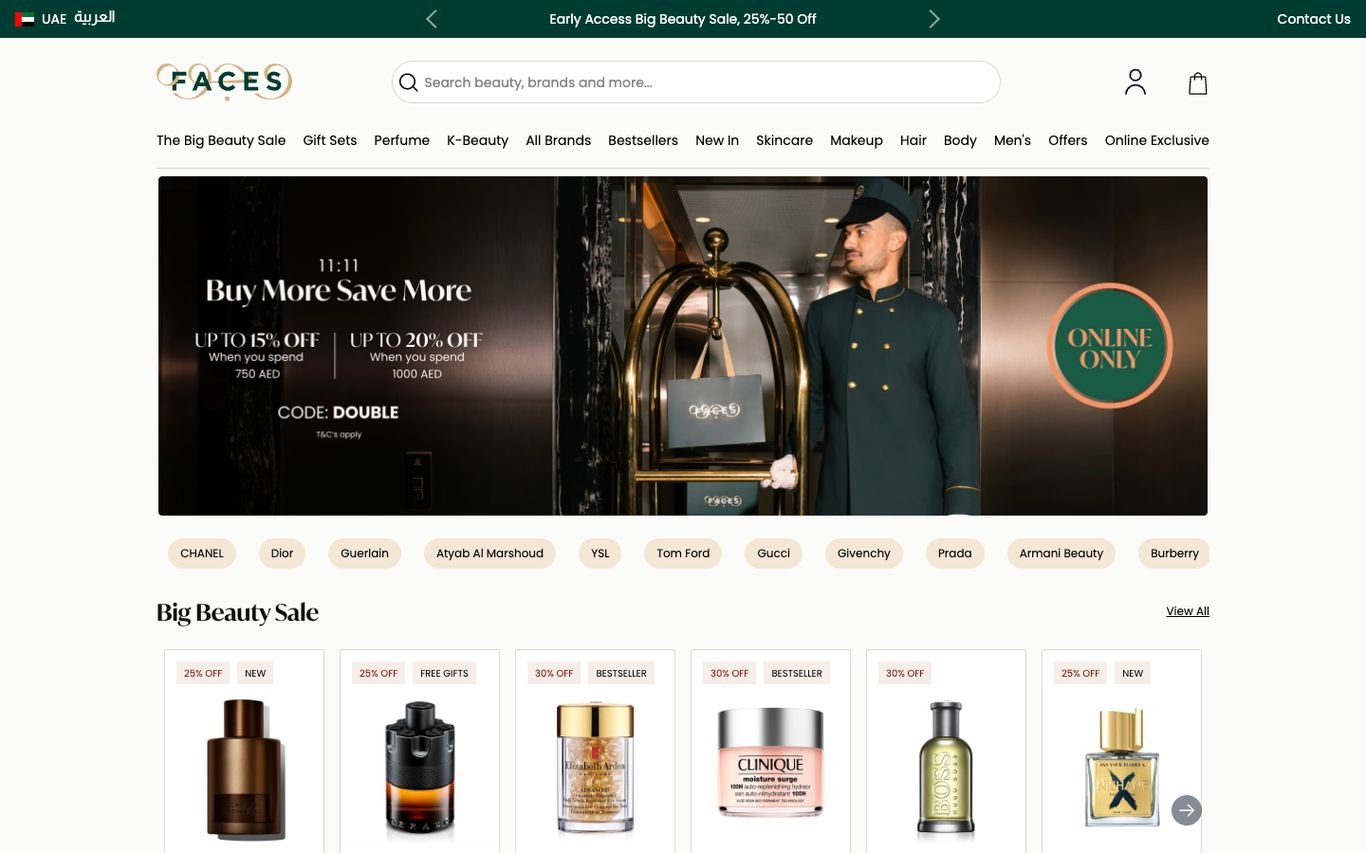
FACES, a Middle East beauty retailer, offers an Arabic toggle, an early-access sale banner, and a row of luxury brand chips from Chanel to Dior. A product carousel underneath shows discount badges on bestsellers.
What to borrow: Brand chips that let shoppers jump to favourite labels.
9. Ulta Beauty
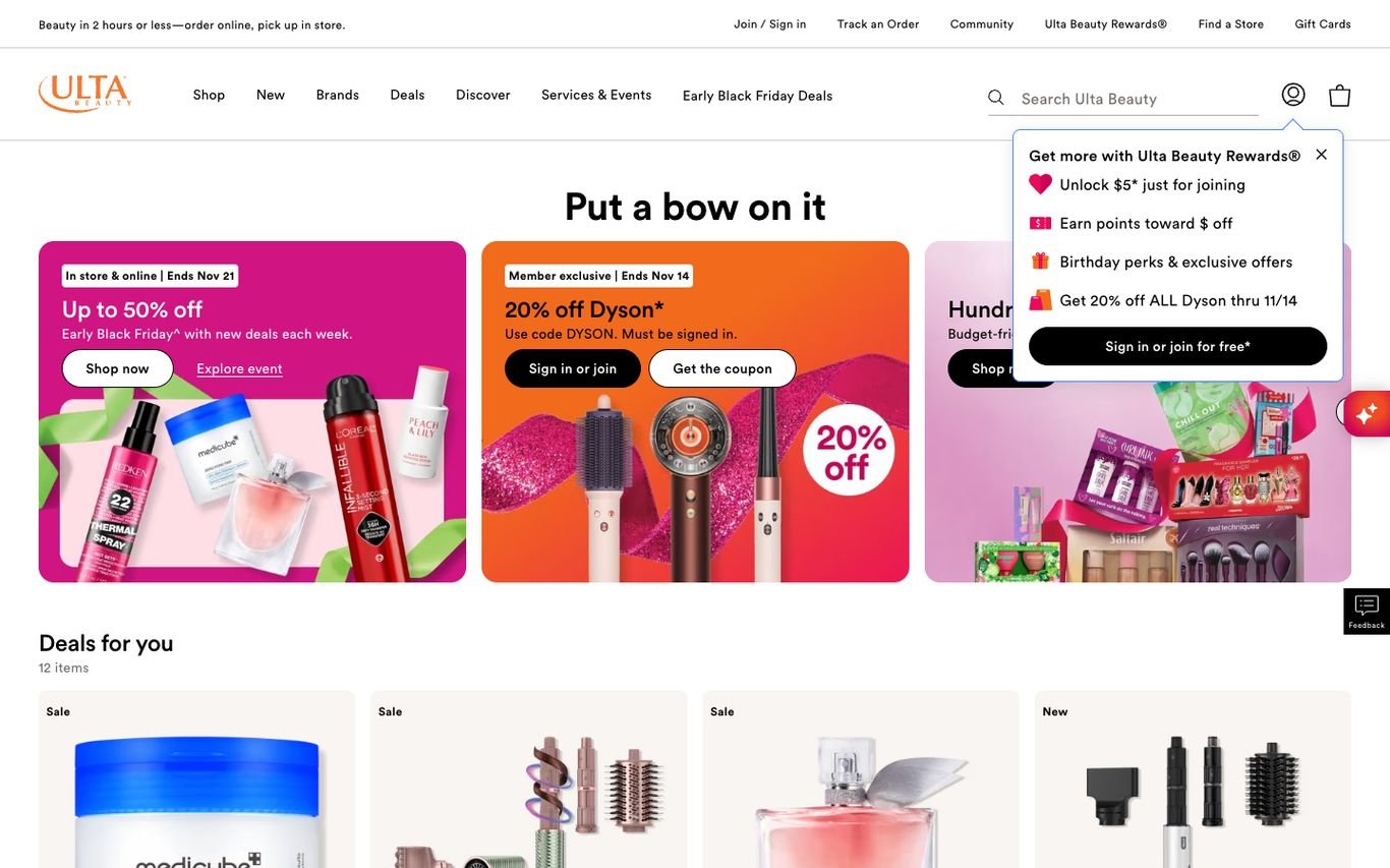
Ulta Beauty’s “Put a bow on it” section shows colourful deal cards for different offers, and a rewards panel lists member perks such as a welcome discount, points, and birthday gifts. Utility links cover order tracking, store finder, and gift cards.
What to borrow: A rewards panel that sells the benefits of signing up.
Quick Comparison
| Website | Market | Standout Feature | Our Rating |
|---|---|---|---|
| Fenty Beauty | Global | Conversational shopping chips | |
| Charlotte Tilbury | UK / Global | Bold offers plus free expert advice | |
| Rare Beauty | US | Editorial campaign and a mission link | |
| Glossier | US | Signature pink and lifestyle styling | |
| BYREDO | Global | Luxury gifting scene | |
| Cult Beauty | UK | AI assistant and loyalty perks | |
| LOOKFANTASTIC | UK | Flash sale graphics and category buttons | |
| FACES | UAE | Luxury brand chips and sale carousel | |
| Ulta Beauty | US | Deal cards and a rewards panel |
Design Tips for Your Beauty Website
1. Help Customers Choose
Shade finders, skin quizzes and filters reduce uncertainty and returns.
2. Make Reviews Prominent
Ratings and real customer photos are powerful in beauty.
3. Tell the Brand Story
Founders, ingredients and values differentiate premium brands.
4. Reward Loyalty
Points, samples and member offers encourage repeat purchases.
5. Use Video
Tutorials and application videos show products in action.
Frequently Asked Questions
What makes a great beauty website?
Beautiful imagery, smart product discovery, detailed product pages with reviews, loyalty rewards and fast mobile checkout.
Can WooCommerce run a beauty store?
Yes, with variations for shades, reviews, subscriptions and loyalty plugins.
How do beauty sites reduce returns?
Shade matching tools, detailed swatches and clear ingredient information.
Conclusion
The best beauty website design combines trust, clarity and an obvious next step. Pair inspiration with tools that help shoppers choose the right product with confidence. Use these 9 examples as inspiration and adapt the patterns that fit your business.
For more inspiration, see our best real estate website designs and best solar company website designs.
Dev Mizan designs and builds fast, conversion-focused WordPress websites for growing businesses, with lead forms connected to your CRM. Get in touch to plan your new website, or message us on WhatsApp.
Want more inspiration? Browse all website design examples by industry →