A diagnostic centre or lab website has to make complex tests feel simple: what each test is, how much it costs, how to prepare and how to book. This post showcases 10 of the best diagnostic center website design examples for 2027, with screenshots, what each site does well, and practical tips you can use on your own website.
The best sites combine clear test menus, transparent pricing, easy booking and fast access to results.
Table of Contents
What Makes a Great Diagnostic Center Website?
- Searchable test menu. Find a test by name, symptom or category.
- Transparent pricing. Prices or packages shown upfront.
- Easy booking. Choose a location or home collection and a time slot.
- Results access. A secure patient portal or app.
- Preparation guidance. Fasting and other instructions for each test.
- Accreditation and trust. Accreditations, doctor review and data security.
1. Function Health

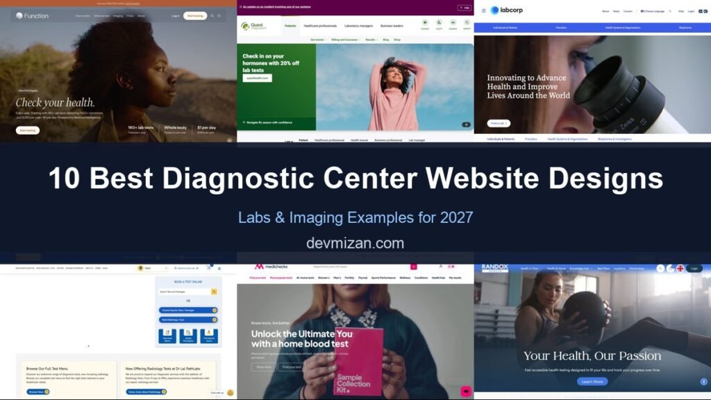
Function Health uses a calm outdoor portrait and a two-word headline, “Check your health,” followed by clear numbers on how many lab tests are included, how often you are tested, and the cost per day. A note that the membership is HSA/FSA eligible answers a common payment question.
What to borrow: Turn your offer into three memorable numbers.
2. Quest Diagnostics

Quest promotes a consumer testing offer in its hero, then adds an “I am a” selector for patients, healthcare professionals, health insurers, businesses, and lab managers. Each audience gets its own journey from the first screen.
What to borrow: An audience selector for organisations serving many user types.
3. Labcorp

Labcorp pairs a microscope image with its mission to advance health and improve lives, plus a Find a Lab button. Tabs for individuals and patients, providers, health systems, and biopharma sit both above and below the hero.
What to borrow: Audience tabs repeated where visitors need them.
4. Dr Lal PathLabs

Dr Lal PathLabs puts a “Book a Test Online” panel in the hero: search tests and packages, choose popular tests, or book a scan. Icons underneath let patients download reports, upload a prescription, or find the nearest centre, and a city selector localises the site.
What to borrow: Shortcuts for reports and prescriptions on the homepage.
5. Medichecks
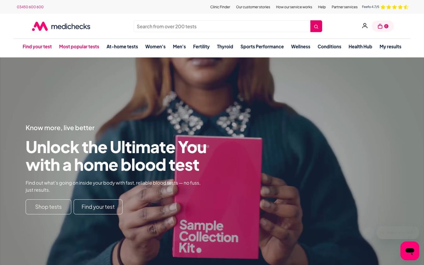
Medichecks shows a customer holding its home test kit beside “Unlock the Ultimate You with a home blood test,” with Shop Tests and Find Your Test buttons. A search covers more than 200 tests, and the navigation groups them by health area, from fertility to sports performance.
What to borrow: Navigation by health goal rather than test name.
6. Randox Health

Randox Health uses an active lifestyle photo and “Your Health, Our Passion,” with a short line about fast, accessible testing. Tabs separate personal, corporate, and pathology services, and the navigation covers in-clinic and at-home testing.
What to borrow: Separate tabs for consumers and corporate clients.
7. SimonMed Imaging

SimonMed explains its AI-enabled imaging in a soft white card over a calming patient photo, with Book Your Scan and Search Locations buttons. Toggles for patients and providers, a phone number, and a chat window keep help close.
What to borrow: A booking button and a location search side by side.
8. SYNLAB

SYNLAB keeps its homepage minimal, with “Medical excellence for you” and a prominent “Find a SYNLAB close to you” search with a geography selector. Side tabs give quick access to contact, the lab finder, and investor information.
What to borrow: Make the nearest lab one search away.
9. Thriva
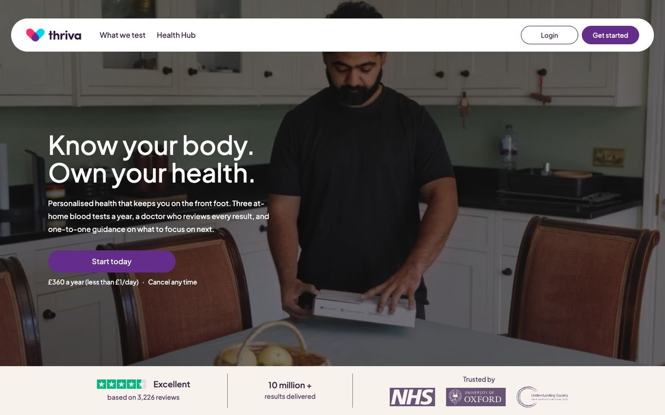
Thriva’s “Know your body. Own your health.” sits over a photo of a customer at home, explaining that a doctor reviews every result, with a Start Today button and the yearly price. A trust bar underneath shows its review rating, the number of results delivered, and recognised partner logos.
What to borrow: Doctor review and partner logos to reassure first-time testers.
10. Unilabs
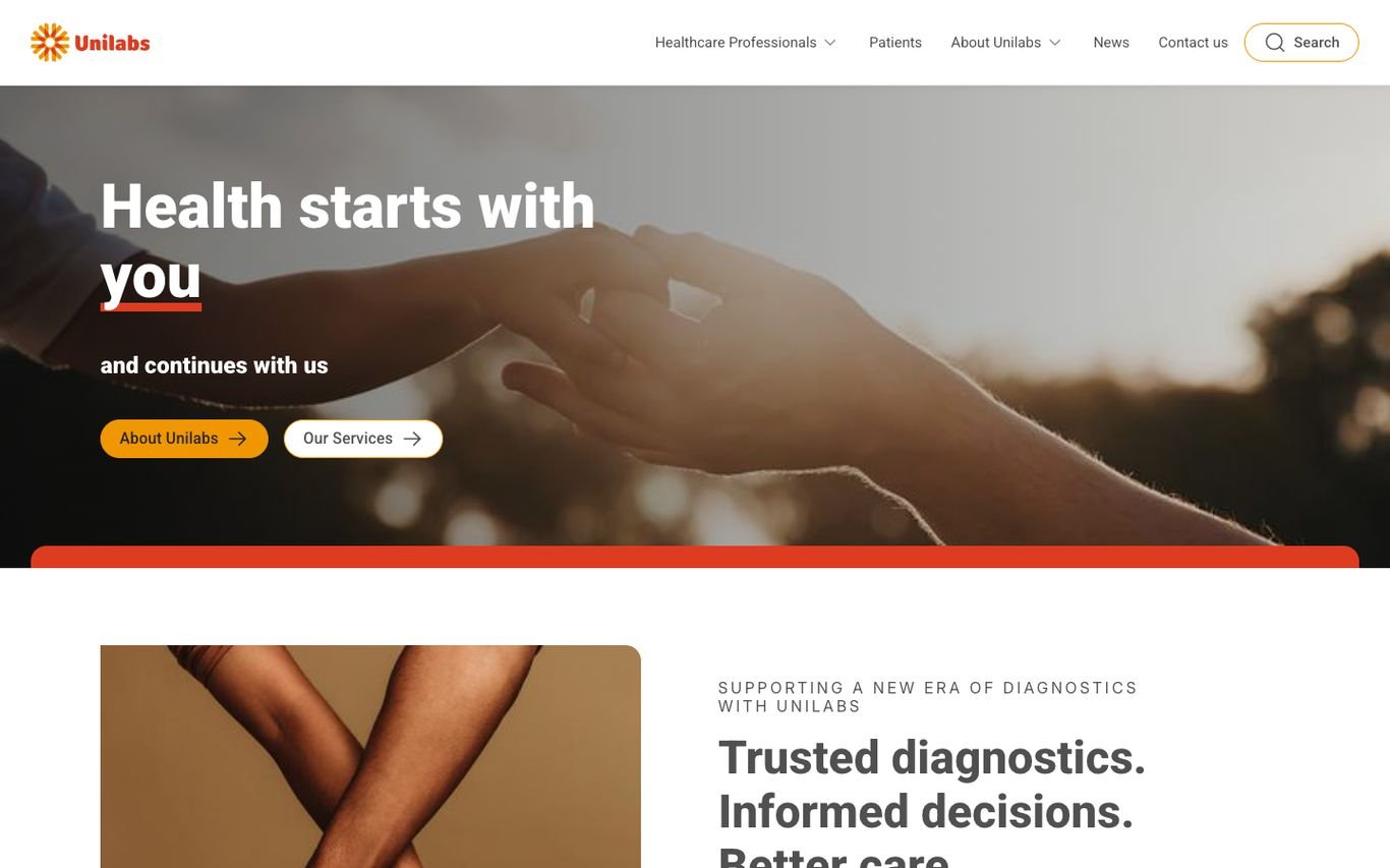
Unilabs pairs a warm photo with “Health starts with you and continues with us,” plus About Unilabs and Our Services buttons. A second section introduces “Trusted diagnostics. Informed decisions. Better care.”
What to borrow: A people-first tone for a clinical service.
Quick Comparison
| Website | Market | Standout Feature | Our Rating |
|---|---|---|---|
| Function Health | US | Simple promise with big numbers | |
| Quest Diagnostics | US | “I am a…” audience selector | |
| Labcorp | US / Global | Mission-led hero with audience tabs | |
| Dr Lal PathLabs | India | Test booking panel with practical shortcuts | |
| Medichecks | UK | Home blood test focus with health-area navigation | |
| Randox Health | UK | Lifestyle imagery with personal and corporate tabs | |
| SimonMed Imaging | US | AI imaging message with booking and locations | |
| SYNLAB | Europe | Minimal lab finder | |
| Thriva | UK | Personal promise plus strong proof | |
| Unilabs | Europe | Warm, human brand line |
Design Tips for Your Diagnostic Center Website
1. Organise Tests the Way Patients Think
Group tests by health goal, symptom or body system, not only by lab codes.
2. Show Prices and What Is Included
Transparent pricing builds trust and reduces calls to the front desk.
3. Offer Home Collection Clearly
If you offer home or workplace sampling, make it a main option.
4. Make Results Easy to Access
Link to the patient portal from the header and explain turnaround times.
5. Explain Results in Plain Language
Guides and doctor-reviewed explanations reduce anxiety.
Frequently Asked Questions
What should a diagnostic center website include?
A test menu, prices or packages, booking, locations, preparation instructions, results access and accreditations.
Should a lab website show prices?
Yes, where possible. Transparent pricing is a major reason people choose direct-to-consumer labs.
Can WordPress handle test booking and packages?
Yes. WordPress can display test catalogues and integrate with booking and patient portal systems.
Conclusion
The best diagnostic center website design combines trust, clarity and an obvious next step. Help patients find the right test, understand the price and book with confidence. Use these 10 examples as inspiration and adapt the patterns that fit your business.
For more inspiration, see our best real estate website designs and best solar company website designs.
Dev Mizan designs and builds fast, conversion-focused WordPress websites for growing businesses, with lead forms connected to your CRM. Get in touch to plan your new website, or message us on WhatsApp.
Want more inspiration? Browse all website design examples by industry →