Furniture is an expensive, considered purchase, so furniture showroom websites have to inspire with beautiful rooms while answering practical questions about size, materials and delivery. This post showcases 10 of the best furniture website design examples for 2027, with screenshots, what each site does well, and practical tips you can use on your own website.
The best furniture sites blend editorial room photography with detailed product information, fabric options and showroom booking.
Table of Contents
What Makes a Great Furniture Website?
- Room-led inspiration. Styled rooms that show products in context.
- Detailed product pages. Dimensions, materials, fabrics and care.
- Configurators. Choose sizes, fabrics and finishes.
- Samples and swatches. Free or low-cost fabric samples.
- Showroom booking. Appointments and design services.
- Clear delivery information. Lead times and white-glove delivery.
1. Pottery Barn

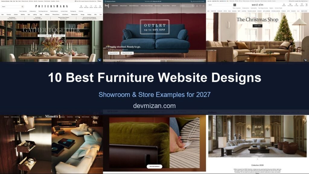
Pottery Barn sets “Gather Together” over a richly styled dining room with buttons for in-stock and dining furniture. A strip of benefits covers free shipping, the sale, and holiday order deadlines, and the navigation promotes room inspiration, free design services, and a wedding registry.
What to borrow: Free design services promoted in the main navigation.
2. Loaf
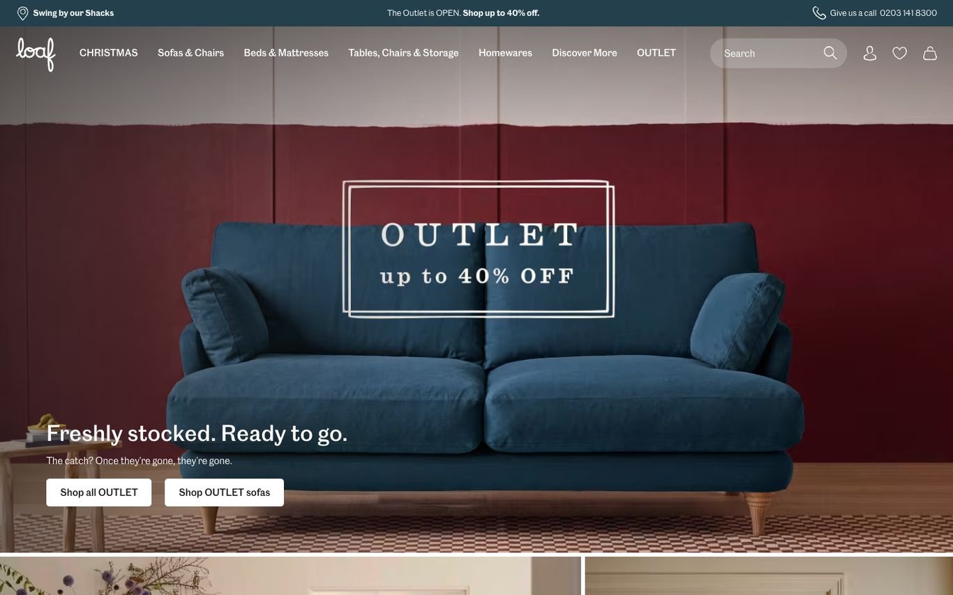
Loaf frames a blue sofa against a deep red wall with a vintage-style “Outlet up to 40% off” sign and the line “Freshly stocked. Ready to go.” The top bar invites shoppers to give the team a call, matching its laid-back, friendly brand.
What to borrow: A warm tone of voice that makes a big purchase feel easy.
3. West Elm
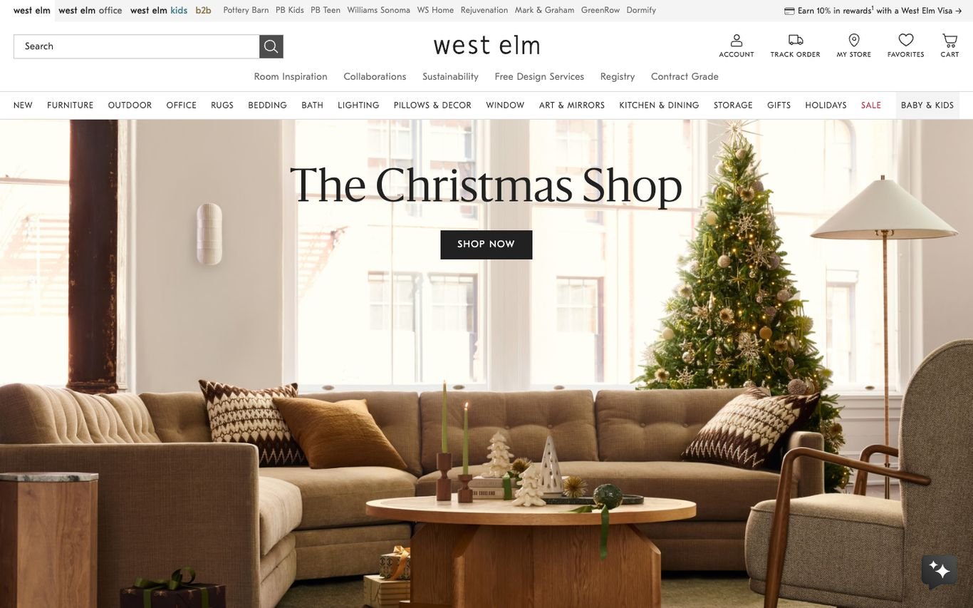
West Elm opens its seasonal shop over a cosy styled living room, with a Shop Now button. A secondary bar links to room inspiration, collaborations, sustainability, free design services, a registry, and contract-grade furniture for businesses.
What to borrow: Sustainability and trade links alongside retail.
4. Minotti
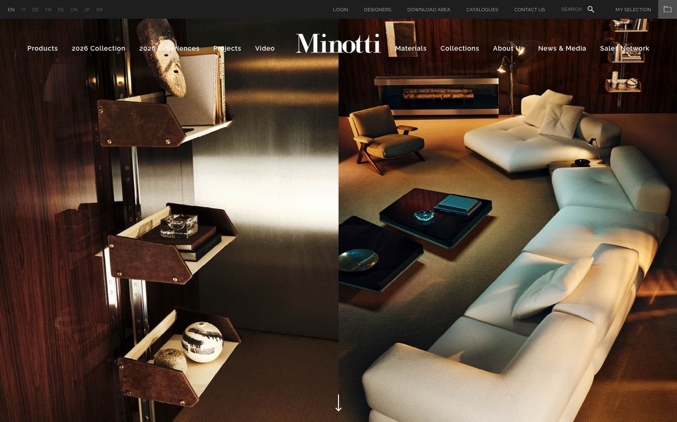
Minotti uses split, dramatically lit interior photographs that show its sofas and shelving in luxurious settings. The navigation covers products, the new collection, materials, and its global sales network.
What to borrow: Moody lighting that signals luxury.
5. Ligne Roset
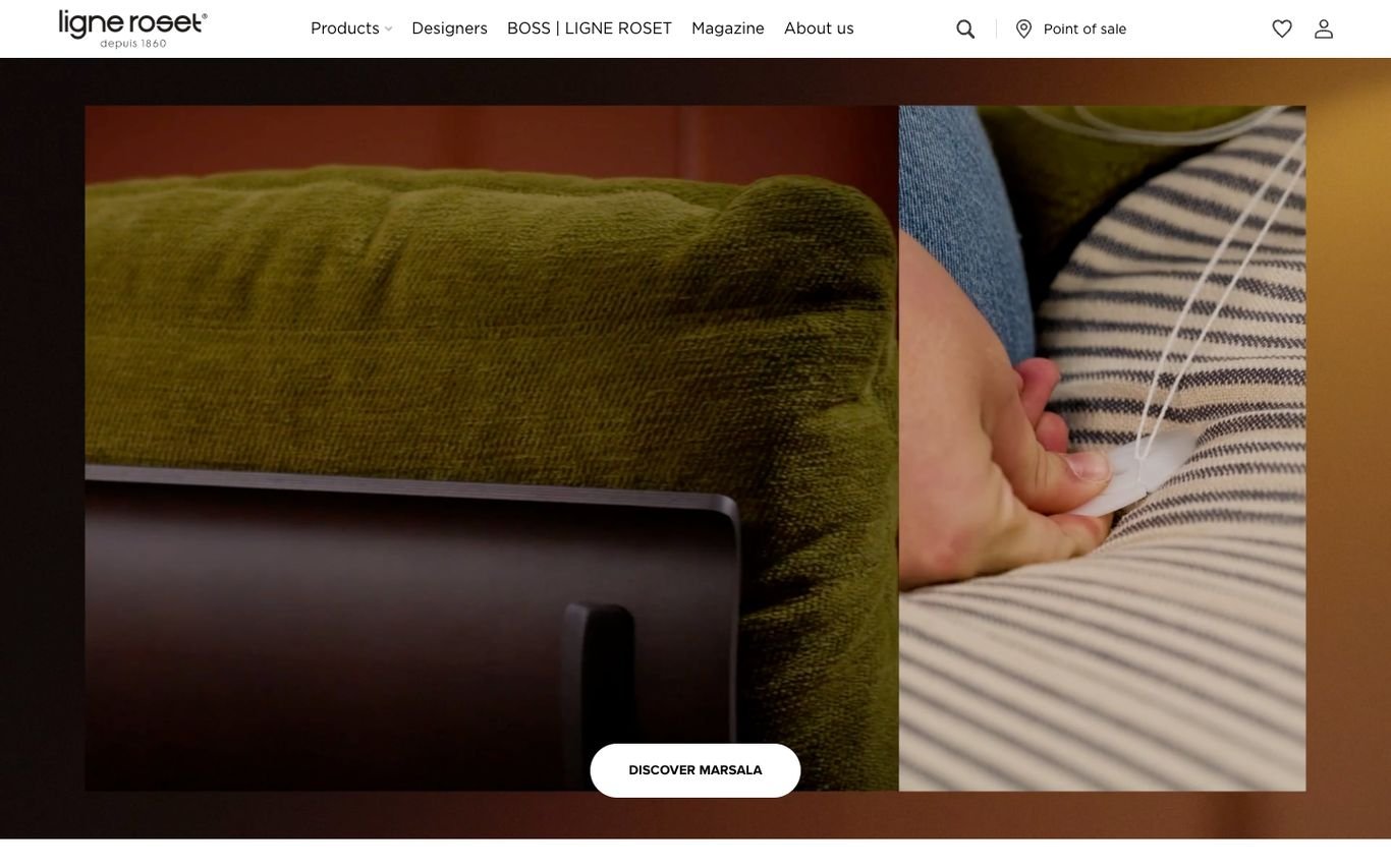
Ligne Roset leads with a close-up of a hand touching velvet and striped upholstery, highlighting texture and craftsmanship, with a Discover button for the featured piece. Designers and a magazine sit in the main navigation alongside a point-of-sale finder.
What to borrow: Close-up detail shots that sell materials and craft.
6. Poliform

Poliform frames a grand salon furnished with its new collection in generous white space, with a short description naming the designers involved. The navigation includes a stylebook, catalogues, contract, and a store locator.
What to borrow: Name your designers to add prestige.
7. Castlery

Castlery turns its country selector into a design moment: “Choose your local site to shop” with a large serif list of countries beside a beautifully styled sideboard photo.
What to borrow: Make even the region picker feel on-brand.
8. Floyd
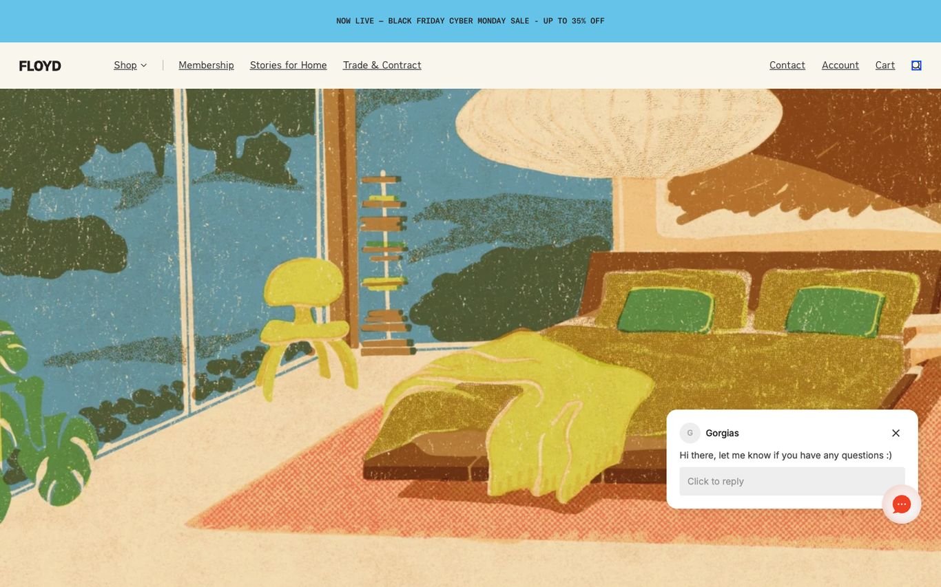
Floyd uses a sunny, hand-drawn illustration of a bedroom instead of photography, which makes the brand instantly recognisable. Membership, home stories, and a trade programme sit in the navigation, and a friendly chat assistant offers help.
What to borrow: Illustration that sets a brand apart from photo-led competitors.
9. Crate & Barrel
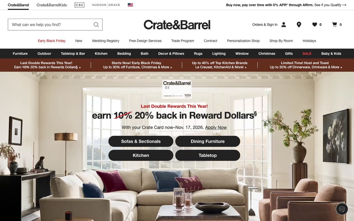
Crate & Barrel overlays a rewards promotion on a styled living room, with buttons for sofas, dining furniture, kitchen, and tabletop. Wedding registry, free design services, and a trade programme sit in the navigation.
What to borrow: Category buttons inside the promotion to move shoppers on.
10. Swoon
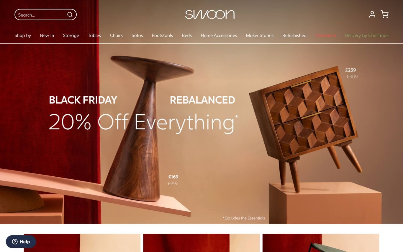
Swoon presents its sale with a rich, dark-red still life of sculptural furniture and objects with price tags, under elegant type. Navigation covers new arrivals, storage, sofas, beds, and more.
What to borrow: Still-life product art direction for design-led furniture.
Quick Comparison
| Website | Market | Standout Feature | Our Rating |
|---|---|---|---|
| Pottery Barn | US | Styled rooms and free design services | |
| Loaf | UK | Playful framing and a friendly tone | |
| West Elm | US | Seasonal shop with design services | |
| Minotti | Italy | Dark, luxurious interior photography | |
| Ligne Roset | France | Craft close-ups | |
| Poliform | Italy | Gallery-style collection launch | |
| Castlery | Global | Elegant country gateway | |
| Floyd | US | Warm illustrated art direction | |
| Crate & Barrel | US | Rewards promo with category buttons | |
| Swoon | UK | Editorial product still life |
Design Tips for Your Furniture Website
1. Shop the Room
Let visitors click products within styled room photos.
2. Remove Size Anxiety
Show dimensions clearly, add room planners or AR previews.
3. Offer Swatches
Fabric samples reduce returns and increase confidence for big purchases.
4. Promote Design Services
Free design consultations and showroom visits help convert high-value orders.
5. Be Clear About Delivery
Lead times, delivery options and returns should be visible before checkout.
Frequently Asked Questions
What should a furniture website include?
Room inspiration, detailed product pages, configurators, swatches, showroom booking and clear delivery information.
Can WooCommerce sell made-to-order furniture?
Yes, with variable products, custom options and lead time messaging.
How can furniture sites reduce returns?
Accurate dimensions, swatches, AR previews and design advice.
Conclusion
The best furniture website design combines trust, clarity and an obvious next step. Inspire with beautiful rooms, then answer every practical question before checkout. Use these 10 examples as inspiration and adapt the patterns that fit your business.
For more inspiration, see our best real estate website designs and best solar company website designs.
Dev Mizan designs and builds fast, conversion-focused WordPress websites for growing businesses, with lead forms connected to your CRM. Get in touch to plan your new website, or message us on WhatsApp.
Want more inspiration? Browse all website design examples by industry →