An interior designer’s website is a portfolio first. It has to show taste in seconds and make the right clients want to get in touch. The best interior design websites let the photography breathe, tell a story about the studio, and quietly guide visitors to an enquiry. This post showcases 13 of the best interior designer website designs for 2027, with screenshots, what each does well, and tips for your own studio.
Table of Contents
What Makes a Great Interior Design Website?
- Photography that leads. Large, high-quality project images with minimal clutter.
- A clear point of view. Visitors should sense the studio’s style instantly.
- Well-organised projects. Residential, commercial, and hospitality work grouped clearly.
- Press and recognition. Features and awards build credibility.
- Shop or product lines. Many studios sell furniture, fabrics, or homeware.
- A simple enquiry path. A short form or email for new projects.
1. Kelly Wearstler
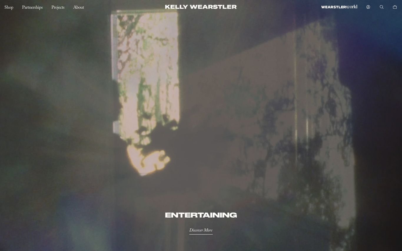
Kelly Wearstler’s homepage feels like a magazine spread: a dreamy, full-screen image of light and shadow with an editorial story and a “Discover more” link. The header balances the studio and the brand, with Shop, Partnerships, Projects, and About, plus a cart.
What to borrow: Editorial content that blends inspiration with shopping.
2. Amber Interiors

Amber Interiors uses one moody, full-bleed photograph of a living room with the studio name spaced out in thin capitals across the middle. A discreet menu in the corner is the only other element, which keeps all the attention on the room.
What to borrow: One great room photo plus a refined wordmark is enough.
3. Beata Heuman
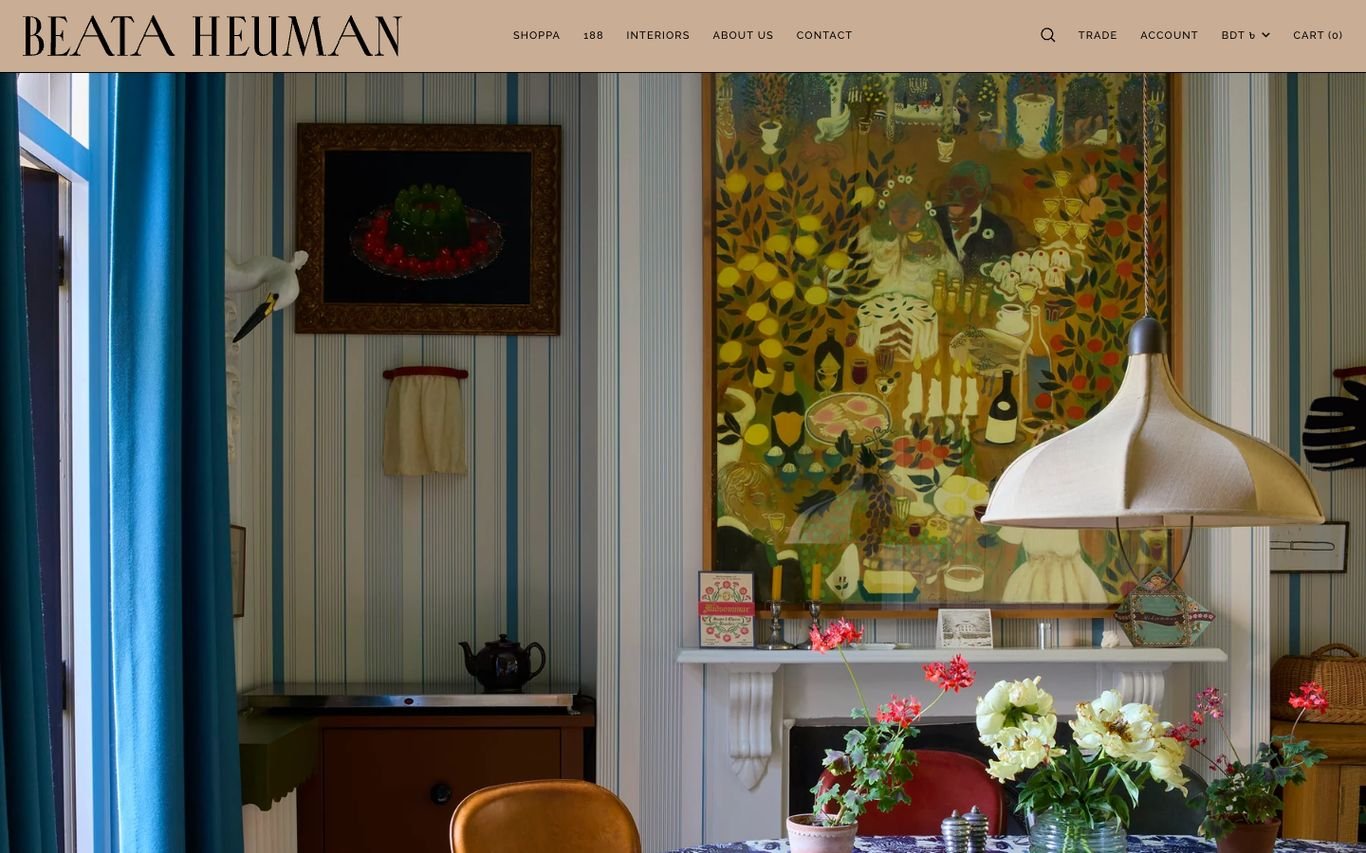
Beata Heuman’s site is as joyful as her rooms: a richly patterned interior fills the screen beneath a sand-coloured header with Shop, Interiors, About, Contact, and Trade links, plus account, currency, and cart. The portfolio and product range sit side by side.
What to borrow: A trade link and shop next to the portfolio.
4. Bunny Williams
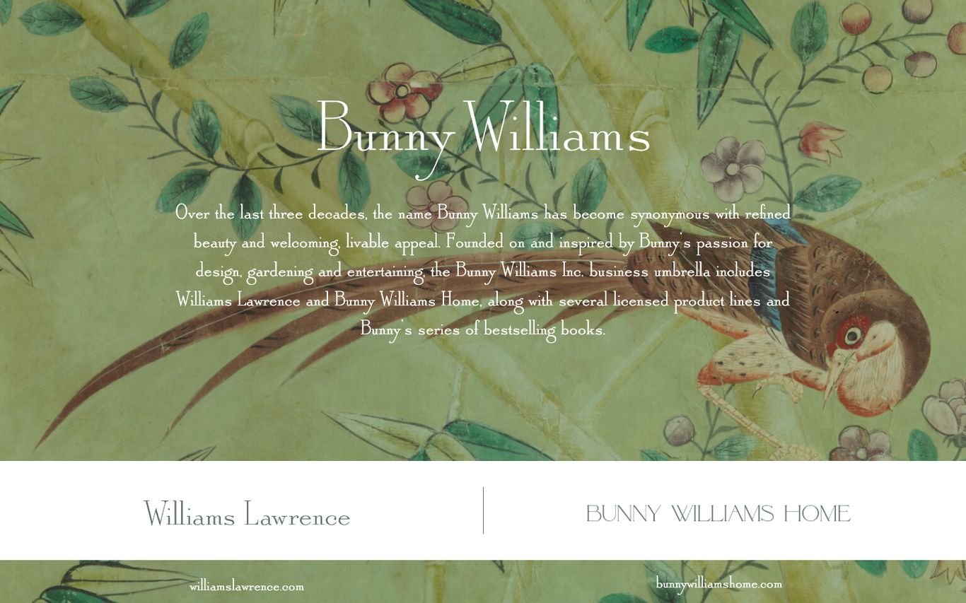
Bunny Williams sets her name in elegant serif type over a botanical, hand-painted wallpaper, followed by a short paragraph about the brand. Two panels underneath send visitors to her furniture and home collections, a neat way to connect several businesses under one name.
What to borrow: Clear panels that route visitors to each part of the brand.
5. Kit Kemp Design Studio
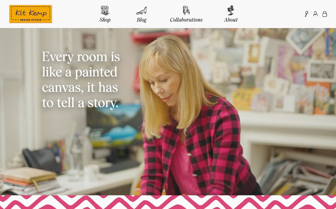
Kit Kemp’s homepage shows the designer at work beside her own line: “Every room is like a painted canvas, it has to tell a story.” Illustrated icons for Shop, Blog, Collaborations, and About replace a standard menu, and a bright zigzag border adds personality.
What to borrow: Put the designer’s face and philosophy front and centre.
6. Nickey Kehoe
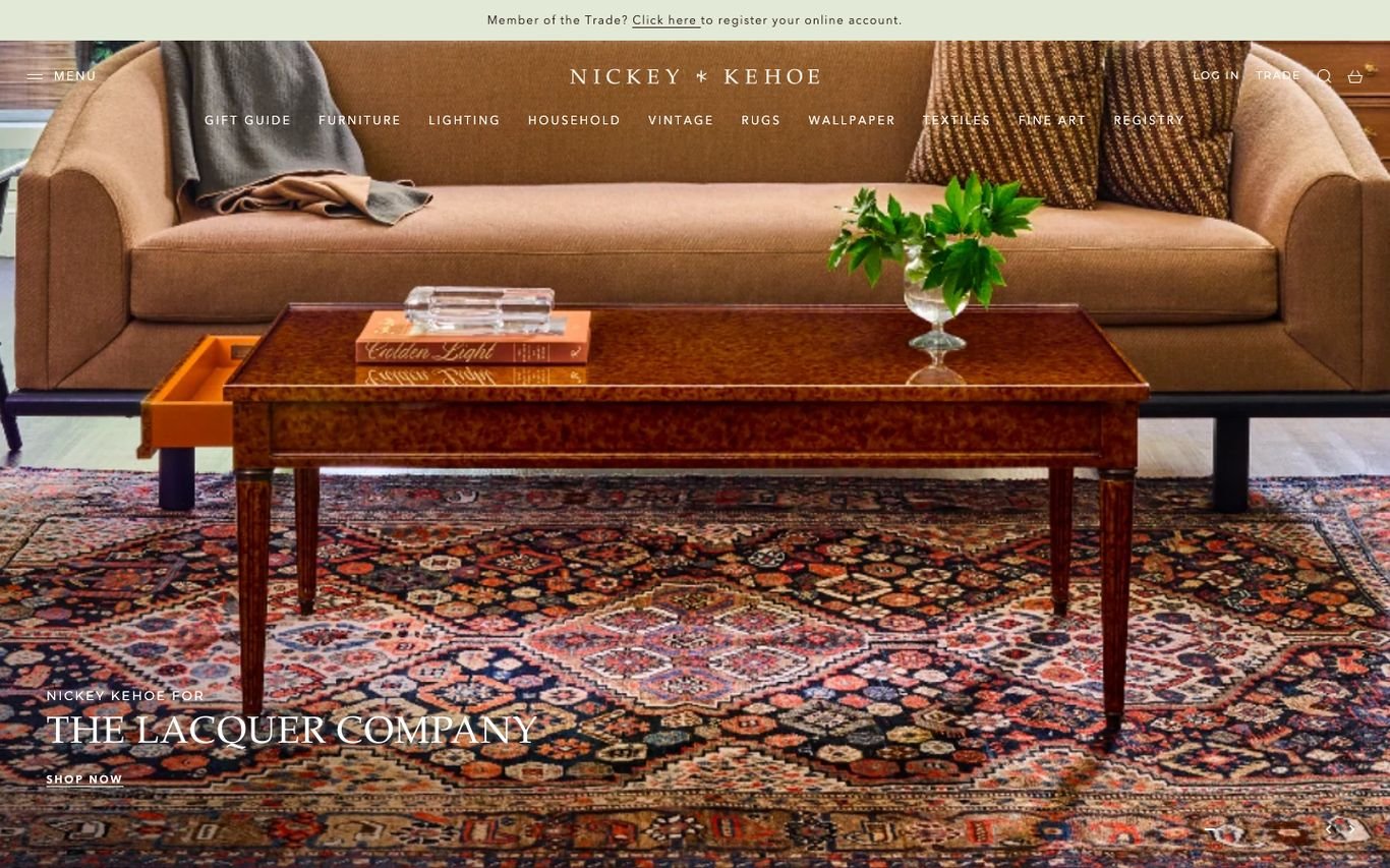
Nickey Kehoe combines a studio and a store. A banner invites trade members to register, the navigation lists shop categories from furniture and lighting to vintage and wallpaper, and a beautifully styled room promotes a product collaboration with a Shop Now link.
What to borrow: A trade registration banner for designers and architects.
7. Reath Design
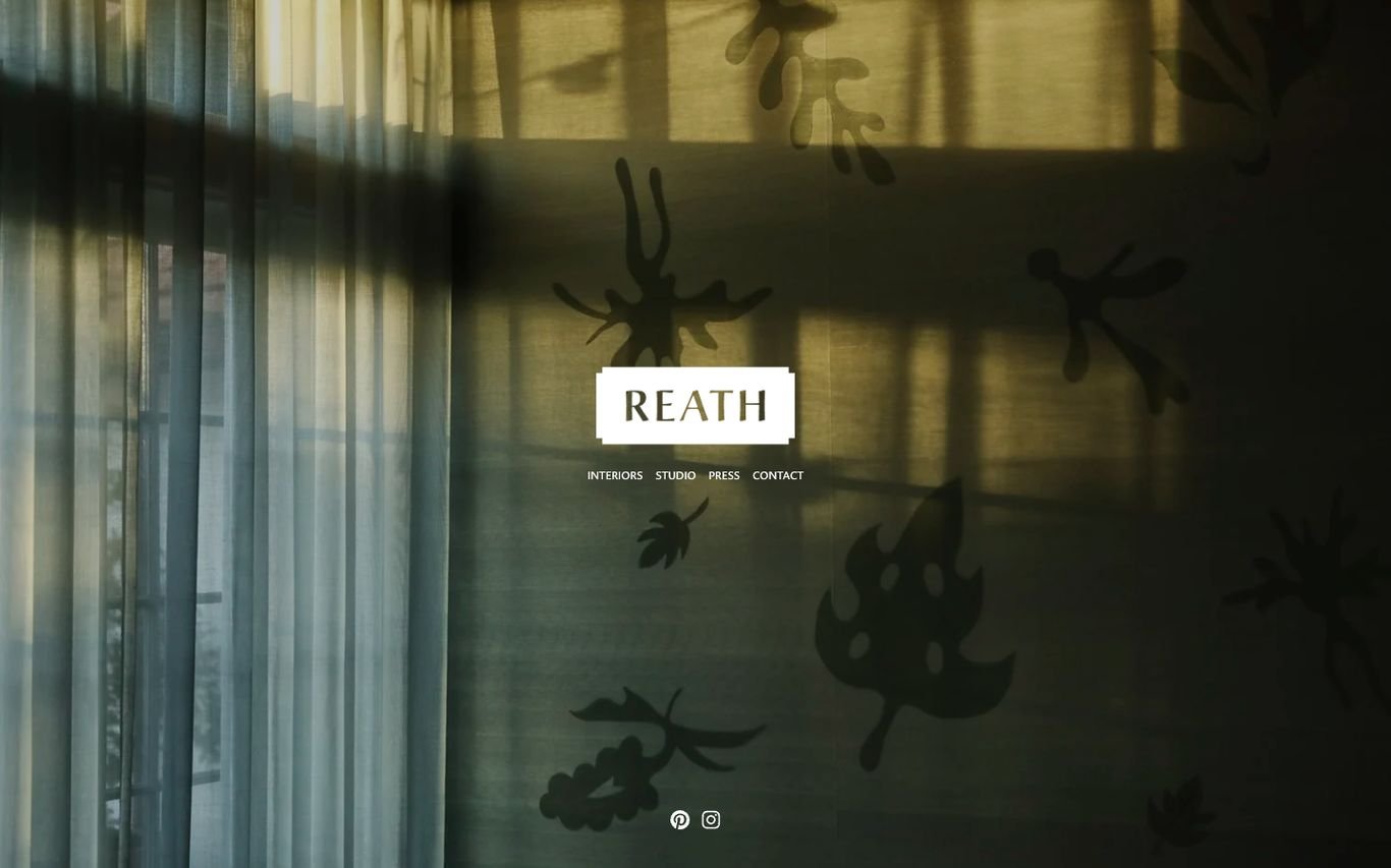
Reath Design keeps everything minimal: a shadowy, sunlit room behind curtains, a centred logo block, and a handful of small links for interiors, studio, press, and contact, plus social icons. The calm presentation matches the studio’s warm, layered interiors.
What to borrow: A tiny, centred navigation that never competes with the image.
8. SheltonMindel
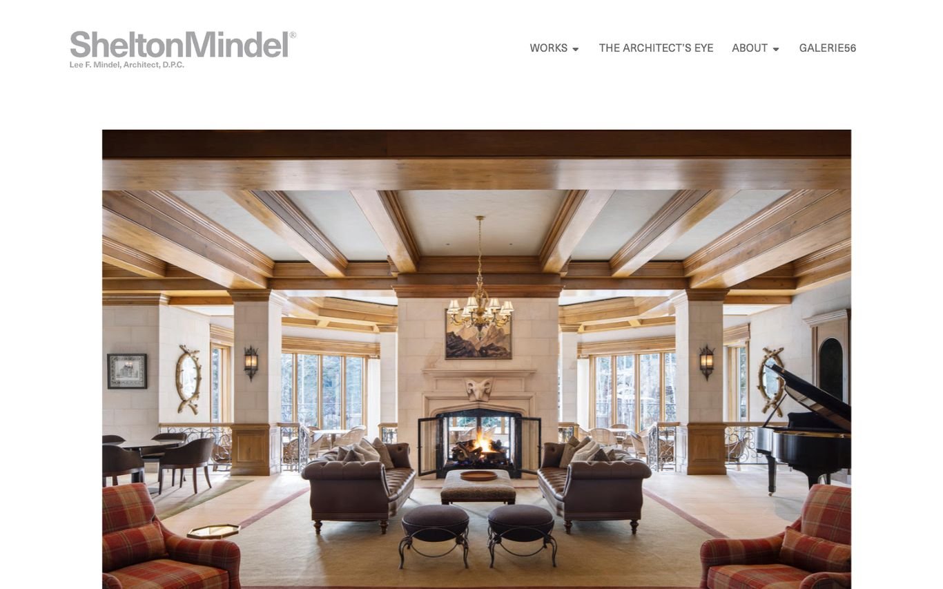
SheltonMindel, an architecture and interiors practice, frames a single project photograph in generous white space. The navigation is short and considered: Works, The Architect’s Eye, About, and Galleries.
What to borrow: Whitespace around images to give a gallery-like feel.
9. Studio Ashby
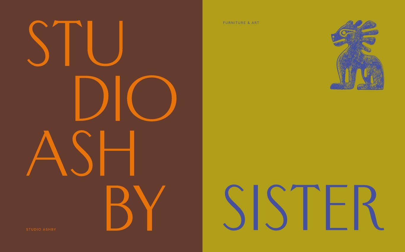
Studio Ashby breaks the usual photography-first rule. The homepage is split into bold colour blocks with oversized stacked lettering for the studio and its sister brand, plus a graphic illustration. It is instantly recognisable and very memorable.
What to borrow: A strong graphic identity that stands out from photo-led sites.
10. Studio Duggan
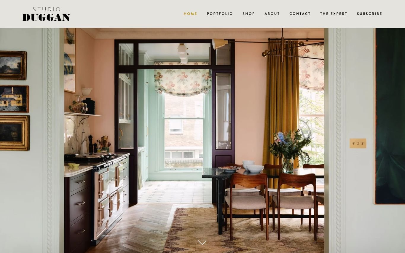
Studio Duggan frames a warm, pink-walled room through a doorway, drawing the eye into the space. The navigation includes a portfolio, a shop, and “The Expert”, an advice section, plus a Subscribe link that builds an audience over time.
What to borrow: An advice section and newsletter that keep visitors coming back.
11. Joseph Dirand Architecture
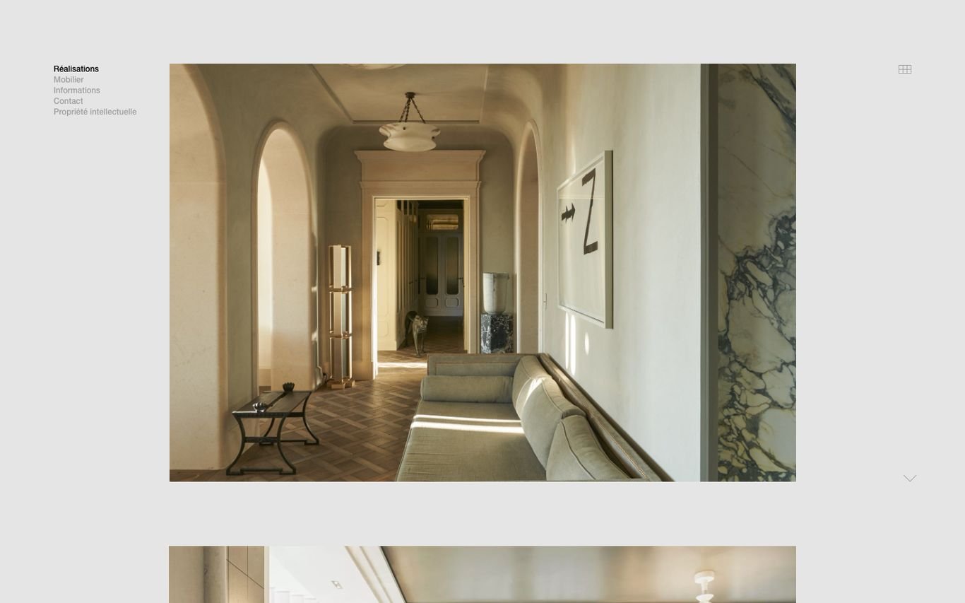
Joseph Dirand presents a serene arched corridor in a large framed photograph, with only a tiny text menu in the corner. The amount of white space makes the site feel like a gallery wall.
What to borrow: Generous white space that makes every image feel curated.
12. Kelly Behun Studio

Kelly Behun Studio fills the screen with a warm sunset interior and sculptural furniture, with the studio’s name across the top and a single Enter button. It sets a mood before showing anything else.
What to borrow: A mood-setting splash image with one clear way in.
13. Pierre Yovanovitch

Pierre Yovanovitch opens with a cream screen, a “PY” monogram at the top, and the designer’s full name in spaced capitals at the bottom. It is about as minimal as a homepage can be, which suits a high-end interior architecture practice.
What to borrow: Extreme minimalism for a luxury personal brand.
Quick Comparison
| Website | Market | Standout Feature | Our Rating |
|---|---|---|---|
| Kelly Wearstler | US | Editorial storytelling with a shop | |
| Amber Interiors | US | Wordmark over a single room | |
| Beata Heuman | UK | Maximalist photography and an integrated shop | |
| Bunny Williams | US | Routing visitors to sub-brands | |
| Kit Kemp Design Studio | UK | The designer, her words, and playful icons | |
| Nickey Kehoe | US | Shop-first design with a trade programme | |
| Reath Design | US | Atmospheric image with a centred logo | |
| SheltonMindel | US | Framed project photography with whitespace | |
| Studio Ashby | UK | Typography-led colour blocks | |
| Studio Duggan | UK | Doorway views and an expert advice section | |
| Joseph Dirand Architecture | France | Gallery-like restraint | |
| Kelly Behun Studio | US | Full-bleed sunset interior with an Enter button | |
| Pierre Yovanovitch | France | Monogram and name, nothing else |
Design Tips for Your Interior Design Website
1. Let the Work Speak
Use full-width photography and keep text short. Navigation can be minimal as long as Projects and Contact are easy to find.
2. Tell the Story Behind Each Project
A few lines on the brief, challenges, and materials help potential clients imagine working with you.
3. Add a Shop if You Have Products
Product lines and collaborations add revenue and keep visitors on the site longer.
4. Show Press and Awards
A simple press page or logo strip adds authority.
5. Qualify Enquiries
A short form asking for project type, location, and timeline saves time on unsuitable leads.
Frequently Asked Questions
What should an interior designer website include?
A portfolio of projects, an about page with the designer’s story, services, press, and a contact or enquiry form.
How many projects should I show?
Quality beats quantity. Six to twelve strong, well-photographed projects are better than dozens of average ones.
Can I sell products on my interior design website?
Yes. WordPress with WooCommerce can run a shop for furniture, decor, or digital design guides alongside your portfolio.
Conclusion
The best interior design websites are edited as carefully as the rooms they show. Use these 13 examples for inspiration, keep your photography front and centre, and make it easy for the right clients to start a conversation.
For more inspiration, see our best real estate website designs and best solar company website designs.
Dev Mizan designs and builds fast, conversion-focused WordPress websites for growing businesses, with lead forms connected to your CRM. Get in touch to plan your new website, or message us on WhatsApp.
Want more inspiration? Browse all website design examples by industry →