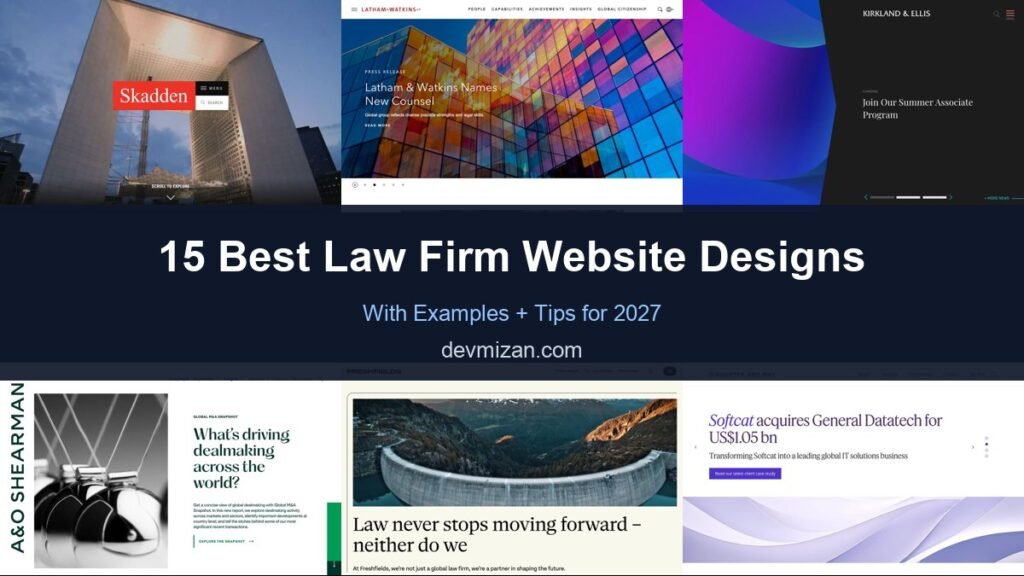
Choosing a lawyer is a high-trust decision, and a law firm’s website is often the first place that trust is won or lost. The best law firm websites look credible, explain what the firm does in plain language, and make it easy to reach the right lawyer. This post showcases 15 of the best law firm website designs for 2027, from global firms to consumer and personal injury practices, with screenshots, what each does well, and tips for your own site.
Whether you run a boutique practice or a regional firm, these examples show how to balance authority with approachability.
Table of Contents
What Makes a Great Law Firm Website?
- Clear practice areas. Visitors should find their legal problem in one or two clicks.
- People-first navigation. Lawyer profiles are among the most visited pages on any firm’s site.
- Credibility signals. Rankings, awards, case results, and client logos where allowed.
- Insights and thought leadership. Articles and briefings show expertise and help SEO.
- Obvious contact options. Phone, form, and office details on every page.
- Accessible, fast design. Many clients arrive stressed and on mobile.
1. Skadden
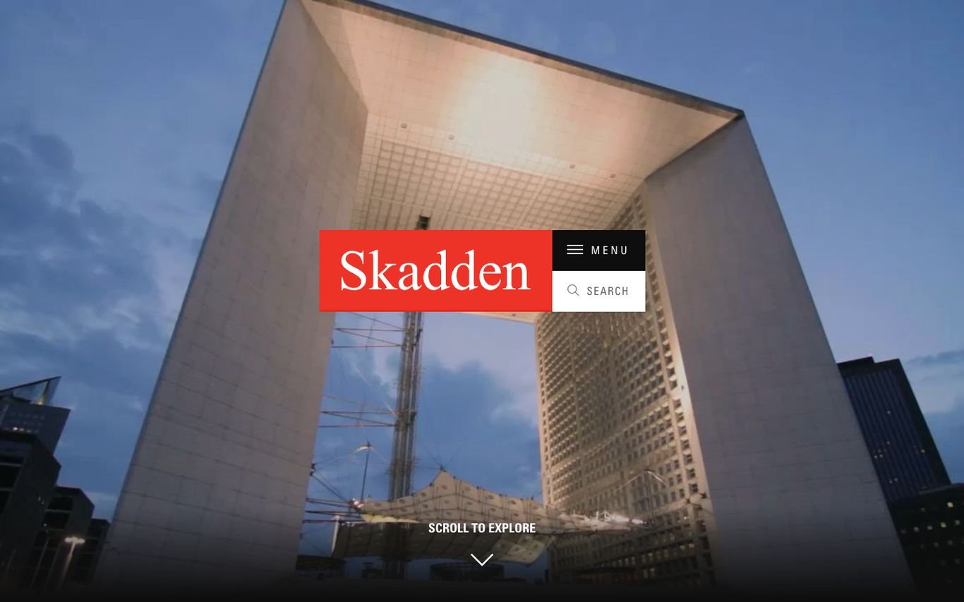
Skadden’s homepage is almost pure image: a full-screen photograph of monumental architecture, the red Skadden logo block, a compact menu and search, and a “Scroll to explore” prompt. It signals scale and confidence without a single sales line.
What to borrow: Let one powerful image and a strong logo carry the first screen.
2. Latham & Watkins
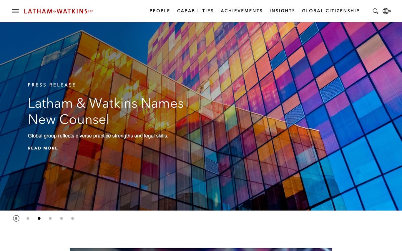
Latham & Watkins pairs a vivid, multicoloured glass facade with a slider for press releases and firm news. The navigation is simple and complete: People, Capabilities, Achievements, Insights, and Global Citizenship.
What to borrow: An “Achievements” section that turns deal wins into proof.
3. Kirkland & Ellis
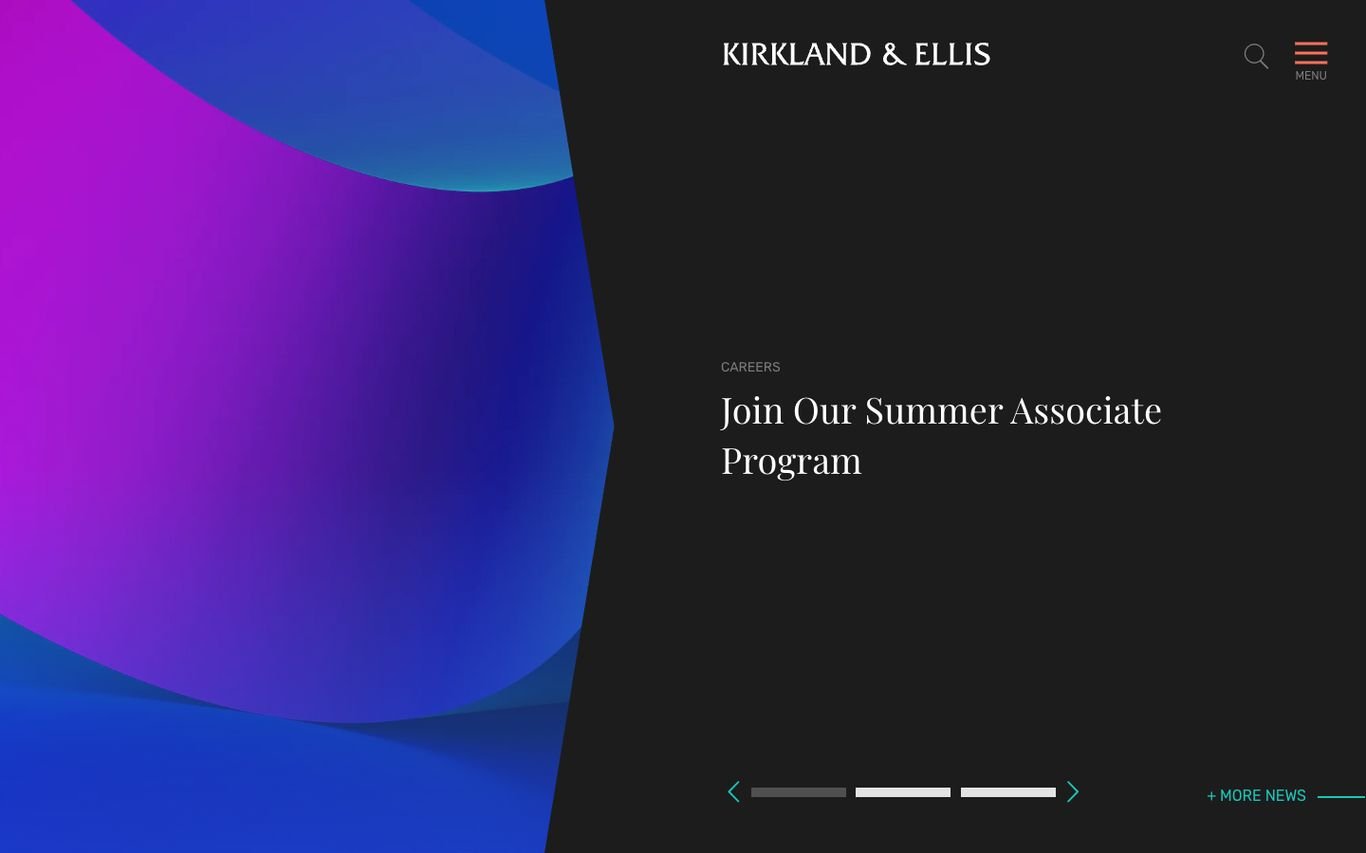
Kirkland & Ellis uses bold purple and blue gradient shapes with elegant serif type, and its homepage slider gives space to careers, such as its summer associate programme. The header is reduced to the logo, search, and a menu icon.
What to borrow: Use the homepage to recruit, not only to sell.
4. A&O Shearman
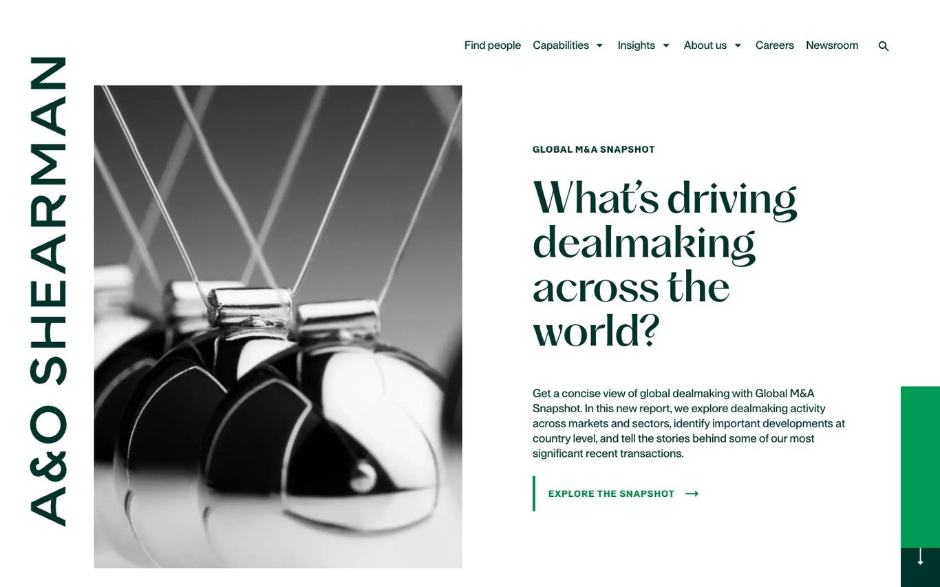
A&O Shearman runs its name vertically down the edge of the screen and pairs a monochrome image with a serif question: “What’s driving dealmaking across the world?” The call to action leads to its global M&A snapshot, a research piece that shows expertise rather than claiming it.
What to borrow: Lead with a research report that answers a client’s big question.
5. Freshfields
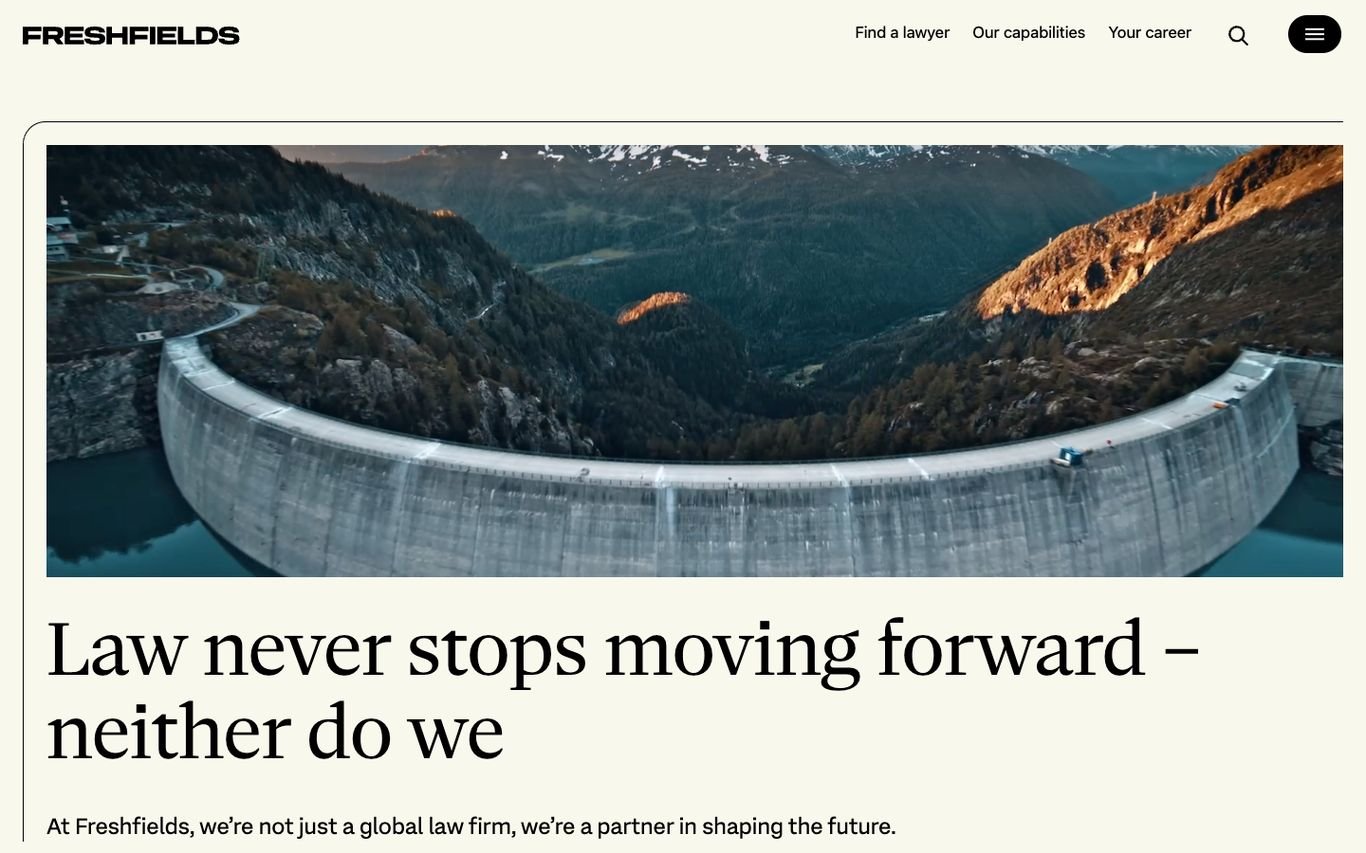
Freshfields uses a warm off-white background, a wide aerial landscape, and the line “Law never stops moving forward, neither do we.” Navigation is minimal: find a lawyer, capabilities, and careers, plus search.
What to borrow: A simple three-link header for the three main audiences.
6. Slaughter and May

Slaughter and May keeps the page white and calm with a soft lilac wave graphic. Instead of a slogan, the hero features a recent client transaction in italic serif type with a “Read our latest client case study” button.
What to borrow: Make a real client story the main message.
7. Mishcon de Reya
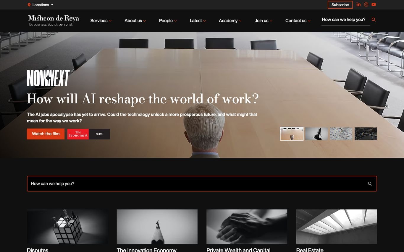
Mishcon de Reya promotes a video series on how AI will reshape the world of work, with a “Watch the film” button. A red-outlined “How can we help you?” search sits below, followed by tiles for disputes, the innovation economy, private wealth, and real estate.
What to borrow: A plain-language search box for visitors who don’t know legal terms.
8. Farrer & Co
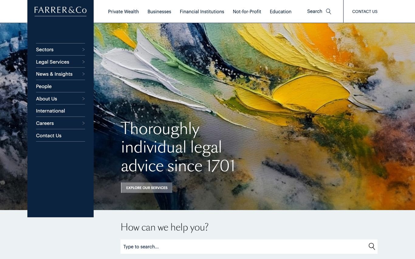
Farrer & Co places a navy side menu over a vivid painted artwork with the line “Thoroughly individual legal advice since 1701.” Audience links for private wealth, businesses, financial institutions, not-for-profit, and education sit in the header, with a “How can we help you?” search below.
What to borrow: Navigation by client type so each visitor finds their path.
9. Withers

Withers greets visitors with “Welcome” over a warm photograph and a short, human paragraph about the big decisions clients face, ending with its line “Withers. Thoughtfully bold.” An orange “About us” button and simple navigation keep the tone approachable.
What to borrow: Speak to clients’ situations, not just the firm’s credentials.
10. Irwin Mitchell
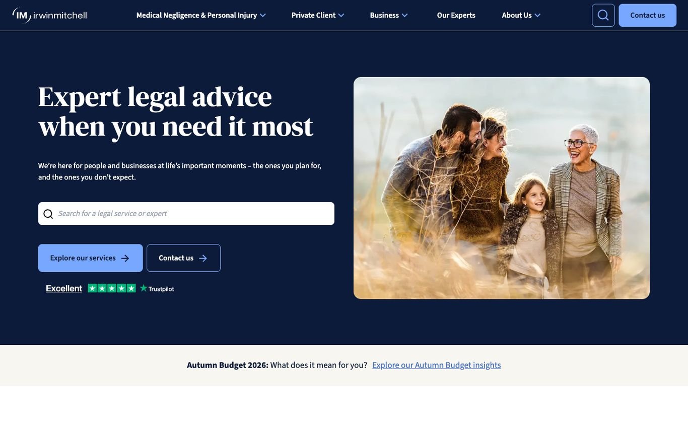
Irwin Mitchell speaks directly to individuals: “Expert legal advice when you need it most,” a family photo, a search for legal services or experts, and buttons to explore services or get in touch. A Trustpilot “Excellent” rating sits right under the calls to action.
What to borrow: A review rating directly under the main buttons.
11. Morgan & Morgan
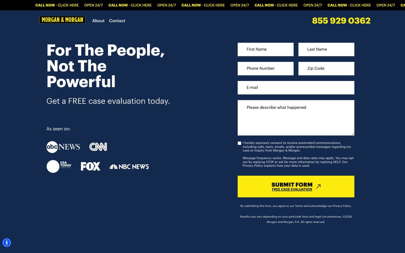
Morgan & Morgan is built for one action: a free case evaluation. The headline “For The People, Not The Powerful” sits beside a short form with a bright yellow submit button, the phone number is large in the header, and a ticker reminds visitors they can call any time. “As seen on” media logos add trust.
What to borrow: Put the enquiry form, phone number and trust logos on the first screen.
12. Wilson Sonsini

Wilson Sonsini uses a dark blue technology graphic and a huge headline about regulatory guidance for developing technologies, making its focus on tech clients unmistakable from the first second.
What to borrow: Lead with your niche so the right clients know they’re in the right place.
13. Fenwick
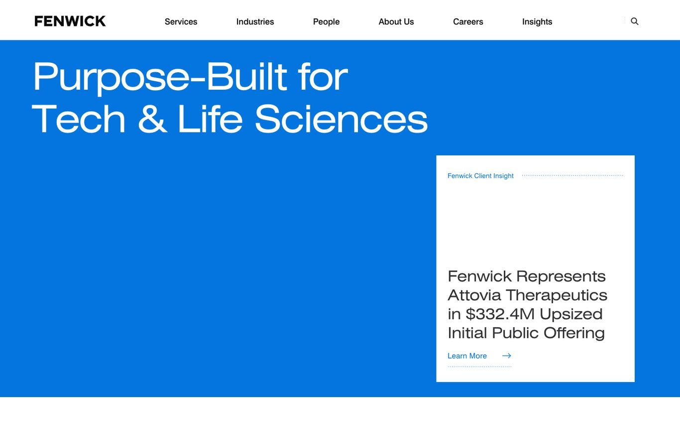
Fenwick fills the screen with bright blue and the line “Purpose-Built for Tech & Life Sciences.” A white card highlights a recent client deal, and the header covers services, industries, people, careers, and insights.
What to borrow: A one-line positioning statement in a strong brand colour.
14. Goodwin

Goodwin’s clean layout pairs “We Live Your Business” and a “How can we help you?” search with a column of recent insights, each with a thumbnail. Below, it introduces the Goodwin Platform for litigation and dispute resolution.
What to borrow: Fresh insights on the homepage show the firm is active and current.
15. BCLP
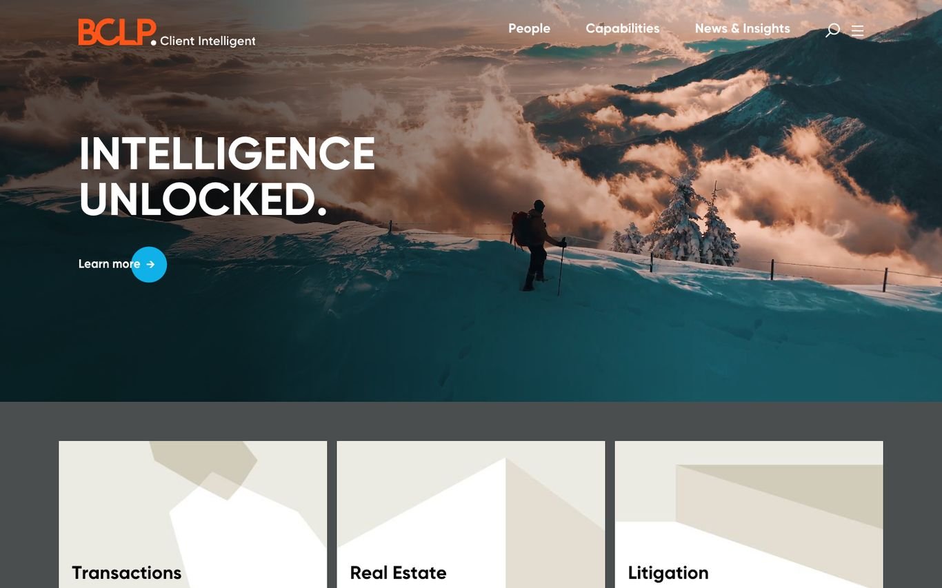
BCLP sets the line “Intelligence unlocked.” over a dramatic mountain photograph, with its “Client Intelligent” tagline beside the logo. Large tiles below link straight to transactions, real estate, and litigation.
What to borrow: Big, image-led tiles for the main practice areas.
Quick Comparison
| Website | Market | Standout Feature | Our Rating |
|---|---|---|---|
| Skadden | US / Global | Full-screen architecture with a bold brand mark | |
| Latham & Watkins | US / Global | Colourful imagery and a news-led slider | |
| Kirkland & Ellis | US / Global | Gradient brand shapes and a careers slider | |
| A&O Shearman | UK / US / Global | Editorial layout with a research hook | |
| Freshfields | UK / Global | Warm editorial tone | |
| Slaughter and May | UK | Client case study as the hero | |
| Mishcon de Reya | UK | Video thought leadership and a “How can we help?” search | |
| Farrer & Co | UK | Heritage meets art | |
| Withers | UK / Global | Personal, reassuring welcome | |
| Irwin Mitchell | UK | Consumer-friendly legal advice | |
| Morgan & Morgan | US | Lead form in the hero | |
| Wilson Sonsini | US | Tech-sector focus with a giant headline | |
| Fenwick | US | Bold colour and a clear niche statement | |
| Goodwin | US / Global | Search plus fresh insights | |
| BCLP | Global | “Client Intelligent” positioning with practice tiles |
Design Tips for Your Law Firm Website
1. Lead With What You Do and Who You Help
Global firms can lead with a brand statement, but smaller firms should say plainly which legal problems they solve and for whom.
2. Make Lawyer Profiles Excellent
Good photos, practice areas, experience, languages, and direct contact details. Profiles often rank in search for the lawyer’s name.
3. Publish Useful Insights
Regular articles on changes in the law build authority and attract search traffic for the questions clients ask.
4. Use Consumer-Friendly Calls to Action for Personal Matters
Personal injury and family firms do well with free consultation offers, phone numbers in the header, and live chat or WhatsApp.
5. Respect Professional Rules
Check your bar or regulator’s rules on testimonials, case results, and advertising claims before publishing them.
Frequently Asked Questions
What should a law firm website include?
Practice areas, lawyer profiles, contact details for each office, insights or articles, and clear calls to action such as a consultation request.
How do law firms get clients from their website?
Mostly through search. Pages that answer specific legal questions and practice pages for local searches bring in enquiries, which convert when contact is easy.
Is WordPress suitable for a law firm website?
Yes. WordPress handles practice pages, lawyer directories, articles, and secure contact forms, and it is easy for staff to update.
Conclusion
The best law firm websites combine authority with clarity: strong branding, easy navigation to practice areas and people, and a simple path to contact. Use these 15 examples as a reference and adapt the patterns that fit your firm’s size and clients.
For more inspiration, see our best real estate website designs and best solar company website designs.
Dev Mizan designs and builds fast, conversion-focused WordPress websites for growing businesses, with lead forms connected to your CRM. Get in touch to plan your new website, or message us on WhatsApp.
Want more inspiration? Browse all website design examples by industry →