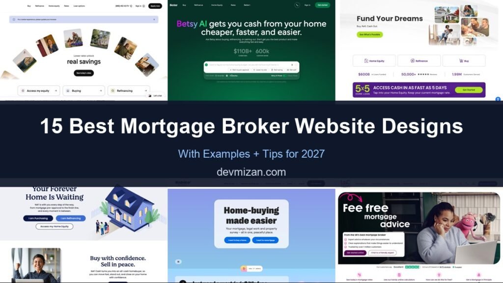
Mortgages are complicated and stressful, so the best mortgage broker websites do one thing brilliantly: make the next step feel simple. They explain options clearly, show what you could borrow or save, and invite you to start in minutes. This post showcases 15 of the best mortgage broker website design examples for 2027 from the US, UK, Australia, Canada, and the UAE, with screenshots, what each does well, and tips for your own site.
Table of Contents
What Makes a Great Mortgage Website?
- A simple first step. Get started, see rates, or check what you can borrow.
- Calculators. Affordability, repayment, and comparison tools.
- Plain-language guidance. Clear explanations for first-time buyers and remortgagers.
- Trust signals. Reviews, regulation details, and lender panels.
- Human help. Advisers, phone, chat, or WhatsApp for questions.
- Fast, secure forms. Applications that work well on mobile.
1. Rocket Mortgage

Rocket Mortgage arranges tilted photos of homes and families around a simple message about lower rates and real savings, with a See Today’s Rates button. Three cards underneath send visitors to the right journey: access my equity, buying, or refinancing, and the phone number and Apply Now sit in the header.
What to borrow: Three intent cards that route visitors by goal.
2. Better Mortgage

Better leads with its AI assistant: a headline about getting cash from your home cheaper and faster, plus a chat-style input with suggested prompts such as starting a pre-approval or lowering a monthly payment. Headline stats on loans funded and customers served sit just above it.
What to borrow: A conversational start instead of a long form.
3. loanDepot

loanDepot pairs “Fund Your Dreams” with a collage of home photos, then offers tiles for home equity, refinance, and buy. A stats bar highlights loans funded, reviews, and customers served, and a bold banner promotes a fast home equity product.
What to borrow: Proof numbers placed right under the main options.
4. New American Funding
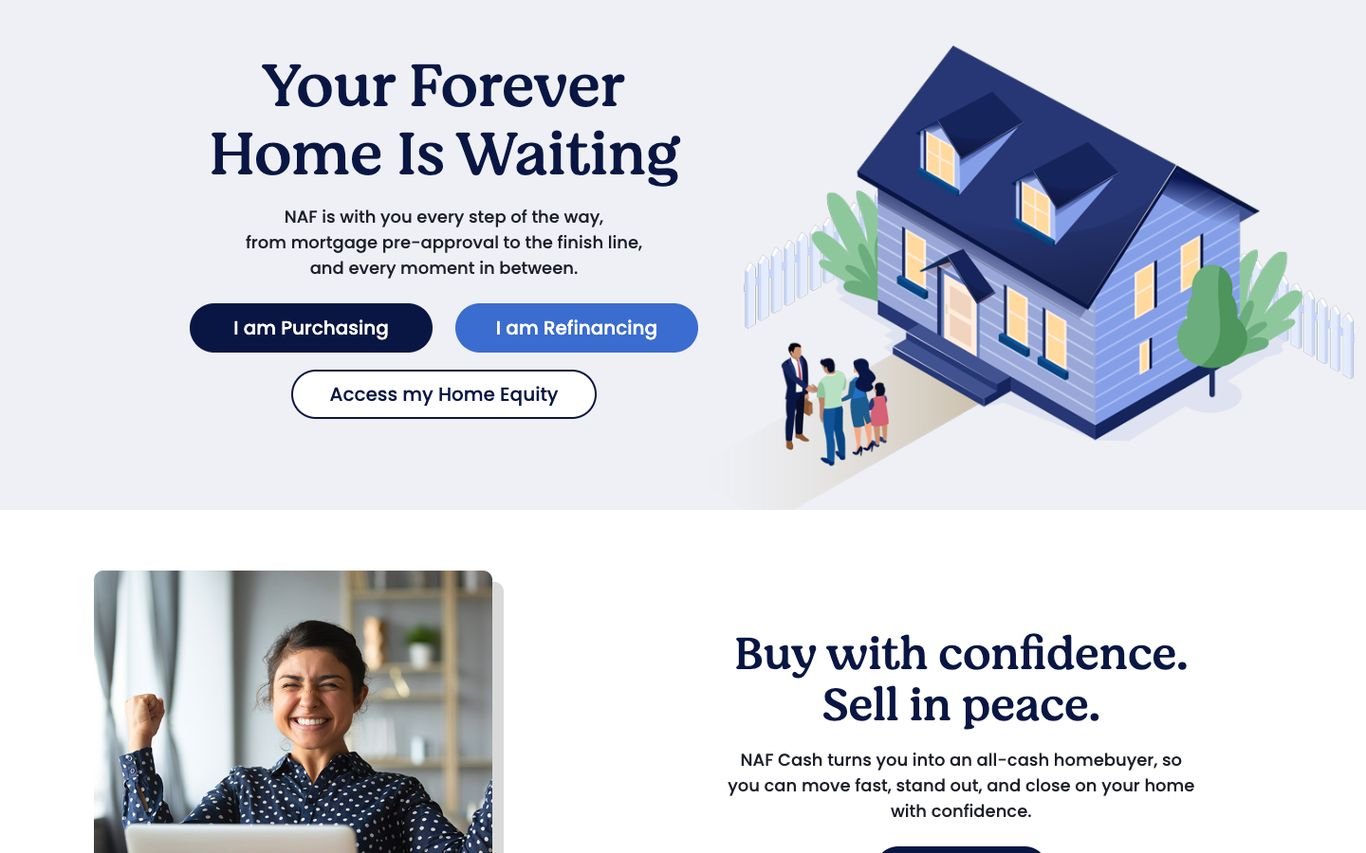
New American Funding uses a playful illustrated house with “Your Forever Home Is Waiting” and three buttons: I am purchasing, I am refinancing, and access my home equity. A second section promotes buying and selling with confidence.
What to borrow: “I am…” buttons that let visitors self-select.
5. Habito

Habito sets a rounded card against a bright sky: “Home-buying made easier,” with a line about handling the mortgage, legal work, and survey in one place. Two buttons, I want to buy a home and I want to remortgage, are the only actions.
What to borrow: A very short first step with just two choices.
6. L&C Mortgages

L&C makes its biggest selling point the headline, “Fee free mortgage advice,” alongside a photo with its pink mascot. A short checklist, Get Started Online and Chat to a Friendly Expert buttons, and a Trustpilot rating follow, with quick links to rates, calculators, and a mortgage in principle.
What to borrow: Lead with your biggest differentiator, here no fees.
7. Mojo Mortgages

Mojo pairs “Online mortgage broker” and a checklist of benefits with a live table of today’s average mortgage rates. Remortgage and Buy a Home buttons, a returning-user login link, and Trustpilot reviews complete the hero.
What to borrow: Show live rates on the homepage to build trust and urgency.
8. Better.co.uk (formerly Trussle)
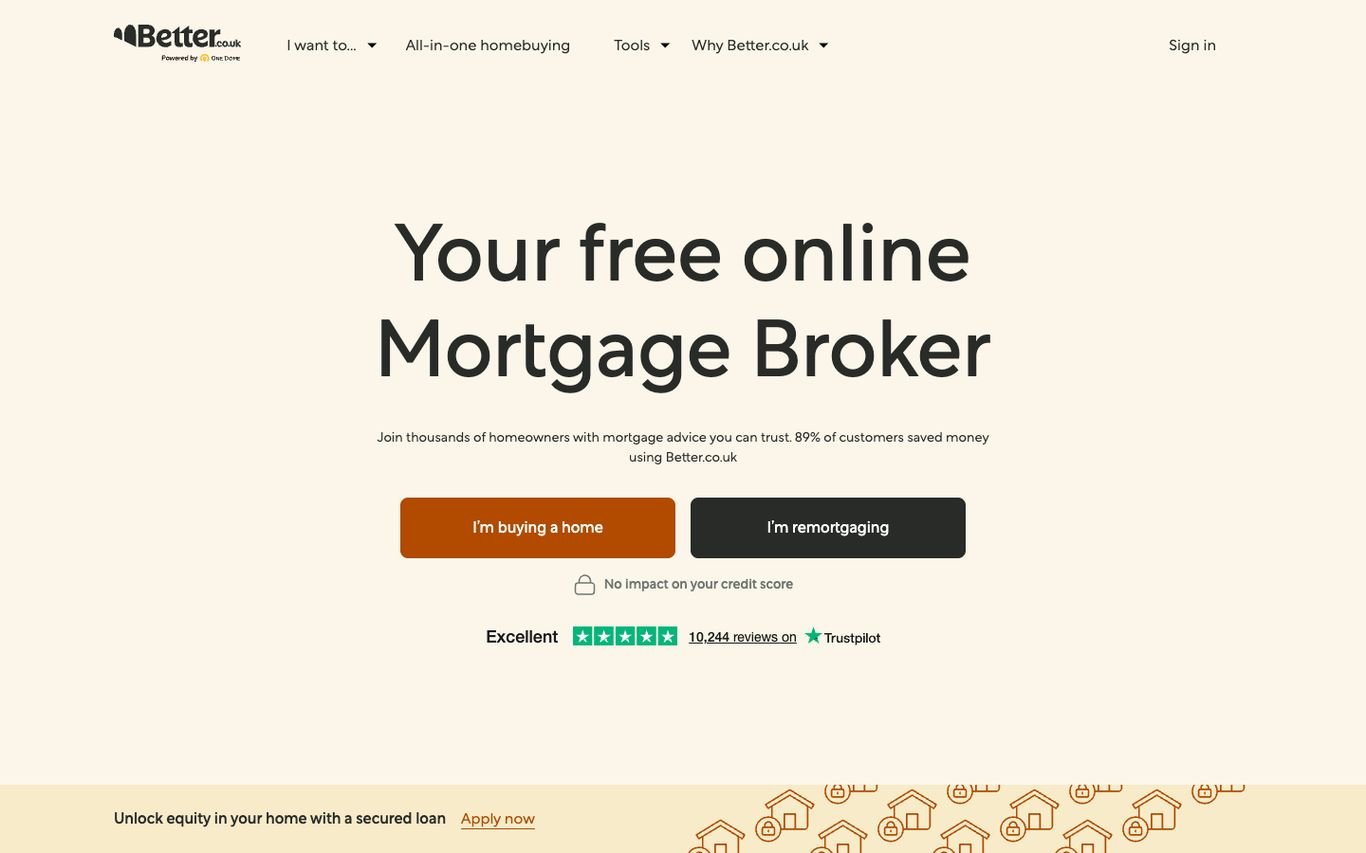
Better.co.uk keeps it simple: “Your free online Mortgage Broker” with two buttons, I’m buying a home and I’m remortgaging. A small note reassures visitors there is no impact on their credit score, and a Trustpilot rating with the number of reviews sits underneath.
What to borrow: Answer the “will this affect my credit score?” worry upfront.
9. Private Finance

Private Finance uses an elegant line-art illustration and the headline “The Client-First Independent Mortgage Broker,” with Get Started and phone buttons. Three stats underneath cover the number of lenders compared, its customer rating, and how long it has been advising.
What to borrow: Three proof points: choice, rating and track record.
10. Aussie

Aussie’s purple hero frames a home photo with an animated “It starts with…” headline and two buttons: I want to buy and I want to refinance. Stats on customers supported and years of experience sit at the bottom, and the header offers Talk to a Broker and Apply Now.
What to borrow: An animated headline that keeps the first screen lively.
11. Lendi

Lendi asks a pointed question, whether you are still on a 6%+ rate and paying more than you need to, followed by Book an Appointment and Compare Rates buttons and a review rating. A section on its panel of lenders shows partner logos.
What to borrow: A question that makes visitors check their own situation.
12. nesto

nesto uses bright yellow and the line “Low mortgage rates from the get go,” with a compact form right in the hero: buy, renew, or refinance, province, and first-time buyer status, then Explore Rates. A top banner reports the latest central bank rate news.
What to borrow: A three-question form that starts the quote immediately.
13. Holo

Holo sets a misty Dubai skyline behind “Everything you need to buy property in the UAE,” with two buttons: I’m looking for a mortgage, and help me find a property. The line “Find it. Finance it.” sums up the combined service.
What to borrow: Serve buyers who need a home and buyers who need finance.
14. Huspy

Huspy uses an elegant serif headline, “Home buying made simple,” over a Dubai skyline, with press logos and a customer quote bubble. Two cards split the journey into mortgages and properties.
What to borrow: Press logos as instant credibility for a newer brand.
15. Mortgage Finder

Mortgage Finder positions itself as “UAE’s Most Trusted Mortgage Advisor” and backs it up with a large Google review score right in the hero. Get Pre-Approved and Mortgage Calculator buttons follow, and WhatsApp and phone sit in the header.
What to borrow: A big, specific review score next to the main claim.
Quick Comparison
| Website | Market | Standout Feature | Our Rating |
|---|---|---|---|
| Rocket Mortgage | US | Photo collage and three clear paths | |
| Better Mortgage | US | AI assistant as the hero | |
| loanDepot | US | Goal tiles plus a stats bar | |
| New American Funding | US | Friendly illustration and role-based buttons | |
| Habito | UK | Calm, friendly card in the sky | |
| L&C Mortgages | UK | Fee-free message with a friendly mascot | |
| Mojo Mortgages | UK | Live rates table beside the pitch | |
| Better.co.uk (formerly Trussle) | UK | Two buttons and a credit-score reassurance | |
| Private Finance | UK | Line-art illustration and trust stats | |
| Aussie | Australia | Animated headline and buyer/refinancer split | |
| Lendi | Australia | Question-led headline that creates urgency | |
| nesto | Canada | Quote form in the hero | |
| Holo | UAE | Two paths: mortgage or property | |
| Huspy | UAE | Elegant serif and press logos | |
| Mortgage Finder | UAE | Review score front and centre |
Design Tips for Your Mortgage Website
1. Start With One Easy Question
The best sites start with something simple, such as buying or remortgaging, and build from there instead of showing a long form.
2. Use Calculators as Lead Magnets
Affordability and repayment calculators are among the most used tools and a natural point to capture contact details.
3. Explain the Process
Step-by-step guides reduce anxiety and help first-time buyers trust you.
4. Show Regulation and Reviews
Regulatory status and review ratings near calls to action build confidence.
5. Connect Leads to Your CRM
Every enquiry should reach an adviser quickly. See our guide to sending website enquiries straight into your CRM.
Frequently Asked Questions
What should a mortgage broker website include?
A simple way to start, calculators, guides for each buyer type, adviser contact options, reviews, and regulatory information.
How do mortgage brokers get leads online?
Through search for questions like ‘how much can I borrow’, calculators that capture details, and partnerships with estate agents and property sites.
Can a mortgage website integrate with real estate websites?
Yes. Mortgage calculators and referral forms can be added to agency and developer websites to generate leads for brokers.
Conclusion
The best mortgage websites turn a complex product into a simple first step. Use these 15 examples to design a site that explains clearly, builds trust, and gets visitors talking to an adviser.
For more inspiration, see our best real estate website designs and best solar company website designs.
Dev Mizan designs and builds fast, conversion-focused WordPress websites for growing businesses, with lead forms connected to your CRM. Get in touch to plan your new website, or message us on WhatsApp.