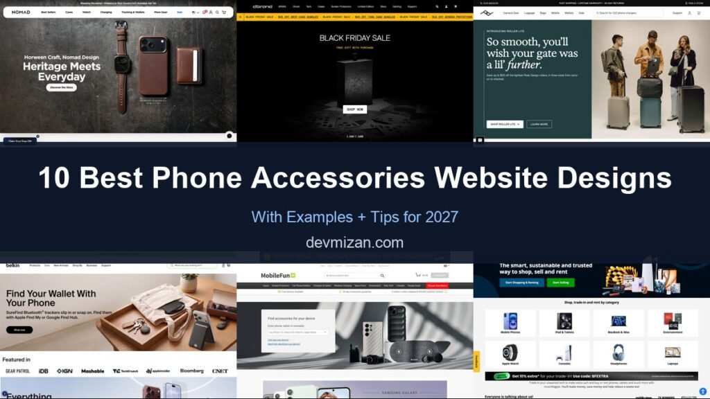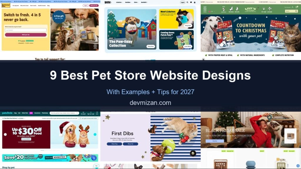
Pet owners shop often and care deeply, so the best pet supplies websites combine friendly design with fast search, subscriptions and helpful advice. This post showcases 9 of the best pet store website design examples for 2027, with screenshots, what each site does well, and practical tips you can use on your own website.
From big retailers to premium brands, these examples show how to turn one-off shoppers into loyal customers.
Table of Contents
What Makes a Great Pet Store Website?
- Shop by pet. Dogs, cats, fish and more, front and centre.
- Fast search and filters. By brand, life stage, diet and size.
- Subscriptions and autoship. Repeat deliveries for food and essentials.
- Personality. Warm, playful photography and copy.
- Services. Grooming, vets and training where offered.
- Advice content. Guides that build trust with pet owners.
1. Butternut Box
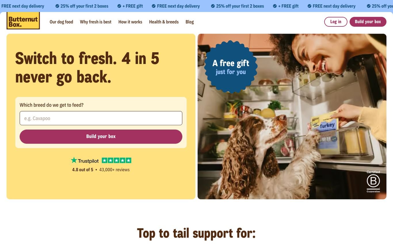
Butternut Box uses a sunny yellow panel with “Switch to fresh. 4 in 5 never go back.” and a single question, “Which breed do we get to feed?”, that leads straight into building a box. A Trustpilot rating with its review count sits underneath, and a ticker across the top repeats the current offers.
What to borrow: Start personalisation with one friendly question.
2. BarkBox

BarkBox arranges its homepage into colourful illustrated cards, from a seasonal toy collection to a new product and a “coming soon” teaser, each with its own Shop Now or Learn More button. The tone is fun and unmistakably on-brand.
What to borrow: Bento-style cards that promote several things without clutter.
3. Lily’s Kitchen
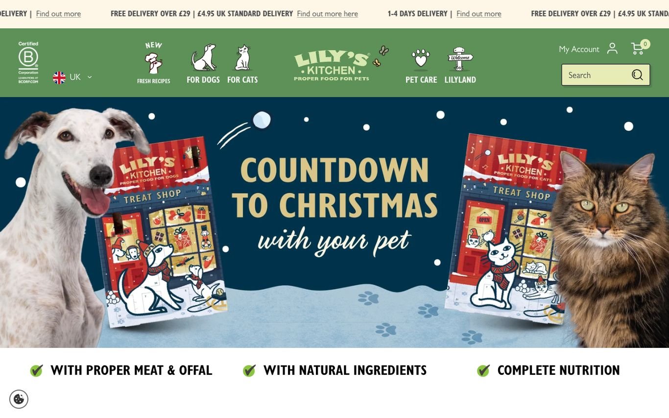
Lily’s Kitchen runs an illustrated seasonal campaign featuring a dog and a cat, with icon-led navigation for dogs, cats, and new recipes. A row of ticks underneath highlights proper meat, natural ingredients, and complete nutrition, and a B Corp badge adds credibility.
What to borrow: Simple ticks that state your product promises.
4. Pet Circle

Pet Circle combines a promo carousel and a first-order discount with an invitation to create a pet profile for tailored products and advice. Free next-day delivery messaging, a search bar, and links to insurance and pharmacy make it a full pet-care hub.
What to borrow: Personalisation through a saved pet profile.
5. Wild One
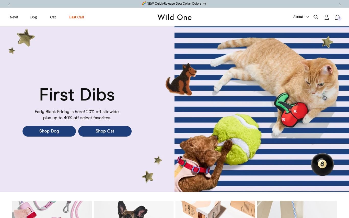
Wild One mixes a lavender panel with blue-and-white stripes, an illustrated cat, and floating toys to promote an early sale, with Shop Dog and Shop Cat buttons. It feels more like a design brand than a pet shop.
What to borrow: A distinctive art direction that sets a premium brand apart.
6. Fable Pets
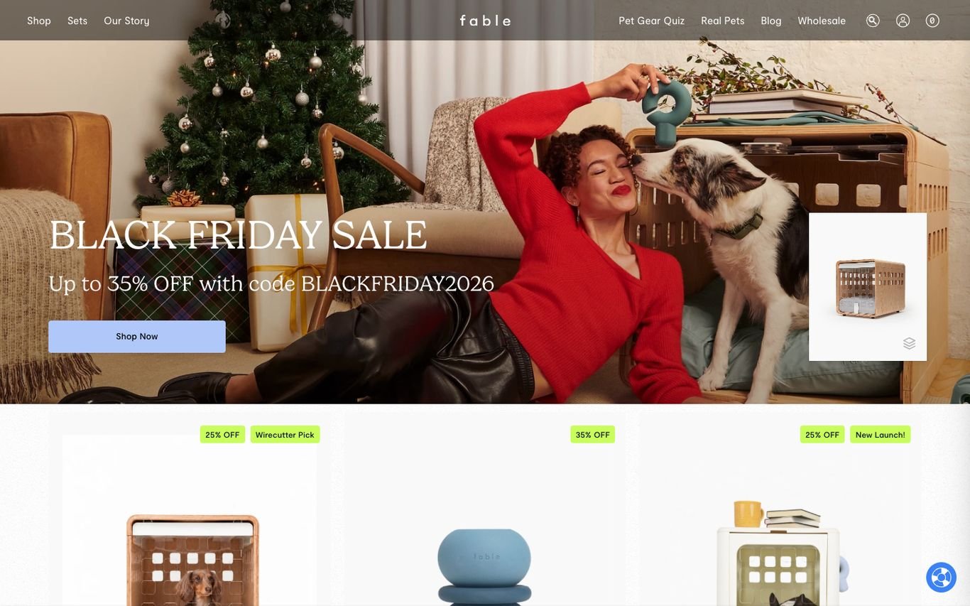
Fable shows a stylish owner and dog in a festive living room, with a sale banner and product cards below. The navigation includes a pet gear quiz and real pet stories, which help shoppers choose and trust the products.
What to borrow: A product quiz that recommends the right gear.
7. Pets at Home

Pets at Home pairs a seasonal sale banner with navigation by pet, from dogs and cats to fish, reptiles, and birds, plus subscribe and save. The top bar highlights fast click and collect and delivery, and links promote its loyalty club and pet insurance quotes.
What to borrow: Services like insurance and grooming alongside products.
8. PetSmart

PetSmart leads with a bold discount banner and a dog with a holiday toy, followed by colourful category tiles for food, treats, and pharmacy. A top bar covers adoptions, store finder, rewards, and autoship.
What to borrow: Autoship and rewards linked from every page.
9. zooplus

zooplus uses bright green branding, promotional tiles, and a strip of benefits: a discount on the first subscription order, a points club, and free delivery over a threshold. A large search bar makes its huge range easy to explore.
What to borrow: A benefits strip that sells subscriptions and loyalty.
Quick Comparison
| Website | Market | Standout Feature | Our Rating |
|---|---|---|---|
| Butternut Box | UK | Breed input that starts the subscription | |
| BarkBox | US | Playful bento-style homepage | |
| Lily’s Kitchen | UK | Illustrated campaigns and clear food promises | |
| Pet Circle | Australia | Pet profiles for personalised shopping | |
| Wild One | US | Design-led illustration and stripes | |
| Fable Pets | US | Lifestyle photography and a gear quiz | |
| Pets at Home | UK | Shop by pet plus services | |
| PetSmart | US | Bold promotion and category tiles | |
| zooplus | UK / Europe | Promotions plus a benefits strip |
Design Tips for Your Pet Store Website
1. Start With Shop by Pet
Most visitors arrive thinking about one animal, so let them choose it first.
2. Promote Subscriptions
Autoship discounts turn food purchases into recurring revenue.
3. Use Real Pet Photography
Happy pets sell better than product shots alone.
4. Add Expert Advice
Feeding and care guides attract search traffic and build trust.
5. Make Reordering Easy
Saved favourites and one-click reorder keep customers coming back.
Frequently Asked Questions
What should a pet store website include?
Shop by pet, search and filters, subscriptions, reviews, delivery information and helpful advice.
Is WooCommerce good for a pet store?
Yes. WooCommerce supports subscriptions, large catalogues and loyalty features.
How can a pet shop increase repeat orders?
Autoship subscriptions, reminders and loyalty points.
Conclusion
The best pet store website design combines trust, clarity and an obvious next step. Make it fast to find the right product for each pet and easy to reorder. Use these 9 examples as inspiration and adapt the patterns that fit your business.
For more inspiration, see our best real estate website designs and best solar company website designs.
Dev Mizan designs and builds fast, conversion-focused WordPress websites for growing businesses, with lead forms connected to your CRM. Get in touch to plan your new website, or message us on WhatsApp.