Property management companies sell peace of mind to landlords and great homes to tenants, and their websites need to speak to both. The best property management websites explain services and fees clearly, show what landlords can earn, and make it easy for tenants to find a home or get support. This post showcases 12 of the best property management website design examples for 2027, from build-to-rent operators to holiday-let managers, with screenshots, what each does well, and tips for your own site.
Table of Contents
What Makes a Great Property Management Website?
- Separate paths for landlords and tenants. Each audience should see its own next step.
- Transparent services and fees. What is included and what it costs.
- Income or rent estimates. A calculator or valuation is a powerful lead magnet for landlords.
- Available homes. Listings that stay accurate and up to date.
- Resident or owner portals. Logins for maintenance, statements, and payments.
- Trust signals. Reviews, accreditations, and numbers under management.
1. Greystar
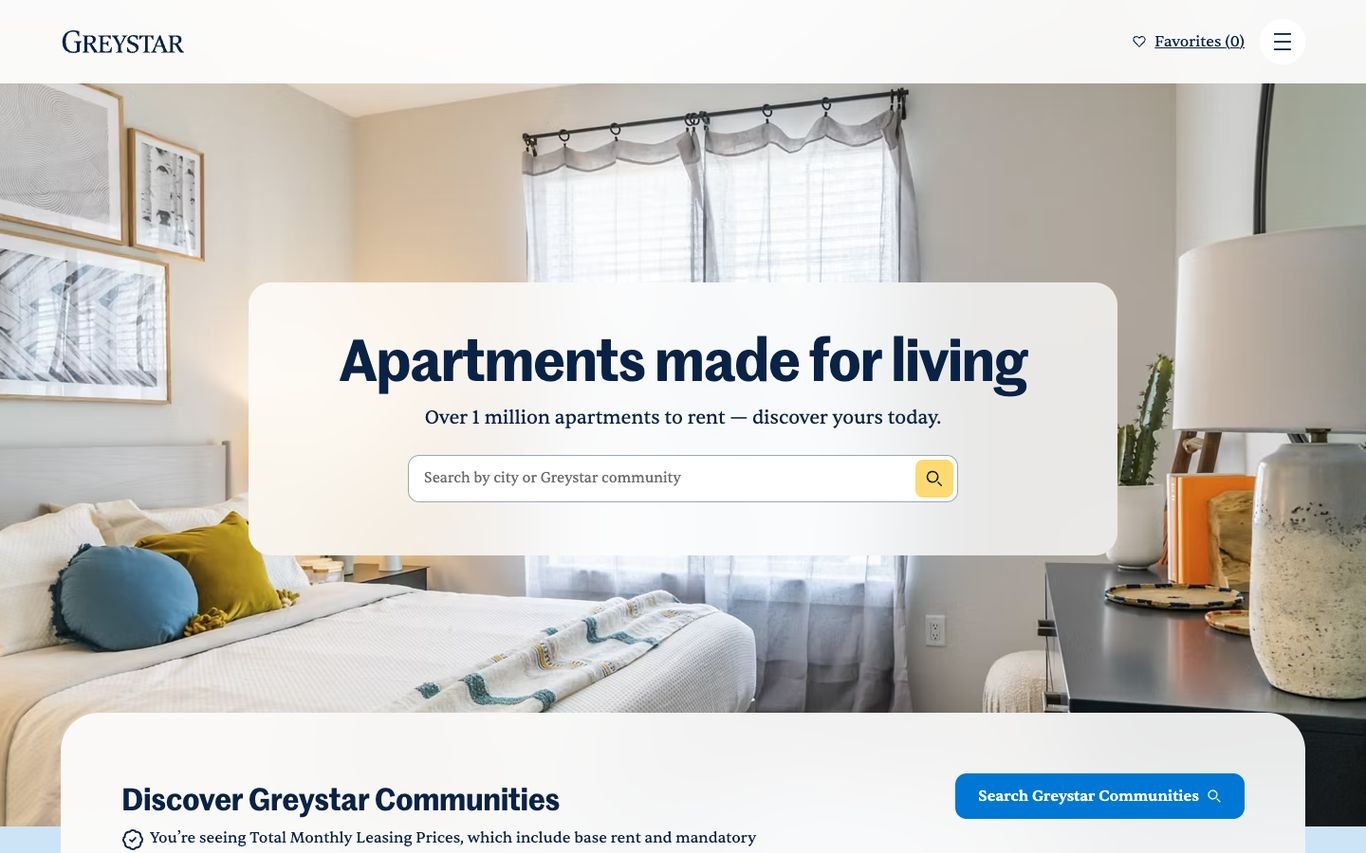
Greystar frames a warm, sunlit bedroom with a search card, “Apartments made for living,” and a search by city or community. A bar below invites visitors to discover its communities and notes that prices shown include mandatory fees, a transparent touch renters appreciate.
What to borrow: Price transparency notes right under the search.
2. Mynd
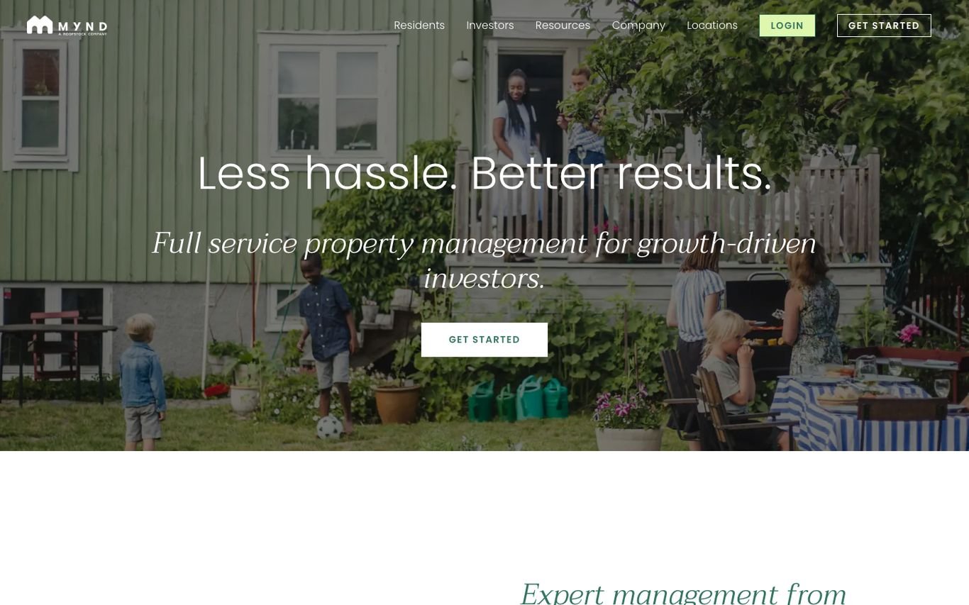
Mynd speaks directly to property investors with “Less hassle. Better results.” and the subline “Full service property management for growth-driven investors,” plus a Get Started button. Navigation separates investors and residents, with a login for each.
What to borrow: A headline that names the exact audience.
3. Evernest

Evernest uses a bright gradient with “Nationally Known, Locally Grown Full-Service Property Management.” Three cards send visitors to search rentals, rent out their home, or buy and sell, and a top bar offers owner and resident logins plus a free rental report.
What to borrow: A free rental report as a lead magnet for landlords.
4. Belong
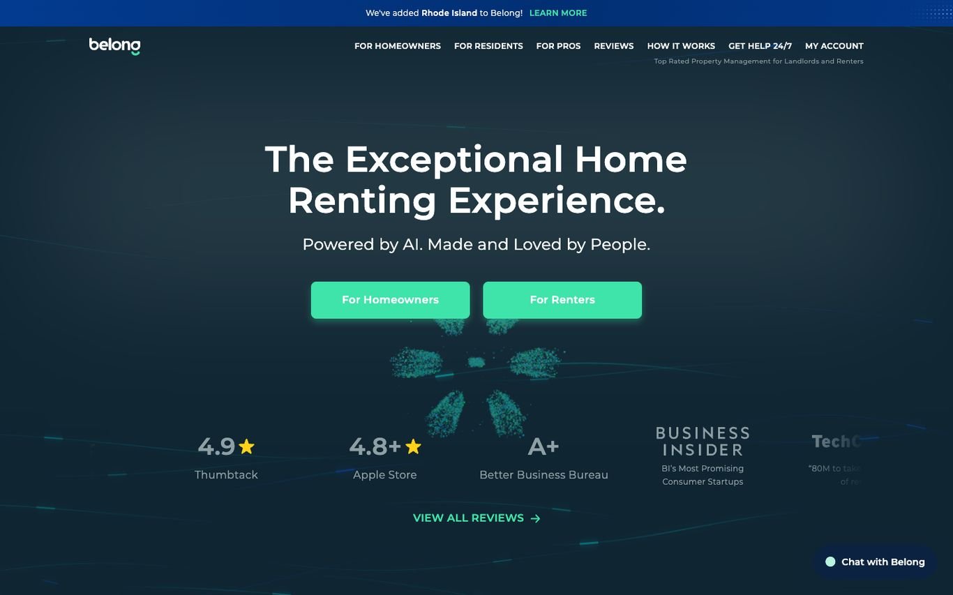
Belong’s dark blue hero promises “The Exceptional Home Renting Experience,” powered by AI and made by people. Two buttons split the audience into homeowners and renters, and a row of ratings from review sites and press sits below.
What to borrow: Separate buttons for each audience, backed by review scores.
5. Grainger

Grainger shows residents relaxing at home with the line “Your next chapter starts here,” plus a search by location and number of bedrooms. The tone is warm and focused on renters rather than investors.
What to borrow: Real residents in the photography make rental feel like home.
6. Get Living
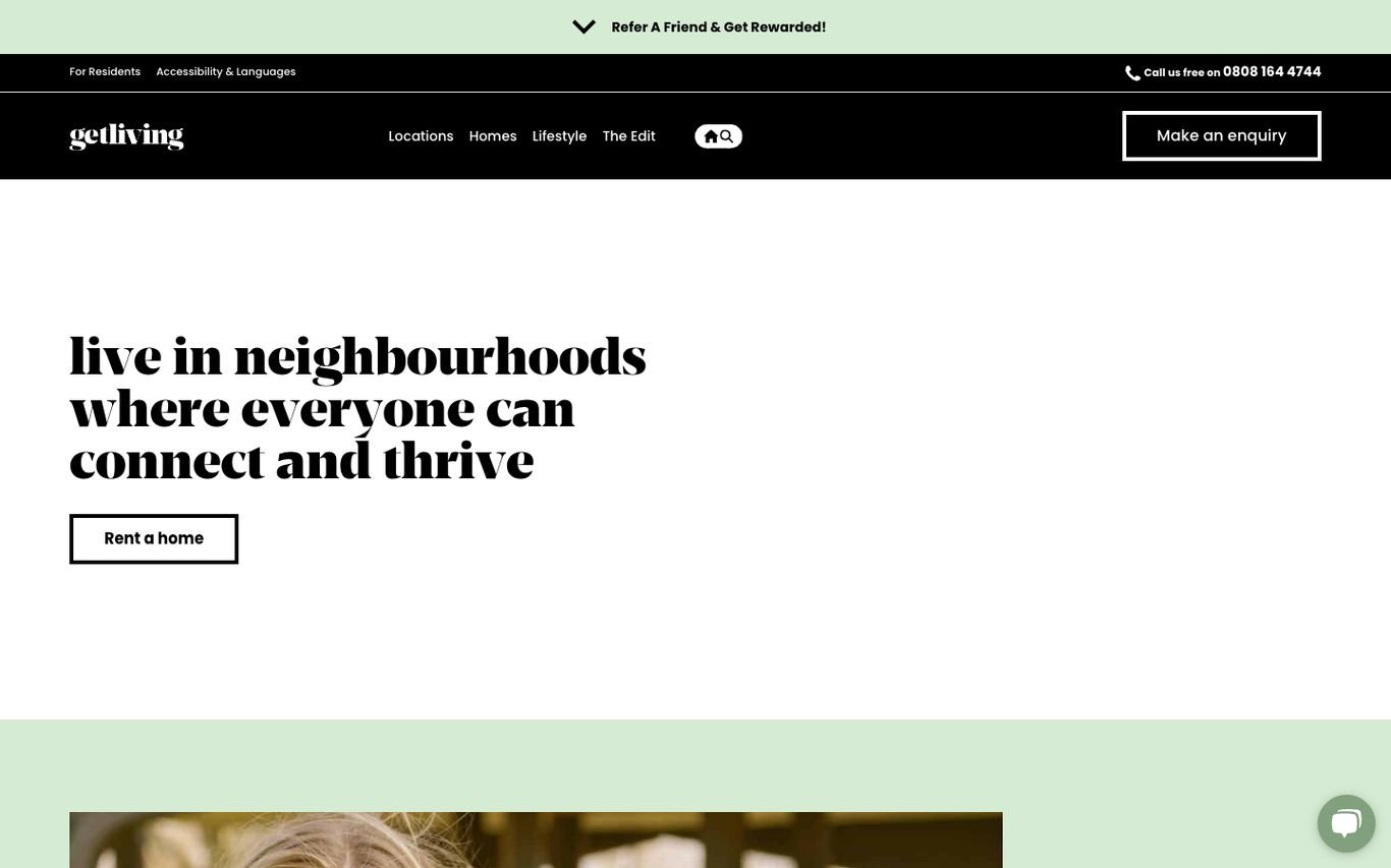
Get Living leads with “live in neighbourhoods where everyone can connect and thrive” and a Rent a Home button. A refer-a-friend banner, phone number, and Make an Enquiry button sit in the header.
What to borrow: A referral banner to turn residents into ambassadors.
7. Quintain Living
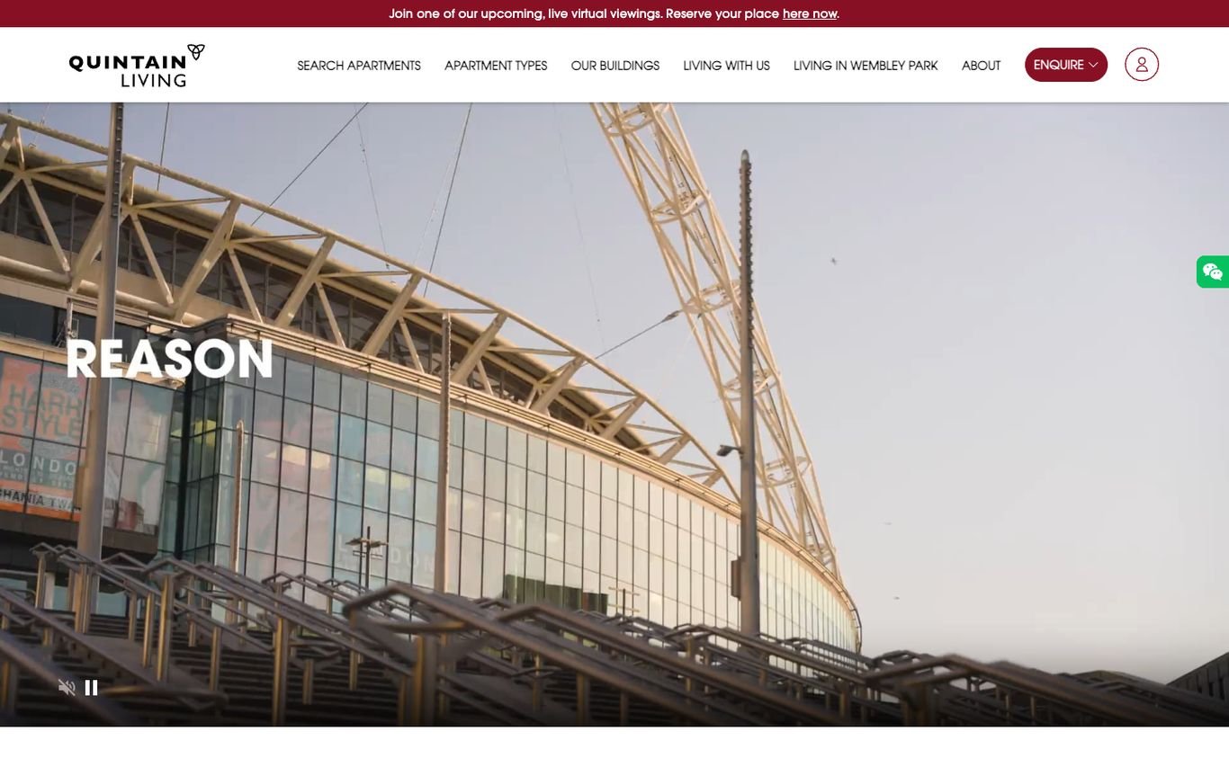
Quintain Living plays cinematic video of its Wembley Park neighbourhood and promotes live virtual viewings in a banner across the top. The navigation covers searching apartments, apartment types, its buildings, living with them, and life in the area, with an Enquire button.
What to borrow: Virtual viewings for renters who can’t visit in person.
8. Essential Living

Essential Living’s hero, “Apartments to rent in London,” sits over an aerial photo with a resident review rating above it. A short line highlights pet-friendly apartments, gyms, concierge, and roof terraces, with buttons to find an apartment or discover locations.
What to borrow: Name the amenities renters search for in the hero.
9. Houst
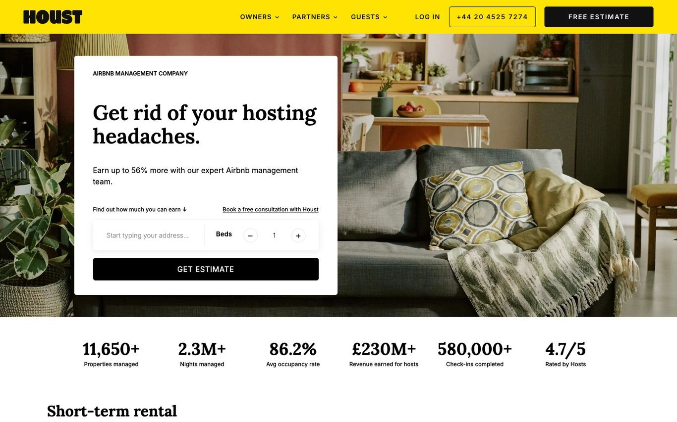
Houst’s yellow-accented design opens with a card, “Get rid of your hosting headaches,” and an instant estimate form asking for the address and number of bedrooms. A row of big numbers underneath covers properties managed, occupancy, revenue for hosts, and its rating.
What to borrow: An instant earnings estimate to capture landlord leads.
10. GuestReady

GuestReady opens with a strip of colourful interior photos and “Book your next stay with GuestReady,” with a destination and dates search for guests. An “I’m a property owner” button gives landlords their own route in.
What to borrow: Serve guests and property owners from the same hero.
11. Pass the Keys
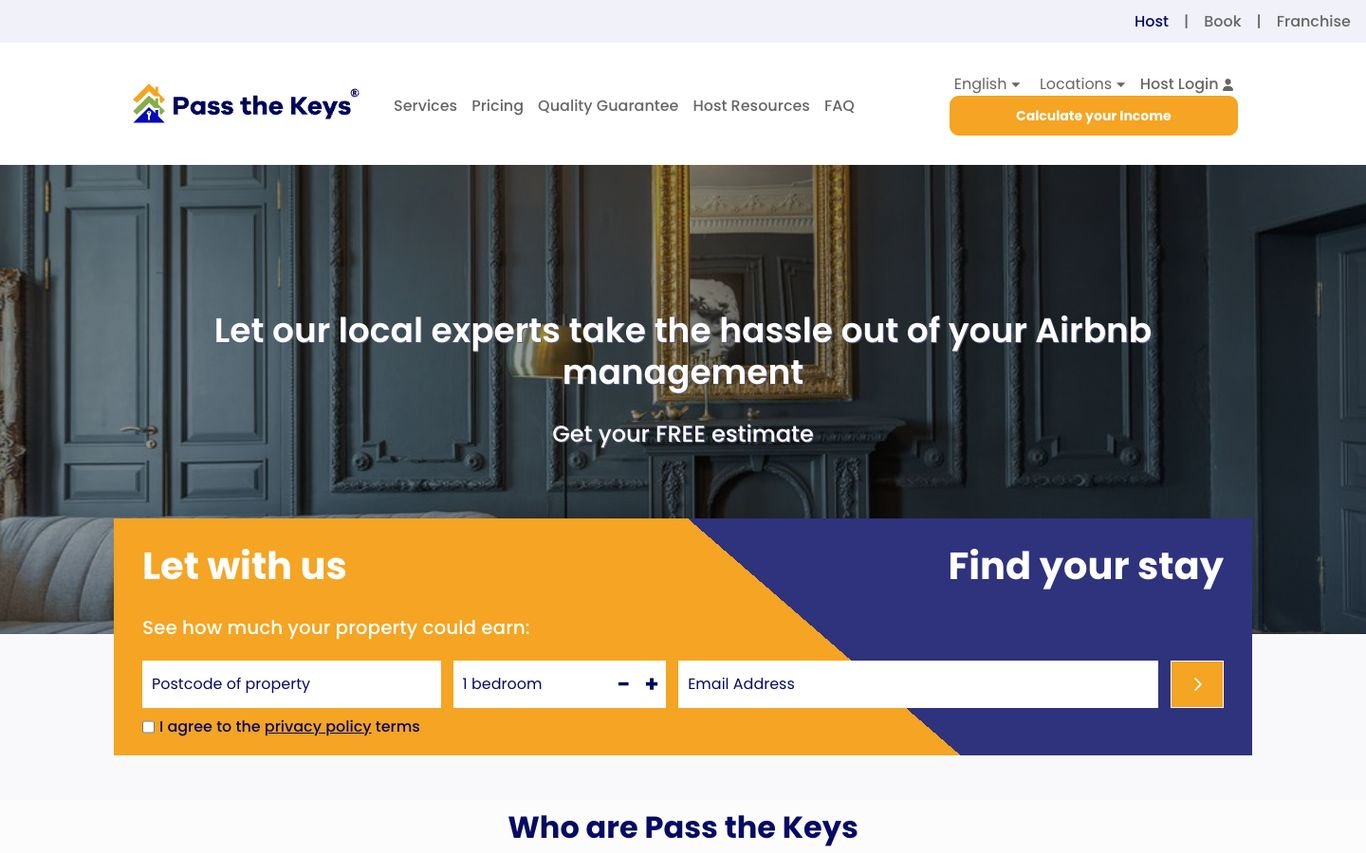
Pass the Keys promises to take the hassle out of Airbnb management, then splits the hero into two panels: Let With Us, with a postcode, bedrooms, and email form for an income estimate, and Find Your Stay for guests. A Calculate Your Income button stays in the header.
What to borrow: A split hero that serves both sides of the marketplace.
12. Frank Porter
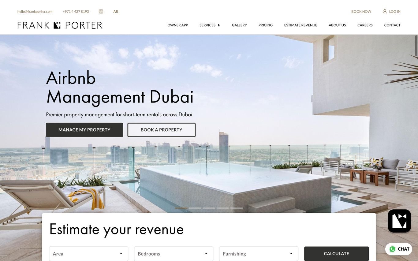
Frank Porter shows a luxury Dubai apartment terrace with “Airbnb Management Dubai” and two buttons, Manage My Property and Book a Property. An “Estimate your revenue” calculator, with area, bedrooms, and furnishing, sits right at the bottom of the hero, with WhatsApp chat in the corner.
What to borrow: A revenue calculator tailored to local areas and property types.
Quick Comparison
| Website | Market | Standout Feature | Our Rating |
|---|---|---|---|
| Greystar | Global | Apartment search in a cosy lifestyle hero | |
| Mynd | US | Investor-focused promise | |
| Evernest | US | Three clear paths and owner tools | |
| Belong | US | Homeowner and renter buttons with review proof | |
| Grainger | UK | Lifestyle photo and a simple home search | |
| Get Living | UK | Community-first message | |
| Quintain Living | UK | Destination video and virtual viewings | |
| Essential Living | UK | Review rating and amenity-led copy | |
| Houst | UK | Earnings estimate form plus a stats bar | |
| GuestReady | Global | Guest booking and owner path side by side | |
| Pass the Keys | UK | Split panel for hosts and guests | |
| Frank Porter | Dubai | Revenue calculator for Dubai owners |
Design Tips for Your Property Management Website
1. Split Landlords and Tenants Early
Use the hero or main navigation to send each audience to the right place.
2. Offer an Instant Rental or Income Estimate
Short-let managers like Houst and GuestReady lead with earnings estimates, which turn browsing landlords into leads.
3. Keep Listings in Sync
Available homes should update automatically from your property management software or CRM. See how to import properties from any CRM into WordPress.
4. Be Clear About Fees
Transparent pricing builds trust and filters out poor-fit landlords.
5. Link to Portals
Resident and owner logins in the header reduce support calls.
Frequently Asked Questions
What should a property management website include?
Services and fees for landlords, available properties for tenants, a rental or income estimate, portals, reviews, and contact details.
How do property managers get new landlords online?
Through rental valuation tools, local search pages, and clear fee and service information that answers landlords’ questions.
Can a WordPress site show live rental listings?
Yes. Listings can be synced automatically from most property management systems and CRMs into WordPress.
Conclusion
The best property management websites serve landlords and tenants equally well and make every next step obvious. Use these 12 examples to plan a site that wins instructions and keeps residents happy.
For more inspiration, see our best real estate website designs and best solar company website designs.
Dev Mizan designs and builds fast, conversion-focused WordPress websites for growing businesses, with lead forms connected to your CRM. Get in touch to plan your new website, or message us on WhatsApp.
Want more inspiration? Browse all website design examples by industry →