A restaurant website has a simple job: make people hungry, then help them book a table or order. The best restaurant websites capture the mood of the dining room in a single screen and keep the menu, location, and booking button one tap away. This post showcases 18 of the best restaurant website designs for 2027, from fine dining to fast casual, with screenshots, what each does well, and tips for your own restaurant.
Table of Contents
What Makes a Great Restaurant Website?
- A strong first impression. Photography or video that sets the mood.
- Booking or ordering front and centre. Reservations, delivery, and click-and-collect.
- A readable menu. HTML menus, not hard-to-read PDFs.
- Locations and hours. Especially important for multi-site brands.
- Mobile-first design. Most restaurant searches happen on phones.
- Personality. Tone of voice and design that match the food.
1. Alinea
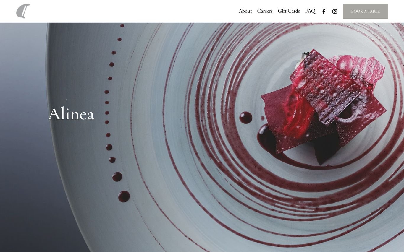
Alinea’s homepage is one dramatic overhead photograph of a plated dish, with the restaurant’s name in small, elegant type and a slim navigation for about, careers, gift cards, FAQ, and a Book a Table button. The restraint mirrors the precision of the food.
What to borrow: Let a single signature dish be the hero.
2. Chipotle
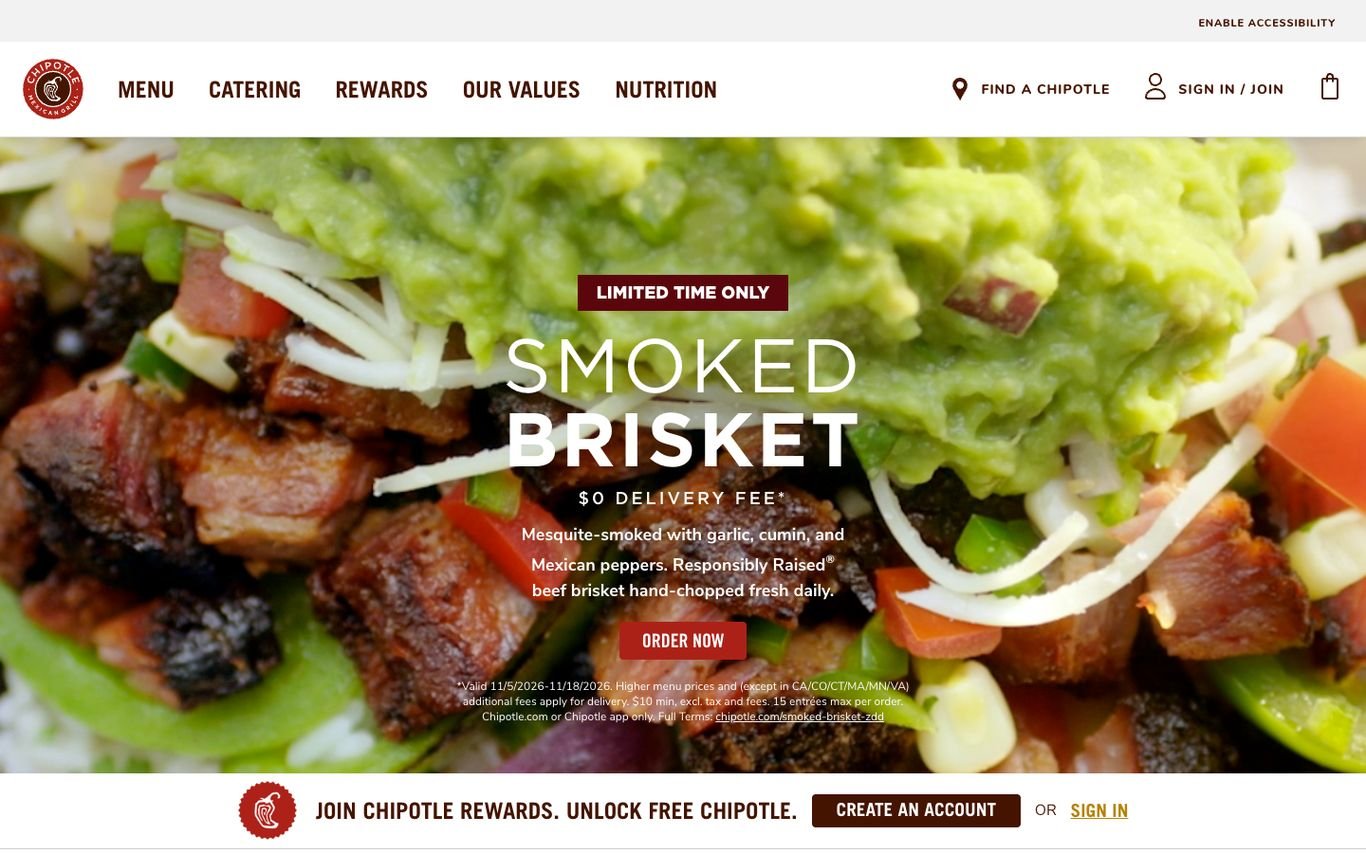
Chipotle leads with a mouth-watering close-up of a limited-time menu item, a delivery offer, and an Order Now button. A banner directly underneath invites visitors to join its rewards programme, and the header covers menu, catering, rewards, values, nutrition, and a location finder.
What to borrow: Pair the order button with a loyalty sign-up.
3. COQODAQ

COQODAQ plays atmospheric video of its kitchen at work, with simple navigation for menus, groups and events, delivery, and about. A bright orange Book a Table button stands out against the dark palette.
What to borrow: One high-contrast booking button against a dark, moody design.
4. Dishoom
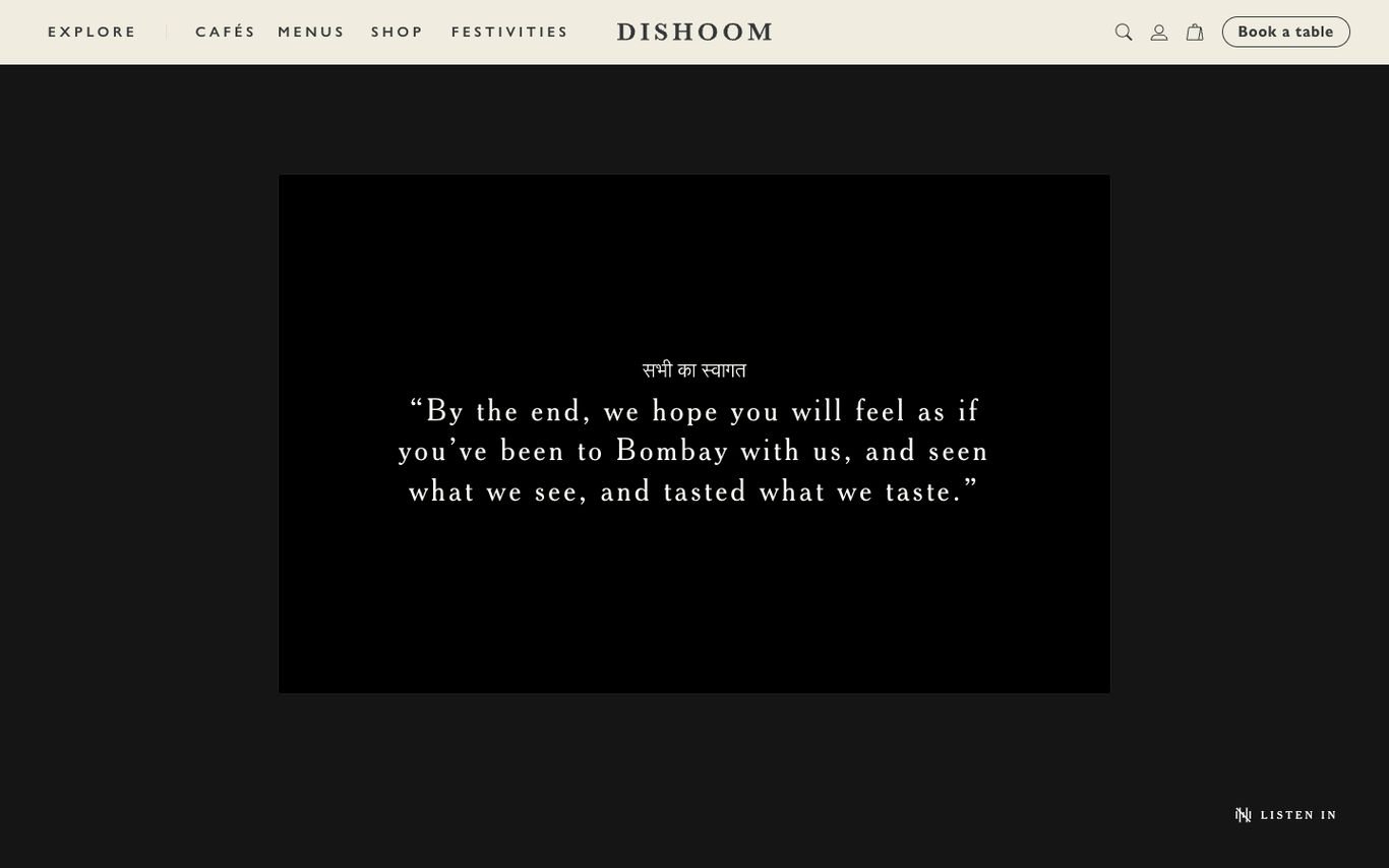
Dishoom opens with a story rather than a menu: a quote about feeling as if you have been to Bombay, set in elegant type on a dark screen, with an option to listen. The navigation then covers cafés, menus, its shop, and festivities, with Book a Table always in the header.
What to borrow: Open with your brand story and atmosphere, not just the food.
5. Flat Iron

Flat Iron stamps “Great Steak for Everyone” in bold type over a photo of its menu and signature cleaver. It instantly communicates the brand’s promise of simple, affordable steak, with Book a Table in the corner.
What to borrow: A one-line promise that sums up the whole concept.
6. Gordon Ramsay Restaurants

Gordon Ramsay Restaurants uses a seasonal hero slider, here promoting Christmas dining, and places a full booking bar along the bottom: choose the restaurant, date, time, and party size, then book. For a group with many venues, it removes several steps.
What to borrow: A booking bar with restaurant, date, time and guests on the homepage.
7. Honest Burgers

Honest Burgers uses chunky boxed navigation buttons for menu, locations, booking, ordering, and its shop, plus a vertical logo and deep green palette. Tiles below tell the brand story, promote new menu items, and celebrate an award, all in the same confident voice.
What to borrow: Let the layout itself express your personality.
8. LPM Restaurants

LPM, La Petite Maison, overlays hand-written red script over a sunlit table of Mediterranean dishes, evoking the French Riviera. A vertical reservations tab stays on the side of the screen.
What to borrow: Hand-drawn elements that make a global brand feel personal.
9. Shake Shack
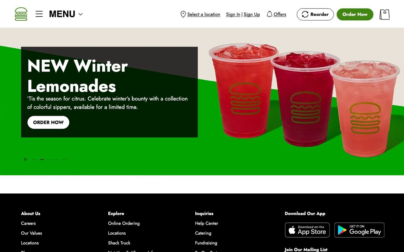
Shake Shack promotes seasonal drinks in a bold green-and-black hero with an Order Now button. The header is built for ordering: select a location, sign in, offers, reorder, and Order Now, and the footer promotes its app.
What to borrow: A Reorder button for returning customers.
10. wagamama

wagamama writes in its trademark lowercase: “our new menu is making waves”, over a colourful bowl of food, with a button to see the new menu. The navigation covers ordering online, its loyalty club, kids and families, and a prominent Book a Table button.
What to borrow: A consistent tone of voice across every headline.
11. Zuma
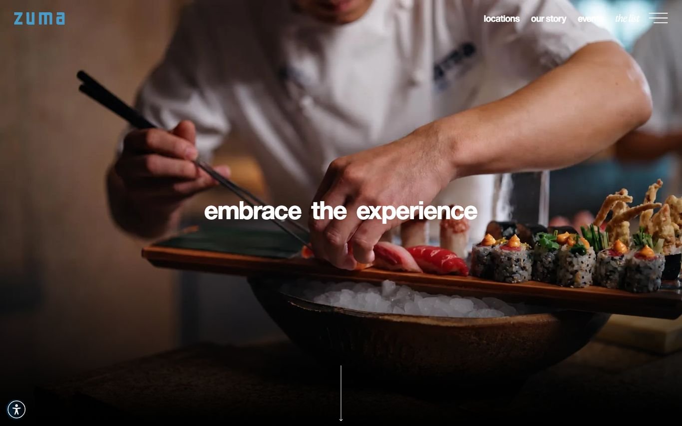
Zuma shows a chef plating sushi with the line “embrace the experience”, and keeps the navigation minimal with locations and its story. The focus is on craft and atmosphere rather than offers.
What to borrow: Show the craft behind the food to justify a premium price.
12. BAO

BAO places perfectly photographed bao buns, cut out against a soft cream background, around the line “Award winning Taiwanese Restaurants” and a list of its London locations. The navigation covers restaurants, karaoke, seasonal menus, its shop, delivery or collection, and bookings.
What to borrow: Cut-out product shots that make the food the hero.
13. LEON
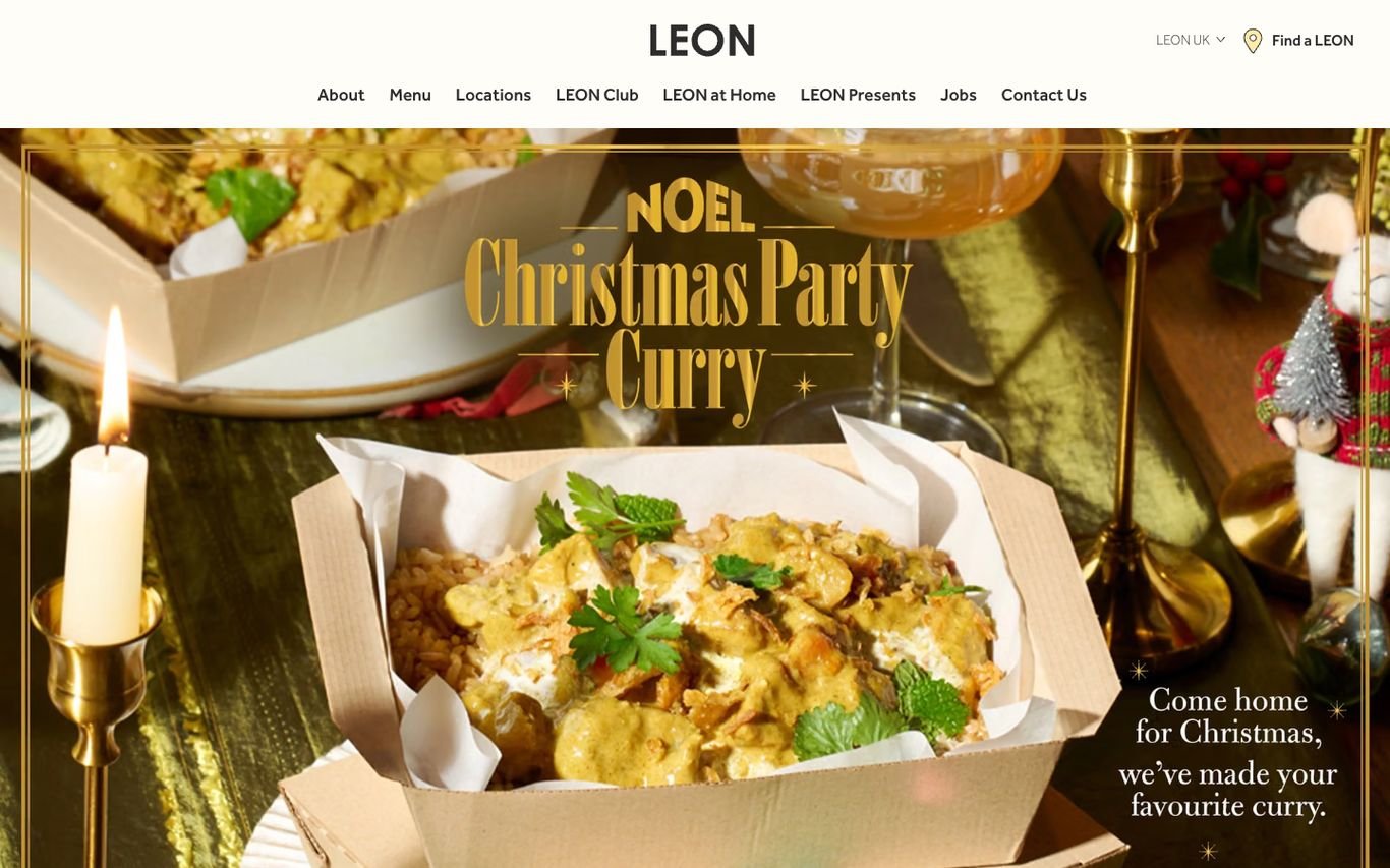
LEON promotes a seasonal special with hand-lettered type over a warm, candlelit food photo, plus a short friendly line underneath. The navigation includes its loyalty club, LEON at Home, and a Find a LEON location button.
What to borrow: Hand-lettering that adds warmth and personality to promotions.
14. PizzaExpress
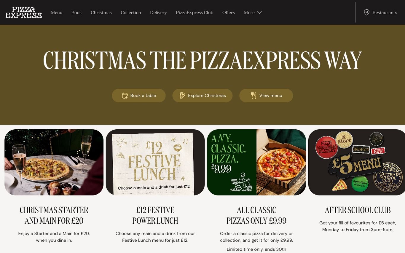
PizzaExpress pairs a big seasonal headline with Book a Table, Explore, and View Menu buttons, then a row of illustrated offer cards, each with a price and a short description. Visitors see the current deals without leaving the homepage.
What to borrow: A row of offer cards with clear prices.
15. ROKA

ROKA runs its name in huge thin letters over a vivid, close-up shot of desserts and fruit. The navigation covers restaurants, menu, group dining, about, and careers.
What to borrow: Oversized branding over close-up food photography.
16. sketch

sketch, known for its art and design, greets visitors with playful 3D objects floating over a snowy scene. The address and phone number sit in a slim bar at the bottom, and a Reservations & Menus button keeps the practical path clear.
What to borrow: Let a distinctive brand show up in the homepage itself.
17. Sticks’n’Sushi

Sticks’n’Sushi shows an overhead spread of dishes on a deep red table with “Many traditions. One table.” and a link to festive group menus. Takeaway and Book a Table buttons sit in the header.
What to borrow: Overhead table shots that sell sharing and group bookings.
18. The Fat Duck

The Fat Duck plays close-up video of a dish being prepared, with a short line about the dining experience and its famous chef, and a Book a Table button. A gift shop and experiences sit in the header.
What to borrow: Video that turns a meal into an experience worth booking.
Quick Comparison
| Website | Market | Standout Feature | Our Rating |
|---|---|---|---|
| Alinea | US | Fine-dining minimalism | |
| Chipotle | US | Limited-time offer plus rewards | |
| COQODAQ | US | Moody kitchen video and a bright booking button | |
| Dishoom | UK | Storytelling before selling | |
| Flat Iron | UK | Bold brand voice over real menu photography | |
| Gordon Ramsay Restaurants | Global | Booking widget built into the hero | |
| Honest Burgers | UK | Chunky, characterful layout | |
| LPM Restaurants | Global | Hand-written script over Riviera photography | |
| Shake Shack | US | Seasonal promo plus ordering tools | |
| wagamama | UK | Playful lowercase brand voice | |
| Zuma | Global | Cinematic chef photography | |
| BAO | UK | Cut-out food photography on a calm background | |
| LEON | UK | Hand-lettered seasonal hero | |
| PizzaExpress | UK | Seasonal hero plus offer cards | |
| ROKA | Global | Giant wordmark over vivid food | |
| sketch | UK | Art-led, playful homepage | |
| Sticks’n’Sushi | UK / Denmark | Overhead table spread and group dining | |
| The Fat Duck | UK | Cinematic video and a story of experience |
Design Tips for Your Restaurant Website
1. Put Booking and Ordering Everywhere
A sticky Book or Order button on mobile is the single most valuable element on a restaurant site.
2. Use Real Food and Interior Photography
Professional photos of your actual dishes and dining room sell far better than stock imagery.
3. Publish Menus as Text
HTML menus load fast, read well on phones, and help you appear in searches for specific dishes.
4. Make Locations Easy
Each site needs its own page with address, map, hours, and booking link.
5. Show Personality
The best sites, from Dishoom to Honest Burgers, sound like the restaurant. Let your brand voice come through.
Frequently Asked Questions
What should a restaurant website include?
Menus, booking or ordering, location and opening hours, photos, contact details, and private dining or events information.
Should my menu be a PDF?
Ideally not. Text menus are faster, easier to read on mobile, and better for search.
Can I take reservations and orders on a WordPress site?
Yes. WordPress integrates with most reservation and online ordering platforms, or can run its own ordering with WooCommerce.
Conclusion
The best restaurant websites make you hungry and make booking easy. Use these 18 examples for inspiration, and make sure your menu, location, and booking button are never more than a tap away.
For more inspiration, see our best real estate website designs and best solar company website designs.
Dev Mizan designs and builds fast, conversion-focused WordPress websites for growing businesses, with lead forms connected to your CRM. Get in touch to plan your new website, or message us on WhatsApp.