Sports and outdoor retailers serve everyone from beginners to serious athletes, so their websites need inspiring imagery, expert guidance and fast, filterable shopping. This post showcases 9 of the best sports store website design examples for 2027, with screenshots, what each site does well, and practical tips you can use on your own website.
The best sports store websites combine performance-led storytelling with specialist navigation and strong loyalty programmes.
Table of Contents
What Makes a Great Sports Store Website?
- Shop by sport or activity. Running, cycling, gym, outdoors and more.
- Powerful filters. Size, brand, level and technical specs.
- Inspiring imagery. Athletes and adventures in action.
- Expert advice. Buying guides, fitting tools and reviews.
- Membership and rewards. Loyalty programmes and member pricing.
- Click and collect. For retailers with stores.
1. evo
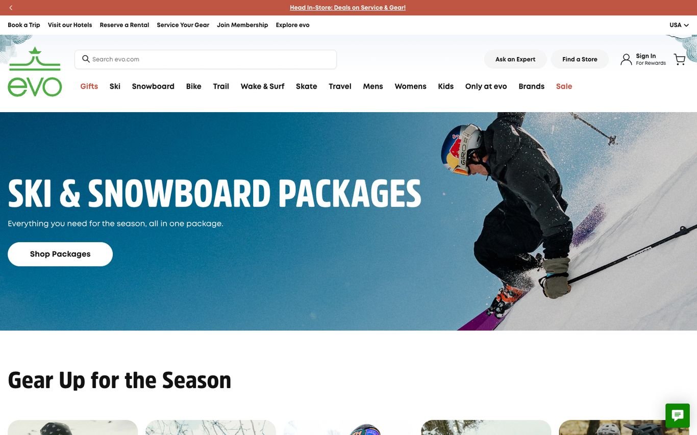
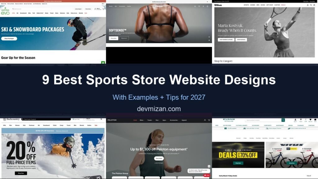
evo promotes ski and snowboard packages with a dynamic action shot, but its top bar is the real lesson: links to book a trip, visit its hotels, reserve a rental, service your gear, and join the membership, plus Ask an Expert and Find a Store.
What to borrow: Connect retail with services like rentals and repairs.
2. Gymshark
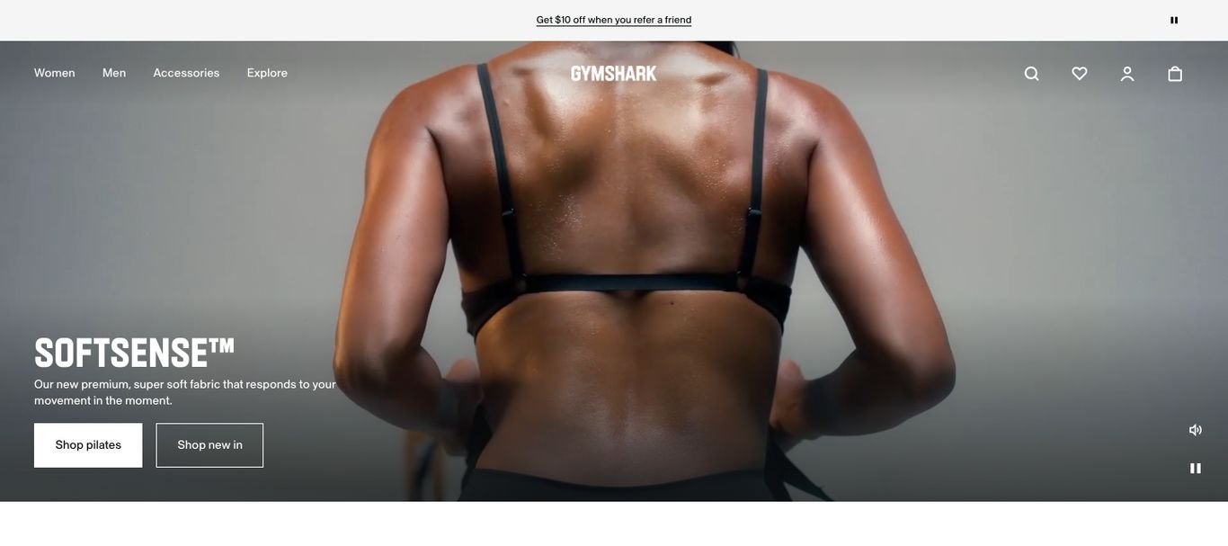
Gymshark launches a new fabric line with a dramatic close-up athletic shot and Shop Styles and Shop New In buttons, followed by a row of products. The look is premium and confident.
What to borrow: Launch new collections with campaign-style photography.
3. Wilson
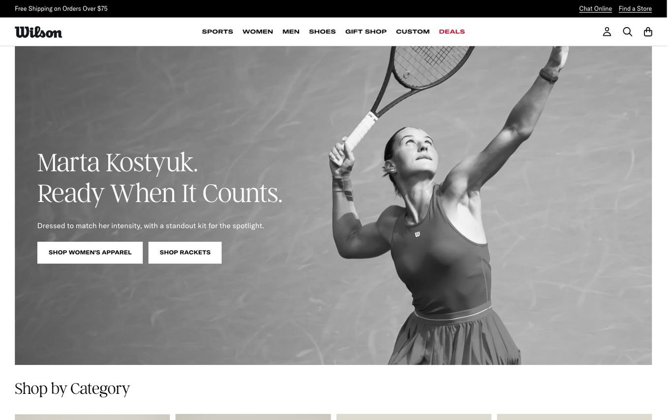
Wilson uses a striking black-and-white portrait of a professional tennis player with “Ready When It Counts” and buttons for apparel and rackets. A custom-products link in the navigation adds a personal touch.
What to borrow: Athlete stories that make products aspirational.
4. Backcountry

Backcountry pairs a bold discount graphic with a skier in deep snow, explaining that the perk is for members and sign-up is free. Utility links offer cash back, a store finder, and expert help.
What to borrow: An “expert help” link beside the search bar.
5. Peloton

Peloton pairs a strong discount headline with financing details and a note about health savings account eligibility, then a strip showing the full product line-up. A chat prompt offers help with current offers.
What to borrow: Finance and eligibility details for high-ticket equipment.
6. Evans Cycles

Evans Cycles, which now powers wiggle.com, uses a perks bar with 0% finance, cycle-to-work savings, repair and service booking, and click and collect, plus category chips for mountain bikes, e-bikes, and more. Deal panels follow.
What to borrow: Service booking and cycle-to-work savings up front.
7. Patagonia

Patagonia pairs a joyful snowy action photo with “Give ’em what they really want” and buttons for women’s, men’s, kids’, and packs and gear. Used clothing sits in the main navigation, reflecting the brand’s values.
What to borrow: Put your values, such as used gear, in the main navigation.
8. Arc’teryx
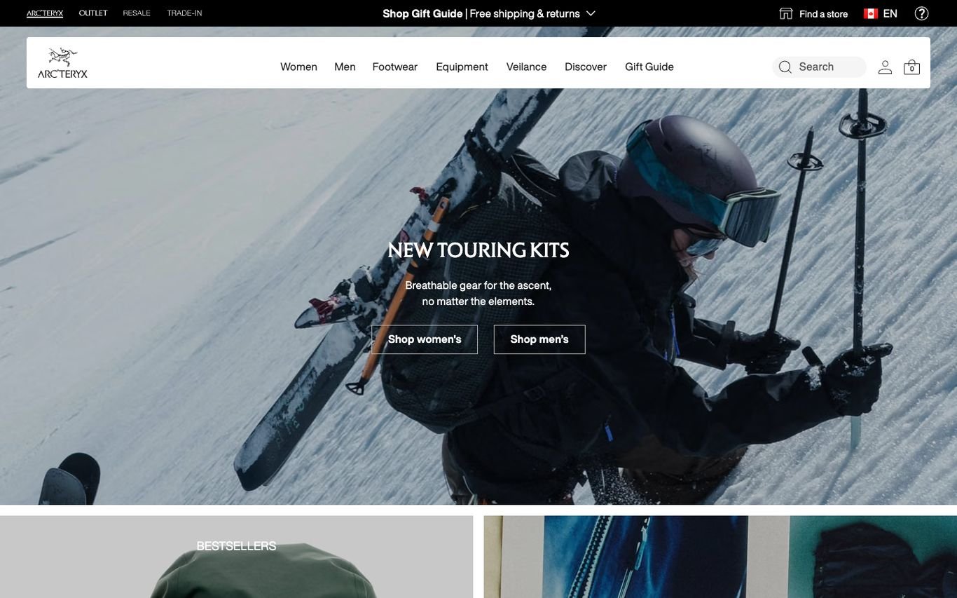
Arc’teryx shows a skier deep in powder to launch new touring kits, with a short technical promise about breathability and the elements, and buttons for women’s and men’s.
What to borrow: Show technical products being used in extreme conditions.
9. Sweaty Betty
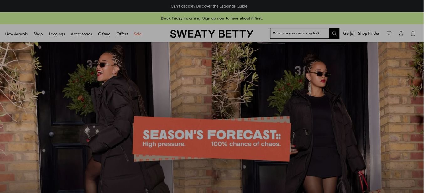
Sweaty Betty uses witty copy styled as a weather forecast for its seasonal campaign, over a bold fashion photo, with navigation for running, yoga, leggings, and accessories.
What to borrow: Witty campaign copy that matches the brand’s personality.
Quick Comparison
| Website | Market | Standout Feature | Our Rating |
|---|---|---|---|
| evo | US | Store, trips, rentals and service in one header | |
| Gymshark | UK / Global | Moody athletic product launch | |
| Wilson | US | Editorial athlete storytelling | |
| Backcountry | US | Member perks and expert help | |
| Peloton | US | Promotion plus financing and eligibility | |
| Evans Cycles | UK | Practical perks bar for cyclists | |
| Patagonia | Global | Gift guide over action photography | |
| Arc’teryx | Global | Technical gear in its element | |
| Sweaty Betty | UK | Playful weather-forecast copy |
Design Tips for Your Sports Store Website
1. Organise by Activity
Customers often start with the sport, then the product.
2. Help With Technical Choices
Size guides, fitting tools and comparison charts reduce returns.
3. Tell Stories
Athlete stories and adventure content build brand and search traffic.
4. Reward Members
Loyalty points and member-only pricing encourage repeat purchases.
5. Connect Online and In-Store
Click and collect, stock checks and events link the channels.
Frequently Asked Questions
What should a sports store website include?
Shop by activity, detailed filters, buying guides, reviews, loyalty rewards and delivery or collection options.
Can WooCommerce run a sports retail site?
Yes, including variable sizes, filters, loyalty and multi-location stock with extensions.
How do sports retailers reduce returns?
Size guides, fit tools and detailed product information.
Conclusion
The best sports store website design combines trust, clarity and an obvious next step. Inspire customers to get active and help them choose the right gear quickly. Use these 9 examples as inspiration and adapt the patterns that fit your business.
For more inspiration, see our best real estate website designs and best solar company website designs.
Dev Mizan designs and builds fast, conversion-focused WordPress websites for growing businesses, with lead forms connected to your CRM. Get in touch to plan your new website, or message us on WhatsApp.
Want more inspiration? Browse all website design examples by industry →