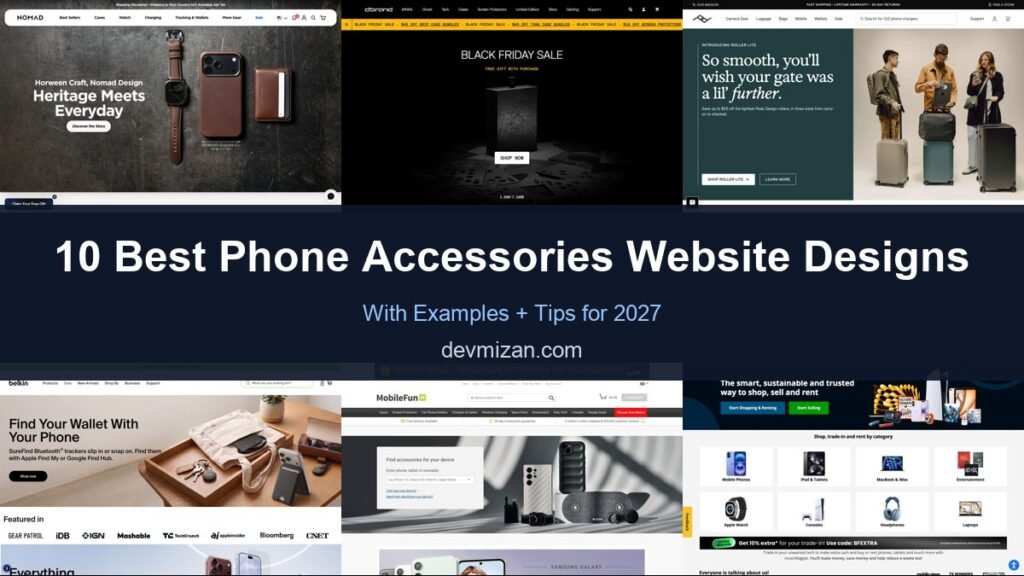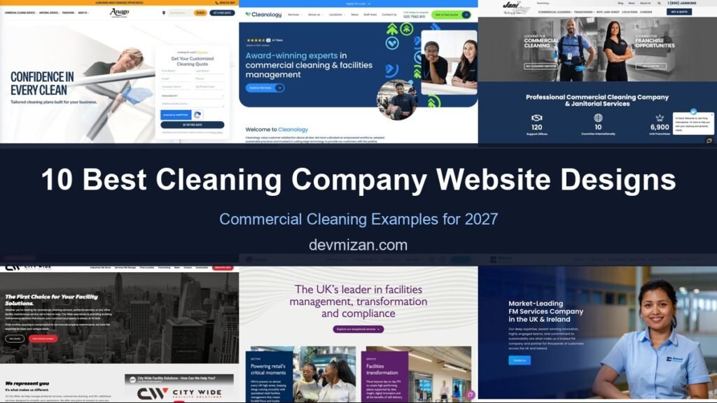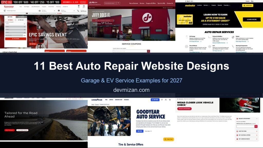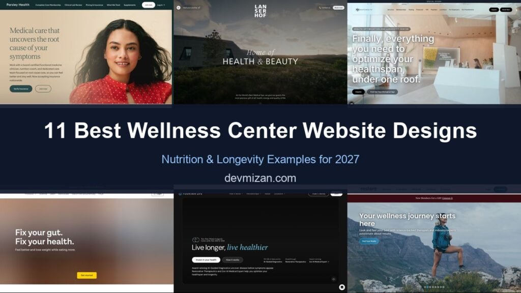
Nutrition and wellness centres sell long-term change, from better energy to healthier ageing. Their websites need to inspire, explain the science and make it easy to start a programme. This post showcases 11 of the best wellness center website design examples for 2027, with screenshots, what each site does well, and practical tips you can use on your own website.
The best wellness websites combine aspirational imagery with clear programmes, practitioner expertise and simple booking.
Table of Contents
What Makes a Great Wellness Center Website?
- Clear programmes. What each programme includes, how long it lasts and the outcomes.
- Expert practitioners. Doctors, nutritionists and coaches with credentials.
- Aspirational imagery. Spaces and experiences that reflect the brand.
- Booking and enquiries. Consultations, retreats or memberships.
- Evidence and results. Science, testing and client stories.
- Content. Articles and guides that build trust.
1. Parsley Health
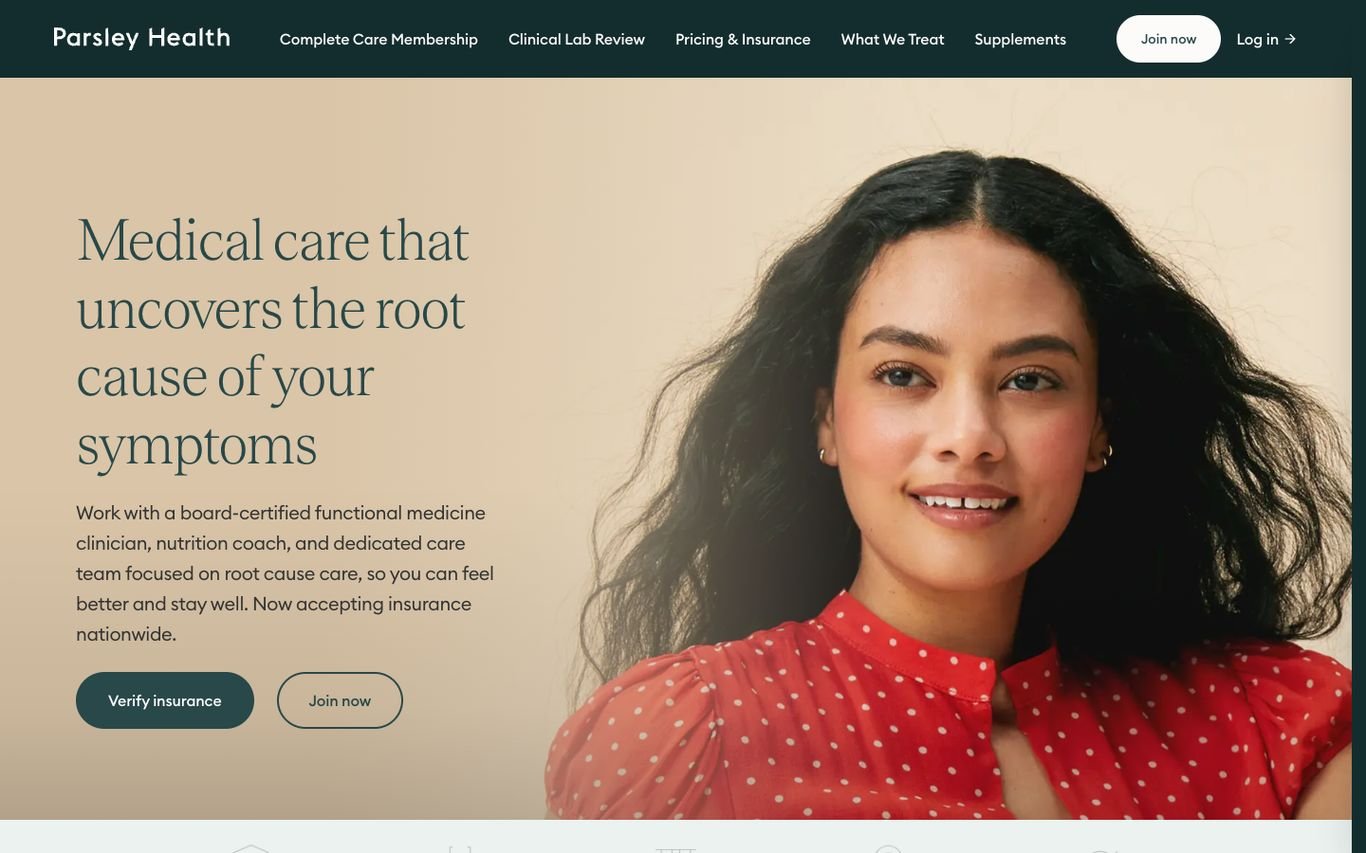
Parsley Health uses an elegant serif headline, “Medical care that uncovers the root cause of your symptoms,” beside a warm portrait. It explains the team (functional medicine clinician plus nutrition coach), notes that it now accepts insurance, and offers Verify Insurance and Join Now buttons.
What to borrow: Make insurance acceptance a headline benefit.
2. Lanserhof

Lanserhof sets “Home of Health & Beauty” in refined serif type over a moody alpine landscape, with a short line about its medical spa. Start Your Journey, Contact Us, and Book Now are the only actions.
What to borrow: Restraint and atmosphere for a luxury wellness brand.
3. Next Health
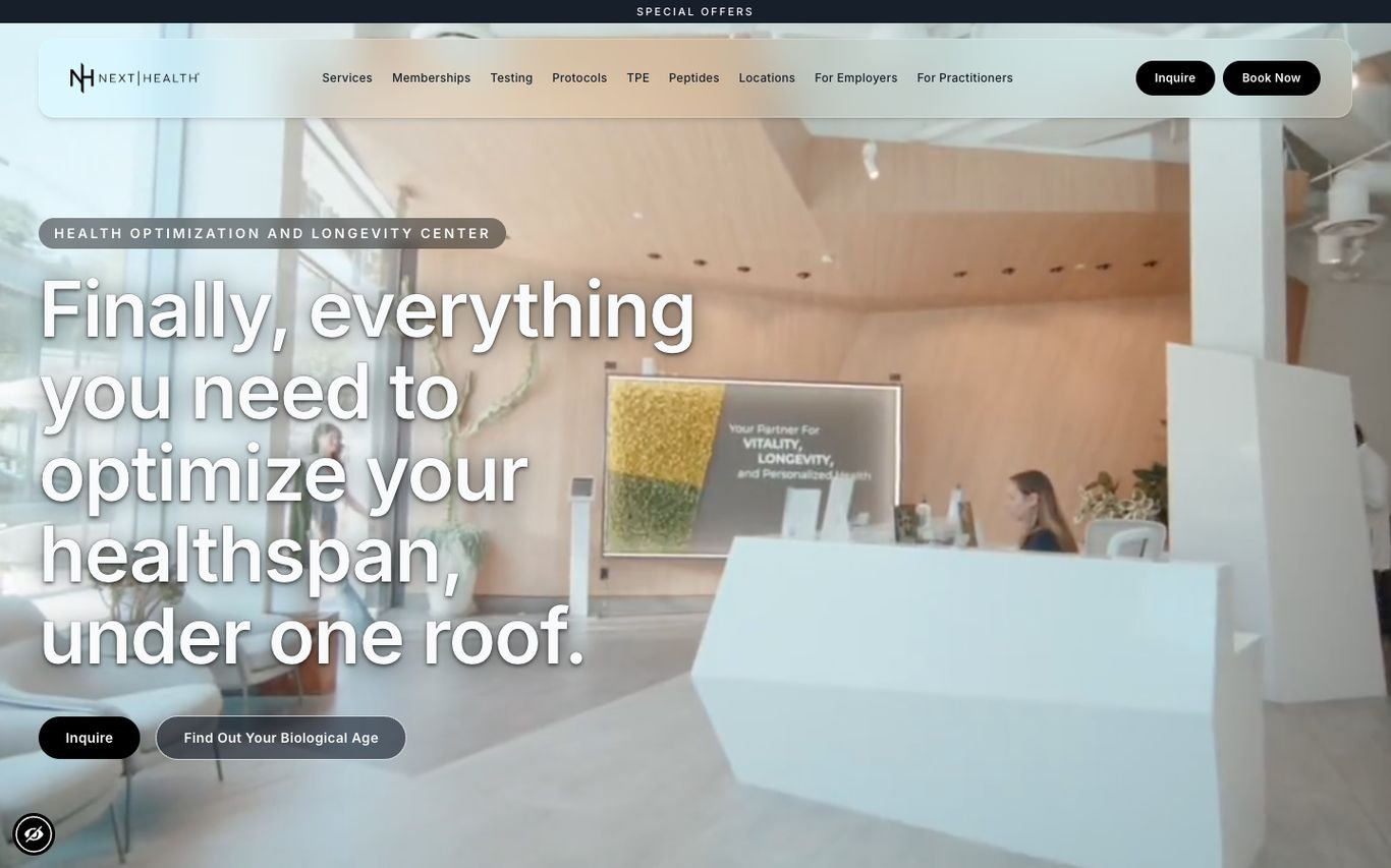
Next Health shows its bright clinic interior with “Finally, everything you need to optimize your healthspan, under one roof,” plus Inquire and Find Out Your Biological Age buttons. The navigation covers services, memberships, testing, protocols, locations, and employers.
What to borrow: A biological age test as an intriguing first step.
4. ZOE

ZOE’s headline, “Fix your gut. Fix your health.”, sits over warm food imagery with a Get Started button. Science, learning content, and a documentary link in the navigation back up the claim.
What to borrow: Link to the science behind your programme.
5. Fountain Life
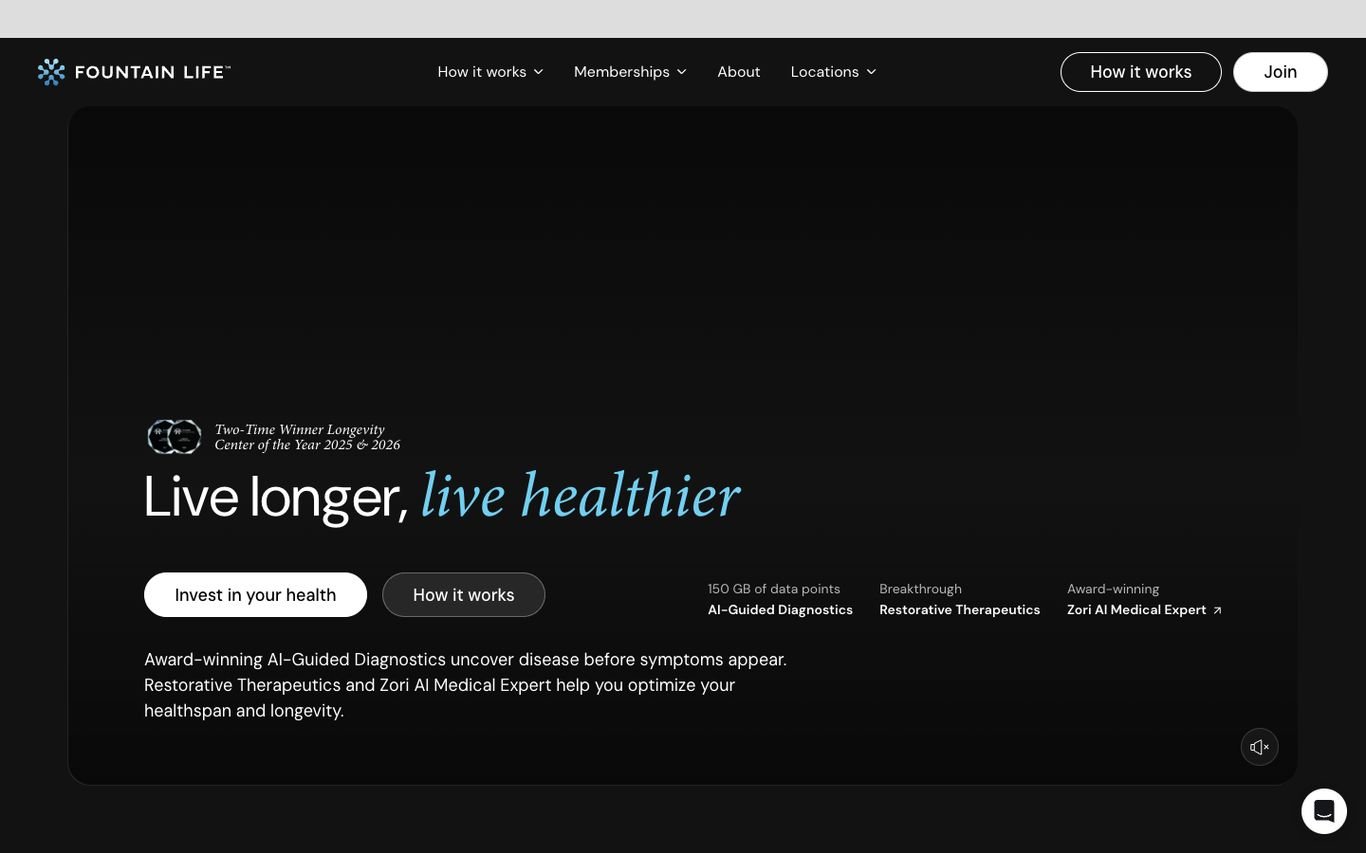
Fountain Life uses a dark, premium design with “Live longer, live healthier,” and buttons to invest in your health or see how it works. Proof points cover its diagnostics data, therapeutics, and AI medical expert.
What to borrow: Proof points that explain a complex, premium offer.
6. Restore Hyper Wellness

Restore shows a hiker on a mountain with “Your wellness journey starts here” and a Find Your Studio button, plus a new-member gift banner and a franchise link in the navigation.
What to borrow: Lifestyle imagery about what clients want to do, not the therapy.
7. SHA Wellness Clinic
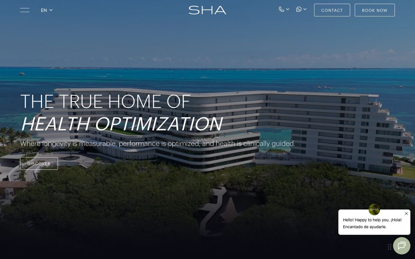
SHA shows its seaside clinic from above with “The true home of health optimization” and a line about measurable longevity and performance. Contact and Book Now buttons sit in the header, with a chat window for enquiries.
What to borrow: A clear category claim for a destination clinic.
8. Clinique La Prairie

Clinique La Prairie uses a dark, cinematic hero with “At the heart of the secret of life” and a line describing it as a progressive longevity clinic. Book Your Program and WhatsApp buttons sit in the header.
What to borrow: WhatsApp contact for an international luxury audience.
9. Kamalaya

Kamalaya welcomes visitors with an aerial view of its tropical hillside sanctuary and a gentle introduction to its holistic approach. Wellness programmes, accommodation, and retreats sit in the navigation with a Book Now button.
What to borrow: Let the destination itself sell the experience.
10. Noom
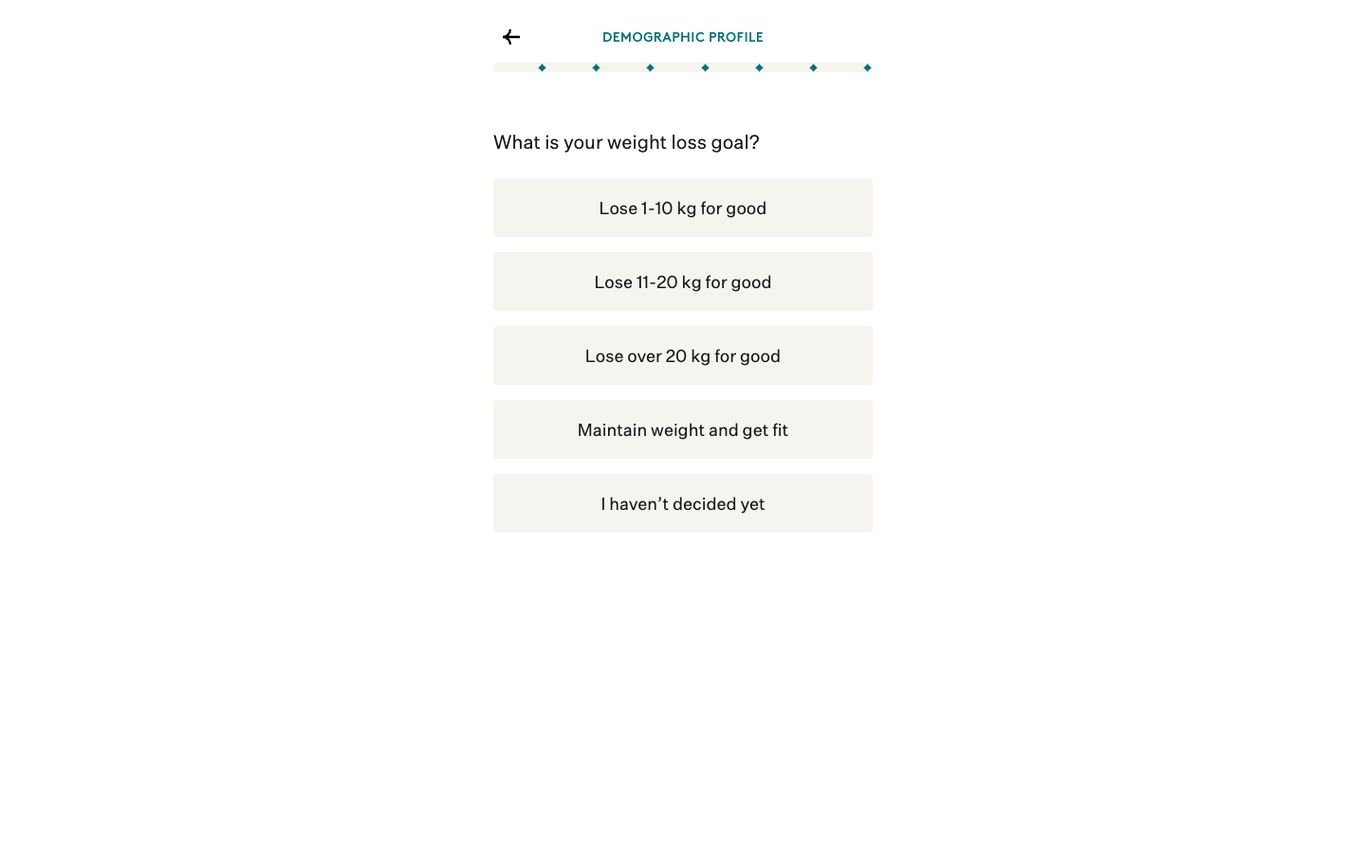
Noom starts the conversion immediately with a short quiz: “What is your weight loss goal?” and a set of answer buttons. It turns the homepage into the first step of personalisation.
What to borrow: Start with one question instead of a sales pitch.
11. VIVAMAYR
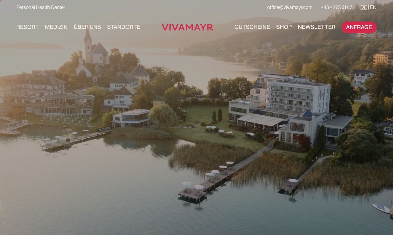
VIVAMAYR shows its lakeside medical health resort from above, with navigation for the resort, medicine, locations, vouchers, and shop, and a bright red enquiry button.
What to borrow: A highly visible enquiry button for high-value bookings.
Quick Comparison
| Website | Market | Standout Feature | Our Rating |
|---|---|---|---|
| Parsley Health | US | Root-cause promise and insurance message | |
| Lanserhof | Germany / Austria / UK | Serif elegance over dramatic landscape | |
| Next Health | US | Healthspan promise with a biological age hook | |
| ZOE | UK / US | Short promise and science links | |
| Fountain Life | US | Longevity positioning with proof points | |
| Restore Hyper Wellness | US | Adventure imagery and studio finder | |
| SHA Wellness Clinic | Spain | Health optimisation positioning | |
| Clinique La Prairie | Switzerland | Cinematic longevity story | |
| Kamalaya | Thailand | Tropical sanctuary welcome | |
| Noom | US | Quiz as the homepage | |
| VIVAMAYR | Austria | Lakeside resort with an enquiry button |
Design Tips for Your Wellness Center Website
1. Explain the Journey
Show how a client moves from first consultation to results.
2. Balance Inspiration and Evidence
Beautiful imagery attracts, but clear science and credentials convince.
3. Offer an Entry Point
A consultation, assessment or short programme lowers the barrier to starting.
4. Showcase Your Practitioners
People trust people, so put your experts front and centre.
5. Publish Helpful Content
Nutrition and lifestyle guides attract search traffic and demonstrate expertise.
Frequently Asked Questions
What should a wellness center website include?
Programmes, practitioner profiles, booking, pricing or packages, client results and helpful content.
How do wellness centers attract clients online?
Through search-friendly content, clear programme pages and an easy first consultation.
Can WordPress handle memberships and bookings?
Yes. WordPress supports booking, memberships and online payments through plugins.
Conclusion
The best wellness center website design combines trust, clarity and an obvious next step. Inspire visitors, explain your approach clearly and make the first step easy. Use these 11 examples as inspiration and adapt the patterns that fit your business.
For more inspiration, see our best real estate website designs and best solar company website designs.
Dev Mizan designs and builds fast, conversion-focused WordPress websites for growing businesses, with lead forms connected to your CRM. Get in touch to plan your new website, or message us on WhatsApp.